#1,219 – Expanding All Nodes in a TreeView by Default

Normally, when you display a TreeView, the nodes are collapsed by default and the user clicks on the expander widgets to expand nodes that they want to look at.

You can expand all nodes in the TreeView by default by setting up an ItemContainerStyle for the TreeView and specifying that you want each TreeViewItem expanded.

Below, we show the first part of a TreeView definition in XAML, referencing an ItemContainerStyle (data templates are not shown).

<TreeView Grid.Row="0" Margin="5" 
          ItemsSource="{Binding Breeds}" 
          ItemContainerStyle="{StaticResource TreeViewItemStyle_ExpandAll}" 
          HorizontalContentAlignment="Stretch">
<!-- remainder of TreeView definition goes here -->

In the style, we simply set the IsExpanded property to true.

<Style x:Key="TreeViewItemStyle_ExpandAll" TargetType="{x:Type TreeViewItem}">
    <Setter Property="IsExpanded" Value="True"/>
</Style>

Now, at runtime, all of the nodes in the TreeView are expanded by default.

#1,218 – Stretching Items in TreeView across Entire Control

You can define a custom data template for items in a TreeView, displaying any content you like in a panel, for each data item.

There’s a problem with doing this, however, if you want the container in the data template to stretch the entire width of the TreeView. In the sample below, we have a data template for a dog breed the displays data across three columns in a Grid. We’ve set the middle column up as star-sized so that the rightmost column (first letter of the breed) sits on the far right of the grid. In the TreeView, we set HorizontalContentAlignment to Stretch, to try getting this grid to stretch across the entire width of the TreeView.

        <TreeView Grid.Row="0" Margin="5" ItemsSource="{Binding Breeds}" HorizontalContentAlignment="Stretch">
            <TreeView.Resources>
                <HierarchicalDataTemplate DataType="{x:Type loc:Breed}" ItemsSource="{Binding Dogs}">
                    <Grid Margin="0,5,0,0">
                        <Grid.ColumnDefinitions>
                            <ColumnDefinition Width="Auto"/>
                            <ColumnDefinition/>
                            <ColumnDefinition Width="Auto"/>
                        </Grid.ColumnDefinitions>
                        
                        <TextBlock Grid.Column="0" Text="Breed:"/>
                        <TextBlock Grid.Column="1" Margin="5,0,0,0" FontWeight="Bold" Text="{Binding Name}"/>
                        <TextBlock Grid.Column="2" Margin="0,0,3,0" FontStyle="Italic" Text="{Binding FirstLetter}"/>
                    </Grid>
                </HierarchicalDataTemplate>

                <HierarchicalDataTemplate DataType="{x:Type loc:Dog}">
                    <StackPanel Orientation="Horizontal" Margin="0,2,0,0">
                        <TextBlock Text="{Binding}"/>
                    </StackPanel>
                </HierarchicalDataTemplate>
            </TreeView.Resources>
        </TreeView>

At runtime, you can see that this doesn’t work. The 3rd column is jammed up against the right side of the second column.

The problem has to do with the default ItemContainerStyle. It includes a control template for each data item that puts the main content for the data item in an auto-sized grid column, not allowing it to stretch across the control.

The solution is to override the ItemContainerStyle and tweak the column definitions to allow the content to extend across the Grid. Below is the full text of the modified style, including all dependent styles. The main style that can be used for a TreeView.ItemContainerStyle is named TreeViewItemStyle1. We’ve modified the style so that the control template has a Grid with only two columns. The second column contains the content and is star-sized.


<Style x:Key="TreeViewItemFocusVisual">
            <Setter Property="Control.Template">
                <Setter.Value>
                    <ControlTemplate>
                        <Rectangle/>
                    </ControlTemplate>
                </Setter.Value>
            </Setter>
        </Style>


        <SolidColorBrush x:Key="TreeViewItem.TreeArrow.Static.Checked.Fill" Color="#FF595959"/>
        <SolidColorBrush x:Key="TreeViewItem.TreeArrow.Static.Checked.Stroke" Color="#FF262626"/>
        <SolidColorBrush x:Key="TreeViewItem.TreeArrow.MouseOver.Stroke" Color="#FF27C7F7"/>
        <SolidColorBrush x:Key="TreeViewItem.TreeArrow.MouseOver.Fill" Color="#FFCCEEFB"/>
        <SolidColorBrush x:Key="TreeViewItem.TreeArrow.MouseOver.Checked.Stroke" Color="#FF1CC4F7"/>
        <SolidColorBrush x:Key="TreeViewItem.TreeArrow.MouseOver.Checked.Fill" Color="#FF82DFFB"/>
        <PathGeometry x:Key="TreeArrow" Figures="M0,0 L0,6 L6,0 z"/>
        <SolidColorBrush x:Key="TreeViewItem.TreeArrow.Static.Fill" Color="#FFFFFFFF"/>
        <SolidColorBrush x:Key="TreeViewItem.TreeArrow.Static.Stroke" Color="#FF818181"/>


<Style x:Key="ExpandCollapseToggleStyle" TargetType="{x:Type ToggleButton}">
            <Setter Property="Focusable" Value="False"/>
            <Setter Property="Width" Value="16"/>
            <Setter Property="Height" Value="16"/>
            <Setter Property="Template">
                <Setter.Value>
                    <ControlTemplate TargetType="{x:Type ToggleButton}">
                        <Border Background="Transparent" Height="16" Padding="5,5,5,5" Width="16">
                            <Path x:Name="ExpandPath" Data="{StaticResource TreeArrow}" Fill="{StaticResource TreeViewItem.TreeArrow.Static.Fill}" Stroke="{StaticResource TreeViewItem.TreeArrow.Static.Stroke}">
                                <Path.RenderTransform>
                                    <RotateTransform Angle="135" CenterY="3" CenterX="3"/>
                                </Path.RenderTransform>
                            </Path>
                        </Border>
                        <ControlTemplate.Triggers>
                            <Trigger Property="IsChecked" Value="True">
                                <Setter Property="RenderTransform" TargetName="ExpandPath">
                                    <Setter.Value>
                                        <RotateTransform Angle="180" CenterY="3" CenterX="3"/>
                                    </Setter.Value>
                                </Setter>
                                <Setter Property="Fill" TargetName="ExpandPath" Value="{StaticResource TreeViewItem.TreeArrow.Static.Checked.Fill}"/>
                                <Setter Property="Stroke" TargetName="ExpandPath" Value="{StaticResource TreeViewItem.TreeArrow.Static.Checked.Stroke}"/>
                            </Trigger>
                            <Trigger Property="IsMouseOver" Value="True">
                                <Setter Property="Stroke" TargetName="ExpandPath" Value="{StaticResource TreeViewItem.TreeArrow.MouseOver.Stroke}"/>
                                <Setter Property="Fill" TargetName="ExpandPath" Value="{StaticResource TreeViewItem.TreeArrow.MouseOver.Fill}"/>
                            </Trigger>
                            <MultiTrigger>
                                <MultiTrigger.Conditions>
                                    <Condition Property="IsMouseOver" Value="True"/>
                                    <Condition Property="IsChecked" Value="True"/>
                                </MultiTrigger.Conditions>
                                <Setter Property="Stroke" TargetName="ExpandPath" Value="{StaticResource TreeViewItem.TreeArrow.MouseOver.Checked.Stroke}"/>
                                <Setter Property="Fill" TargetName="ExpandPath" Value="{StaticResource TreeViewItem.TreeArrow.MouseOver.Checked.Fill}"/>
                            </MultiTrigger>
                        </ControlTemplate.Triggers>
                    </ControlTemplate>
                </Setter.Value>
            </Setter>
        </Style>


<Style x:Key="TreeViewItemStyle1" TargetType="{x:Type TreeViewItem}">
            <Setter Property="Background" Value="Transparent"/>
            <Setter Property="HorizontalContentAlignment" Value="{Binding HorizontalContentAlignment, RelativeSource={RelativeSource AncestorType={x:Type ItemsControl}}}"/>
            <Setter Property="VerticalContentAlignment" Value="{Binding VerticalContentAlignment, RelativeSource={RelativeSource AncestorType={x:Type ItemsControl}}}"/>
            <Setter Property="Padding" Value="1,0,0,0"/>
            <Setter Property="Foreground" Value="{DynamicResource {x:Static SystemColors.ControlTextBrushKey}}"/>
            <Setter Property="FocusVisualStyle" Value="{StaticResource TreeViewItemFocusVisual}"/>
            <Setter Property="Template">
                <Setter.Value>
                    <ControlTemplate TargetType="{x:Type TreeViewItem}">
                        <Grid>
                            <Grid.ColumnDefinitions>
                                <ColumnDefinition MinWidth="19" Width="Auto"/>
                                <ColumnDefinition Width="*"/>
                            </Grid.ColumnDefinitions>
                            <Grid.RowDefinitions>
                                <RowDefinition Height="Auto"/>
                                <RowDefinition/>
                            </Grid.RowDefinitions>
                            <ToggleButton x:Name="Expander" ClickMode="Press" IsChecked="{Binding IsExpanded, RelativeSource={RelativeSource TemplatedParent}}" Style="{StaticResource ExpandCollapseToggleStyle}"/>
                            <Border x:Name="Bd" Grid.Column="1" BorderBrush="{TemplateBinding BorderBrush}" BorderThickness="{TemplateBinding BorderThickness}" Background="{TemplateBinding Background}" Padding="{TemplateBinding Padding}" SnapsToDevicePixels="true">
                                <ContentPresenter x:Name="PART_Header" ContentSource="Header" HorizontalAlignment="{TemplateBinding HorizontalContentAlignment}" SnapsToDevicePixels="{TemplateBinding SnapsToDevicePixels}"/>
                            </Border>
                            <ItemsPresenter x:Name="ItemsHost" Grid.Row="1" Grid.Column="1" />
                        </Grid>
                        <ControlTemplate.Triggers>
                            <Trigger Property="IsExpanded" Value="false">
                                <Setter Property="Visibility" TargetName="ItemsHost" Value="Collapsed"/>
                            </Trigger>
                            <Trigger Property="HasItems" Value="false">
                                <Setter Property="Visibility" TargetName="Expander" Value="Hidden"/>
                            </Trigger>
                            <Trigger Property="IsSelected" Value="true">
                                <Setter Property="Background" TargetName="Bd" Value="{DynamicResource {x:Static SystemColors.HighlightBrushKey}}"/>
                                <Setter Property="Foreground" Value="{DynamicResource {x:Static SystemColors.HighlightTextBrushKey}}"/>
                            </Trigger>
                            <MultiTrigger>
                                <MultiTrigger.Conditions>
                                    <Condition Property="IsSelected" Value="true"/>
                                    <Condition Property="IsSelectionActive" Value="false"/>
                                </MultiTrigger.Conditions>
                                <Setter Property="Background" TargetName="Bd" Value="{DynamicResource {x:Static SystemColors.InactiveSelectionHighlightBrushKey}}"/>
                                <Setter Property="Foreground" Value="{DynamicResource {x:Static SystemColors.InactiveSelectionHighlightTextBrushKey}}"/>
                            </MultiTrigger>
                            <Trigger Property="IsEnabled" Value="false">
                                <Setter Property="Foreground" Value="{DynamicResource {x:Static SystemColors.GrayTextBrushKey}}"/>
                            </Trigger>
                        </ControlTemplate.Triggers>
                    </ControlTemplate>
                </Setter.Value>
            </Setter>
            <Style.Triggers>
                <Trigger Property="VirtualizingPanel.IsVirtualizing" Value="true">
                    <Setter Property="ItemsPanel">
                        <Setter.Value>
                            <ItemsPanelTemplate>
                                <VirtualizingStackPanel/>
                            </ItemsPanelTemplate>
                        </Setter.Value>
                    </Setter>
                </Trigger>
            </Style.Triggers>
        </Style>


For completeness, here’s a fragment of the TreeView, using the new style.

<TreeView Grid.Row="0" Margin="5" ItemsSource="{Binding Breeds}" ItemContainerStyle="{StaticResource TreeViewItemStyle1}" HorizontalContentAlignment="Stretch">

We can see that the third element is now lined up on the right side of the TreeView at runtime.

#1,217 – Using Multiple HierarchicalDataTemplates in a TreeView

I showed last time how to use a HierarchicalDataTemplate as the ItemTemplate for a TreeView. This allowed us to specify the look and feel of each node in the tree and also dictated how the main data item would be traversed to generate the tree.

If you have some hierarchical data in which the items are not all of the same type, you can specify more than one HierarchicalDataTemplate for the TreeView, based on the underlying type of each node.

Let’s assume that we have both a Breed and a Dog class. Breed objects contain information about a breed and in turn have a Dogs property that is a list of individual dogs of that breed.

In the example below, we have a TreeView whose ItemsSource is bound to a list of breeds. We then include a template to use for each Breed item and a different template to use for each Dog item in the tree. We also indicate that the tree should be expanded by looking at the Dogs property in each breed instance.

        <TreeView Grid.Row="0" Margin="5" ItemsSource="{Binding Breeds}">
            <TreeView.Resources>
                <HierarchicalDataTemplate DataType="{x:Type loc:Breed}" ItemsSource="{Binding Dogs}">
                    <StackPanel Orientation="Horizontal" Margin="0,5,0,0">
                        <TextBlock Text="Breed:"/>
                        <TextBlock Margin="5,0,0,0" FontWeight="Bold" Text="{Binding Name}"/>
                    </StackPanel>
                </HierarchicalDataTemplate>

                <HierarchicalDataTemplate DataType="{x:Type loc:Dog}">
                    <StackPanel Orientation="Horizontal" Margin="0,2,0,0">
                        <TextBlock Text="{Binding}"/>
                    </StackPanel>
                </HierarchicalDataTemplate>
            </TreeView.Resources>
        </TreeView>

Note that we specify a DataType for each HierarchicalDataTemplate. As the tree is constructed, the appropriate template will be used, based on whether a node is a breed or a dog.

Below, we can see how this will look at runtime. Breed nodes show the breed’s name. Dog nodes show the dog’s name and age. We just have a TextBlock bound to the Dog instance as a whole, which causes the dog’s ToString method to get invoked. In our case, we’ve overridden ToString to display the dog’s name and age.

#1,216 – Creating a Custom ItemTemplate in a TreeView

If we just want each node in a TreeView control to contain text, we can use a single TreeViewItem in the HierarchicalDataTemplate and bind its Header property to the text that we want displayed. However, we can use an Panel we like in the data template.

The example below builds on our last post, but using a Grid in a Border for each person in the tree.

<TreeView Grid.Row="0" Margin="5" ItemsSource="{Binding Royal}">
    <TreeView.ItemTemplate>
        <HierarchicalDataTemplate ItemsSource="{Binding Children}">
            <Border Background="AliceBlue" Margin="0,2,0,0" Padding="4,2,8,2" 
                    BorderBrush="DimGray" BorderThickness="1"
                    CornerRadius="3">
                <Grid>
                    <Grid.RowDefinitions>
                        <RowDefinition/>
                        <RowDefinition/>
                    </Grid.RowDefinitions>
                    <Grid.ColumnDefinitions>
                        <ColumnDefinition/>
                        <ColumnDefinition/>
                    </Grid.ColumnDefinitions>

                    <TextBlock Grid.Row="0" Grid.Column="0" FontWeight="Bold"
                               Text="{Binding Name}"/>
                    <TextBlock Grid.Row="1" Grid.Column="0" FontStyle="Italic"
                               Text="{Binding BirthDeath}" Margin="5,0,0,0"/>
                    <Image Grid.RowSpan="2" Grid.Column="2"
                           Height="20" Width="20" Margin="5,0"
                           Source="Crown.png"
                           Visibility="{Binding KingOrQueen, Converter={StaticResource BooleanToVisibilityConverter}}"/>
                </Grid>
            </Border>
        </HierarchicalDataTemplate>
    </TreeView.ItemTemplate>
</TreeView>

Here’s what the final result looks like (after I expand a few of the TreeView nodes:

#1,215 – Binding a TreeView to a Hierarchical Data Source

Below is a very simple example of how you might use a TreeView control to display a set of hierarchical data.

Let’s say that we have a Person object that looks like the following. (INPCBase is just a class that implements INotifyPropertyChanged and includes a SetField method).

    public class Person : INPCBase
    {
        public Person(string name, int birth, int? death)
        {
            Name = name;
            Birth = birth;
            Death = death;

            Children = new List<Person>();
        }

        private string _name;
        public string Name
        {
            get { return _name; }
            set { SetField(ref _name, value); }
        }

        private int _birth;
        public int Birth
        {
            get { return _birth; }
            set { SetField(ref _birth, value); }
        }

        private int? _death;
        public int? Death
        {
            get { return _death; }
            set { SetField(ref _death, value); }
        }

        private List<Person> _children;
        public List<Person> Children
        {
            get { return _children; }
            private set { SetField(ref _children, value); }
        }

        public override string ToString()
        {
            string death = Death.HasValue ? Death.Value.ToString() : "";
            return string.Format($"{Name} ({Birth} - {death})");
        }
    }

Notice that we have a Children property that in turn contains other Person objects. Also note that we override ToString so that the default string representation for a Person includes their name and birth/death.

Now let’s assume that we have some ViewModel with a property called Royal that is a list of Person objects. The property might look like:

        private List<Person> _royal;
        public List<Person> Royal
        {
            get { return _royal; }
            set { SetField(ref _royal, value); }
        }

Let’s assume that we initialize this list as follows:

            var p1 = new Person("George V", 1865, 1936);

            var p2 = new Person("Edward VIII", 1894, 1974);
            var p3 = new Person("George VI", 1895, 1952);
            var p4 = new Person("Mary", 1897, 1965);
            var p5 = new Person("Henry", 1900, 1974);
            var p6 = new Person("George", 1902, 1942);
            var p7 = new Person("John", 1905, 1919);

            var p8 = new Person("Elizabeth II", 1926, null);
            var p9 = new Person("Margaret", 1865, 1936);

            var p10 = new Person("Richard", 1944, null);

            var p11 = new Person("Edward", 1935, null);
            var p12 = new Person("Michael", 1942, null);

            var p13 = new Person("Charles", 1948, null);
            var p14 = new Person("Anne", 1950, null);
            var p15 = new Person("Andrew", 1960, null);
            var p16 = new Person("Edward", 1964, null);

            p1.Children.AddRange(new [] { p2, p3, p4, p5, p6, p7});
            p3.Children.AddRange(new[] { p8, p9 });
            p5.Children.Add(p10);
            p6.Children.AddRange(new[] { p11, p12 });
            p8.Children.AddRange(new[] { p13, p14, p15, p16 });

            Royal = new List<Person>() { p1 };

To wire this hierarchical data source up to a TreeView control, we use a HierarchicalDataTemplate in XAML, as shown below.

        <TreeView Grid.Row="0" Margin="5" ItemsSource="{Binding Royal}">
            <TreeView.ItemTemplate>
                <HierarchicalDataTemplate ItemsSource="{Binding Children}">
                    <TreeViewItem Header="{Binding}"/>
                </HierarchicalDataTemplate>
            </TreeView.ItemTemplate>
        </TreeView>

There are several things to note about this XAML fragment:

  • We set the ItemsSource of the TreeView to our top-level property (a list of Person, which contains one person).
  • We tell the HierarchicalDataTemplate to use the Children property to traverse the hierarchy
  • We indicate that each node should be a TreeViewItem object, with text (Header) that just binds to the Person object. This causes the default ToString method of the object to be used for the text

The final result is a nice little family tree:

1215-01

#1,214 – Naming Scheme for XAML Elements

Although XAML elements do not require a name, it’s sometimes useful to name them for debugging purposes–e.g. when using Visual Studio’s Live Visual Tree.

Below is a modest proposal for a naming convention for various WPF controls.

  • AccessText – at
  • Border – brd
  • BulletDecorator – bd
  • Button – btn
  • Calendar – cal
  • Canvas – cnv
  • CheckBox – chk
  • ComboBox – cbo
  • ContextMenu – ctx
  • DataGrid – dg
  • DatePicker – dat
  • DockPanel – dp
  • Expander – exp
  • Frame – fr
  • Grid – grd
  • GridSplitter – gsp
  • GroupBox – grp
  • Hyperlink – hyp
  • Image – img
  • InkCanvas – ikc
  • InkPresenter – ikp
  • Label – lbl
  • ListBox – lb
  • ListView – lv
  • MediaElement – me
  • Menu – mnu
  • NavigationWindow – nw
  • Page – pg
  • Panel – pnl
  • PasswordBox pwd
  • Popup – pop
  • ProgressBar – pb
  • RadioButton rdo
  • ResizeGrip – rgr
  • RepeatButton rpt
  • RichTextBox – rtb
  • ScrollBar – sb
  • ScrollViewer – sv
  • Separator – sep
  • Slider – sli
  • StackPanel – sp
  • StatusBar – stb
  • TabControl – tab
  • TabItem – tbi
  • TextBlock – tb
  • TextBox – txt
  • Thumb – th
  • ToolBar – tbr
  • ToolTip – tt
  • TreeView – tv
  • Viewbox – vb
  • VirtualizingStackPanel – vsp
  • Window – win
  • WrapPanel – wp

You could certainly go too far in naming controls in a WPF application. Instead of naming every single control, it’s probably more sensible to name a subset of controls, providing names when it makes sense.

#1,213 – Why You May Want to Name XAML Elements

In the days of Win Forms, we had to name every user interface element because the name is how we referenced the element when setting initial properties and then working with the element from code-behind.

In WPF, most developers have (hopefully) trained themselves to not bother with naming elements. Ideally, all interaction with a control is done through the use of commands and data binding, which means that there is then no need to ever access a control from code-behind.

Having said that, there is one valid use case for naming XAML elements in WPF. When you use a debugging tool that shows you the visual tree of an application, it’s helpful to have your elements named, so you can figure out what’s what.

Below is a XAML fragment for a simple WPF application. Note that I’ve named some of the elements (I’m not bothering to name simple labels).

    <Grid x:Name="grdMain" Margin="10">
        <Grid.RowDefinitions>
            <RowDefinition Height="Auto"/>
            <RowDefinition Height="Auto"/>
            <RowDefinition/>
        </Grid.RowDefinitions>
        <Grid.ColumnDefinitions>
            <ColumnDefinition Width="Auto"/>
            <ColumnDefinition/>
        </Grid.ColumnDefinitions>

        <Button x:Name="btnPressMe" Grid.Row="0" Grid.Column="0" Margin="10" Command="local:SomeViewModel.PressMeCommand" Content="{Binding RelativeSource={RelativeSource Self}, Path=Command.Text}" Padding="10,5"/>
        <TextBlock x:Name="txbPressResults" Grid.Row="0" Grid.Column="1" Margin="10" Text="{Binding PressResults}"/>

        <TextBlock Grid.Row="1" Grid.Column="0" Text="Say something:"/>
        <TextBox x:Name="txtYourText" Grid.Row="1" Grid.Column="1" Text="{Binding YourText}"/>

        <TextBlock Grid.Row="2" Grid.ColumnSpan="2" Text="Gosh, I love this application"/>
    </Grid>

When I run the application, I can bring up Visual Studio’s Live Visual Tree and then explore the visual tree of the application. Notice the named elements in the visual tree, corresponding to the names given in the XAML.

Naming elements in this way can make debugging a bit easier when you’re navigating through the visual tree.

#1,212 – Viewing WPF Trace Output Outside of Visual Studio

When you’re running a WPF application from within Visual Studio, you can view trace output in Visual Studio’s Output window. That is, you’ll see any trace output that you generate using Trace.WriteLine. This doesn’t work, however, if you’re not running in Debug mode or when you run your application outside of Visual Studio.

There’s a tool that you can use, however, to capture Trace output for a WPF application, even if it it’s a Release build and is running outside of Visual Studio.

The DebugView tool, available for download here, will display debug output for all applications in Windows. This includes .NET Trace output, which means that the application will display all trace output while your application is running.

Note that DebugView shows debug output for all applications, which means that you may need to filter out applications that you don’t care about. (See OutputDebugString call in the Win32 library).

Let’s say that we do the following in a Button_Click event:

        private void Button_Click(object sender, RoutedEventArgs e)
        {
            Trace.WriteLine($"You clicked a button at {DateTime.Now.ToLongTimeString()}");
        }

We can now build and run the WPF application (i.e. after shutting down Visual Studio). Running DebugView, you can see the output.

#1,211 – Catching Exceptions Originating in Property Accessors

Post #1,210 explained that when data binding causes a property accessor to fire (either get or set) and an exception occurs, the exception will be ignored by the data binding layer. The exception gets caught internally and converted into a binding error that you normally don’t see.

We can use the technique described in #1,209 to to intercept this binding error and convert it back to an exception. This avoids the problem of these original exceptions never being seen.

Below is a complete example, setting us up with a NullReferenceException that comes out of a property set accessor. We wire up a trace listener that will catch this error and other binding errors.

First, we define a BindingErrorTraceListener class, which intercepts the binding errors by overriding the WriteLine method. In the snippet below, we simply throw a new exception that contains the entire text of the binding error. This will work for all binding errors (e.g. due to binding expression problems or due to exceptions coming out of property accessors).

    public class BindingErrorTraceListener : TraceListener
    {
        public override void Write(string s) { }

        public override void WriteLine(string message)
        {
            throw new Exception(message);
        }
    }

Next, we wire up the listener in our application’s startup logic. We also set up a handler for unhandled exceptions and display the body of the exception. (You could just as easily log the exception here).

    public partial class App : Application
    {
        protected override void OnStartup(StartupEventArgs e)
        {
            base.OnStartup(e);

            PresentationTraceSources.Refresh();
            PresentationTraceSources.DataBindingSource.Switch.Level = SourceLevels.Error;
            PresentationTraceSources.DataBindingSource.Listeners.Add(new BindingErrorTraceListener());

            DispatcherUnhandledException += App_DispatcherUnhandledException;
        }

        private void App_DispatcherUnhandledException(object sender, System.Windows.Threading.DispatcherUnhandledExceptionEventArgs e)
        {
            MessageBox.Show(e.Exception.Message);
        }
    }

For existing WPF applications, this is all you need to do. All binding errors will now be converted to exceptions, caught and displayed. Some might argue that this should be standard fare for every WPF application. (Maybe not displaying the errors to the user, but at least logging them).

The snippets below are for a sample application, so that you can see this in action.

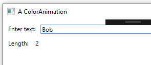
We start with a window that lets the user type in someone’s name then then displays the number of characters in the name.

<Window x:Class="WpfApp1.MainWindow" xmlns="http://schemas.microsoft.com/winfx/2006/xaml/presentation" xmlns:x="http://schemas.microsoft.com/winfx/2006/xaml" xmlns:d="http://schemas.microsoft.com/expression/blend/2008" xmlns:mc="http://schemas.openxmlformats.org/markup-compatibility/2006" xmlns:local="clr-namespace:WpfApp1" mc:Ignorable="d" Title="A ColorAnimation" Height="350" Width="525">
    
    <Grid Margin="10">
        <Grid.RowDefinitions>
            <RowDefinition Height="Auto"/>
            <RowDefinition/>
        </Grid.RowDefinitions>
        <Grid.ColumnDefinitions>
            <ColumnDefinition Width="Auto"/>
            <ColumnDefinition/>
        </Grid.ColumnDefinitions>
        
        <TextBlock Text="Enter text:"/>
        <TextBox Grid.Column="1" Margin="10,0" Text="{Binding YourTextqqqq, UpdateSourceTrigger=PropertyChanged}"/>

        <TextBlock Grid.Row="1" Margin="0,10" Text="Length:"/>
        <TextBlock Grid.Row="1" Grid.Column="1" Margin="0,10" Text="{Binding TextLength}"/>
    </Grid>
</Window>

In the code-behind, we simply wire up the DataContext of the window to a viewmodel.

    public partial class MainWindow : Window
    {
        public SomeViewModel ViewModel { get; set; }

        public MainWindow()
        {
            InitializeComponent();
            ViewModel = new SomeViewModel();
            this.DataContext = ViewModel;
        }
    }

Finally, we have the body of our viewmodel, where we make an attempt to call a method on a BobNotify object when the user types “Bob”. We haven’t initialized the object, so this will generate a null reference exception.

    public class SomeViewModel : INotifyPropertyChanged
    {
        private BobNotify _bobNotify;

        private string _yourText;
        public string YourText
        {
            get { return _yourText; }
            set
            {
                if (SetProp(ref _yourText, value))
                {
                    // E-mail Bob if someone types his name
                    // (but we forgot to initialize BobNotify object, so will get NullRefException here).
                    if (_yourText == "Bob")
                        _bobNotify.SendEmail(_yourText);

                    RaisePropertyChanged("TextLength");
                }
            }
        }

        public int TextLength
        {
            get
            {
                return string.IsNullOrWhiteSpace(_yourText) ? 0 : _yourText.Length;
            }
        }

        protected bool SetProp<T>(ref T backingField, T value, [CallerMemberName] string propName = null)
        {
            bool valueChanged = false;

            // Can't use equality operator on generic types
            if (!EqualityComparer<T>.Default.Equals(backingField, value))
            {
                backingField = value;
                RaisePropertyChanged(propName);
                valueChanged = true;
            }

            return valueChanged;
        }

        public event PropertyChangedEventHandler PropertyChanged = delegate { };

        private void RaisePropertyChanged(string propname)
        {
            PropertyChanged(this, new PropertyChangedEventArgs(propname));
        }
    }

When we put all of these pieces together and test the application, we see that when the user types “Bob”, we get the dialog popping up with the full text of the binding error. In the body of the error you can see the original NullReferenceException.

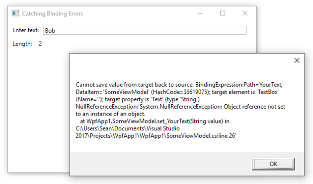
One interesting thing to note is the part saying target element is ‘TextBox’ (Name=”). The name is empty because in .xaml, we didn’t name the element. You often avoid naming XAML elements in WPF because you shouldn’t need to interact with the elements in your code-behind. However, naming elements can be useful in cases like this, where the name would normally be reported.

#1,210 – Exceptions in Property Accessors Can Be Ignored in Production Code

In the same way that binding errors are quietly swallowed in production code, exceptions originating in property getters or setters invoked as a result of WPF data binding can also be quietly ignored in production code.

Assume that we bind a TextBox.Text property to a string-based property in a ViewModel, as below. Note that when the data binding engine tries to set a property value of “Bob”, we’ll get a NullReferenceException.

        private BobNotify _bobNotify;

        private string _yourText;
        public string YourText
        {
            get { return _yourText; }
            set
            {
                if (SetProp(ref _yourText, value))
                {
                    // E-mail Bob if someone types his name
                    // (but we forgot to initialize BobNotify object, so will get NullRefException here).
                    if (_yourText == "Bob")
                        _bobNotify.SendEmail(_yourText);

                    RaisePropertyChanged("TextLength");
                }
            }
        }

        public int TextLength
        {
            get
            {
                return string.IsNullOrWhiteSpace(_yourText) ? 0 : _yourText.Length;
            }
        }

If we include this code in a release build and do nothing special to listen for binding errors, the exception will be quietly swallowed. The only hint that something went wrong is that the TextBlock that we bind TextLength to doesn’t get updated once we type the second “b” in “Bob”.

We can handle these sorts of errors in the same way that we did for other types of binding errors, by adding a binding error trace listener.