#1,201 – How to Share Star Sized Column Sizes

You can use the SharedSizeGroup attribute to share column sizes across different grids. You can’t normally share sizes of star-sized columns across multiple grids, however, since star sizing works only in the context of the current grid.

Below is an example of how to get a star sized column to be the same size as a star sized column in a different grid. In the example, we have two grids. In the first, we have two auto-sized TextBlocks and then a star-sized TextBox that takes up the remaining space. In the second grid, we have just a TextBlock and a TextBox, but we want the TextBox to be the same size as the one in the first grid. Using SharedSizeGroup on the TextBox columns won’t work, since the columns would then get auto-sized.

The solution is to set up a SharedSizeGroup on every column except for the TextBox columns and to add a dummy third column in the second grid. The TextBox columns will then each independently use star sizing and end up the same size.

    <StackPanel Margin="15" Grid.IsSharedSizeScope="True">
        <Grid>
            <Grid.ColumnDefinitions>
                <ColumnDefinition Width="Auto" SharedSizeGroup="A"/>
                <ColumnDefinition Width="*"/>
                <ColumnDefinition Width="Auto" SharedSizeGroup="B"/>
            </Grid.ColumnDefinitions>

            <TextBlock Grid.Column="0" Text="Col 1"/>
            <TextBox Grid.Column="1" />
            <TextBlock Grid.Column="2" Text="3rd column here"/>
        </Grid>

        <Separator Margin="0,20"/>

        <Grid>
            <Grid.ColumnDefinitions>
                <ColumnDefinition Width="Auto" SharedSizeGroup="A"/>
                <ColumnDefinition />
                <ColumnDefinition SharedSizeGroup="B"/>
            </Grid.ColumnDefinitions>

            <TextBlock Grid.Column="0" Text="1"/>
            <TextBox Grid.Column="1"/>
        </Grid>
    </StackPanel>

1201

#1,197 – Autosizing in a Grid with Maximum Size

You can use autosizing for grid rows or columns to have the row or column automatically size to fit its contents. There are times, however, when you want the row or column to fit its contents, but only up to a limit. E.g. Autosize a row height, but only to a maximum of 20% of the size of the entire grid.

You can autosize within limits by using the MaxHeight attribute and a value converter.

Below, we have a grid with two rows, each containing a ListBox. The second row is set to autosize and the first to use all remaining space.

<Window.Resources>
    <ResourceDictionary>
        <local:MaxHeightConverter x:Key="MaxHeightConverter"/>
        <sys:Double x:Key="adjMaxHeightRatio">0.2</sys:Double>
    </ResourceDictionary>
</Window.Resources>

<Grid x:Name="grdRoot">
    <Grid.RowDefinitions>
        <RowDefinition Height="*"/>
        <RowDefinition Height="Auto"/>
    </Grid.RowDefinitions>

    <ListBox Grid.Row="0" ItemsSource="{Binding Dogs}" />

    <ListBox Grid.Row="1" ItemsSource="{Binding MoreDogs}" MaxHeight="{Binding ElementName=grdRoot, Path=ActualHeight, Converter={StaticResource MaxHeightConverter}, ConverterParameter={StaticResource adjMaxHeightRatio}}" />
</Grid>

The second ListBox will take as much room as it needs (grow to fit all elements), until it reaches 20% of the height of the parent grid. At that point, it will be constrained and get a vertical scrollbar.

Here’s the code for the converter:

public class MaxHeightConverter : IValueConverter
{
    public object Convert(object value, Type targetType, object parameter, CultureInfo culture)
    {
        double pctHeight = (double)parameter;

        if ((pctHeight <= 0.0) || (pctHeight > 100.0))
            throw new Exception("MaxHeightConverter expects parameter in the range (0,100]");

        return ((double)value * pctHeight);
    }

    public object ConvertBack(object value, Type targetType, object parameter, CultureInfo culture)
    {
        throw new NotImplementedException();
    }
}

#1,176 – Custom Panel, part VIII (Treemap-like Visualization)

Here’s one more example of a custom panel.  The code below is for a panel that arranges its children in a very simple treemap sort of structure.  (This implementation isn’t really a treemap, but vaguely similar to what has been described in the literature).

The panel defines a Weight attached property that the child elements use to indicate a relative weight.  The panel then sorts the children based on weight and arranges them such their final area is proportional to their weight.

    public class ChildAndRect
    {
        public UIElement Element { get; set; }
        public Rect Rectangle { get; set; }
    }

    public class WeightedPanel : Panel
    {
        private static FrameworkPropertyMetadata weightMetadata =
            new FrameworkPropertyMetadata(1.0,
                FrameworkPropertyMetadataOptions.AffectsParentArrange);

        public static readonly DependencyProperty WeightProperty =
            DependencyProperty.RegisterAttached("Weight", typeof(double),
                typeof(WeightedPanel), weightMetadata);

        public static void SetWeight(DependencyObject depObj, double value)
        {
            depObj.SetValue(WeightProperty, value);
        }

        // Measure phase
        protected override Size MeasureOverride(Size availableSize)
        {
            double totalWeight = totalChildWeight();

            foreach (ChildAndRect child in ChildrenTreemapOrder(InternalChildren.Cast<UIElement>(), availableSize))
                child.Element.Measure(child.Rectangle.Size);

            return availableSize;
        }

        // Arrange phase
        protected override Size ArrangeOverride(Size finalSize)
        {
            foreach (ChildAndRect child in ChildrenTreemapOrder(InternalChildren.Cast<UIElement>(), finalSize))
                child.Element.Arrange(child.Rectangle);

            return finalSize;
        }

        private double totalChildWeight()
        {
            double weightSum = 0;
            foreach (UIElement elem in InternalChildren)
                weightSum += (double)elem.GetValue(WeightProperty);

            return weightSum;
        }

        /// <summary>
        /// Return child elements orderd by weight (largest to
        /// smallest), passing back Rect for each child
        /// (size and location), implementing a (crude)
        /// treemap.
        /// </summary>
        /// <param name="elems">Child elements to measure/arrange</param>
        /// <param name="containerSize">Available container size</param>
        /// <returns></returns>
        private IEnumerable<ChildAndRect> ChildrenTreemapOrder(IEnumerable<UIElement> elems, Size containerSize)
        {
            double remainingWeight = totalChildWeight();

            double top = 0.0;
            double left = 0.0;

            // Alternate between left edge and top edge
            bool leftEdge;

            // Sort by weight
            var childrenByWeight = elems.OrderByDescending(
                e => (double)e.GetValue(WeightProperty));

            // Allocate space for each child, one at a time.
            // Moving left to right, top to bottom
            foreach (var child in childrenByWeight)
            {
                leftEdge = (containerSize.Width - left) > (containerSize.Height - top);

                Size size;

                double childWeight = (double)child.GetValue(WeightProperty);
                double pctArea =  childWeight / remainingWeight;
                remainingWeight -= childWeight;

                // Entire height, proportionate width
                if (leftEdge)
                    size = new Size(pctArea * (containerSize.Width - left), containerSize.Height - top);

                // Top edge - Entire width, proportionate height
                else
                    size = new Size(containerSize.Width - left, pctArea * (containerSize.Height - top));

                yield return new ChildAndRect { Element = child, Rectangle = new Rect(new Point(left, top), size) };

                if (leftEdge)
                    left += size.Width;
                else
                    top += size.Height;
            }
        }
    }

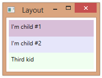
Below, we use the panel to create labels representing several states. The Weight property is used to record the states’ area.  (The states are in no particular order).

    <loc:WeightedPanel>
        <Label Content="Oregon" loc:WeightedPanel.Weight="93381"
               Background="Bisque" />
        <Label Content="California" loc:WeightedPanel.Weight="163696"
               Background="Lavender" />
        <Label Content="Colorado" loc:WeightedPanel.Weight="104094"
               Background="LightCoral" />
        <Label Content="Montana" loc:WeightedPanel.Weight="147042"
               Background="Honeydew" />
        <Label Content="Nevada" loc:WeightedPanel.Weight="110561"
               Background="Goldenrod" />
        <Label Content="New Mexico" loc:WeightedPanel.Weight="121589"
               Background="Silver" />
        <Label Content="Texas" loc:WeightedPanel.Weight="268581"
               Background="Thistle" />
        <Label Content="Arizona" loc:WeightedPanel.Weight="113998"
               Background="GhostWhite" />
    </loc:WeightedPanel>

Here’s what this looks like at run-time:
1176-001
Note: One improvement that could be made to this algorithm is to adopt a true implementation of a treemap algorithm that includes “squarifying” elements to reduce the number of “long skinny” child objects.

#1,175 – Custom Panel, part VII (Using Attached Property to Arrange)

Here’s an example of a custom panel that uses an attached property (weight) in determining both size and position of child elements.

    public class WeightedPanel : Panel
    {
        private static FrameworkPropertyMetadata weightMetadata =
            new FrameworkPropertyMetadata(1.0,
                FrameworkPropertyMetadataOptions.AffectsParentArrange);

        public static readonly DependencyProperty WeightProperty =
            DependencyProperty.RegisterAttached("Weight", typeof(double),
                typeof(WeightedPanel), weightMetadata);

        public static void SetWeight(DependencyObject depObj, double value)
        {
            depObj.SetValue(WeightProperty, value);
        }

        protected override Size MeasureOverride(Size availableSize)
        {
            double totalWeight = totalChildWeight();

            foreach (UIElement elem in InternalChildren)
            {
                double childWeight = (double)elem.GetValue(WeightProperty);
                double childHeight = (childWeight / totalWeight) * availableSize.Height;
                elem.Measure(new Size(availableSize.Width, childHeight));
            }

            return availableSize;
        }

        protected override Size ArrangeOverride(Size finalSize)
        {
            double totalWeight = totalChildWeight();
            double top = 0.0;

            foreach (UIElement elem in InternalChildren)
            {
                double childWeight = (double)elem.GetValue(WeightProperty);
                double childHeight = (childWeight / totalWeight) * finalSize.Height;
                Rect r = new Rect(new Point(0.0, top),
                                  new Size(elem.DesiredSize.Width, childHeight));

                elem.Arrange(r);

                top += childHeight;
            }

            return finalSize;
        }

        private double totalChildWeight()
        {
            double weightSum = 0;
            foreach (UIElement elem in InternalChildren)
                weightSum += (double)elem.GetValue(WeightProperty);

            return weightSum;
        }
    }

Below, we use this panel, specifying that 2nd label is 2x bigger (more weight) than the first label.

    <loc:WeightedPanel>
        <Label Content="I'm child #1" loc:WeightedPanel.Weight="1"
               Background="Thistle" />
        <Label Content="I'm child #2" loc:WeightedPanel.Weight="2"
               Background="Lavender" />
        <!-- Weight defaults to 1 -->
        <Label Content="Third kid"
               Background="Honeydew" />
    </loc:WeightedPanel>

1175-001

#1,174 – Custom Panel, part VI (Attached Properties)

You can define an attached dependency property in a custom panel.  The attached property can be used by child elements of the panel and in a way that affects how the child elements are laid out.  In the example below, we define a boolean SecondColumn property.  If set, this property indicates that a child element should appear in a second column.

    public class TwoColPanel : Panel
    {
        private static FrameworkPropertyMetadata secColMetadata =
            new FrameworkPropertyMetadata(false,
                FrameworkPropertyMetadataOptions.AffectsParentArrange);

        public static readonly DependencyProperty SecondColumnProperty =
            DependencyProperty.RegisterAttached("SecondColumn", typeof(bool),
                typeof(TwoColPanel), secColMetadata);

        public static void SetSecondColumn(DependencyObject depObj, bool value)
        {
            depObj.SetValue(SecondColumnProperty, value);
        }

        protected override Size MeasureOverride(Size availableSize)
        {
            foreach (UIElement elem in InternalChildren)
                elem.Measure(availableSize);

            return availableSize;
        }

        protected override Size ArrangeOverride(Size finalSize)
        {
            double topCol1 = 0.0;
            double topCol2 = 0.0;

            for (int i = 0; i < InternalChildren.Count; i++)
            {
                bool col2 = (bool)InternalChildren[i].GetValue(SecondColumnProperty);

                double left = col2 ? (finalSize.Width / 2.0) : 0.0;
                double top = col2 ? topCol2 : topCol1;

                Rect r = new Rect(new Point(left, top),
                                  InternalChildren[i].DesiredSize);

                InternalChildren[i].Arrange(r);

                if (col2)
                    topCol2 += InternalChildren[i].DesiredSize.Height;
                else
                    topCol1 += InternalChildren[i].DesiredSize.Height;
            }

            return finalSize;
        }
    }

We use the attached property as follows:

    <loc:TwoColPanel Margin="5">
        <Label Content="I'm child #1" loc:TwoColPanel.SecondColumn="True"
               Background="Thistle" />
        <Label Content="I'm child #2" loc:TwoColPanel.SecondColumn="False"
               Background="Lavender" />
        <Label Content="Third kid"
               Background="Honeydew" />
    </loc:TwoColPanel>

1174-001

#1,173 – Custom Panel, part V (Two Columns)

Below is another example of a custom panel.  This panel arranges its children into two columns, flowing to the next row after both columns are filled.  It also gives each child element a uniform amount of space, based on the total size of the containing panel.

    public class TwoColUniformPanel : Panel
    {
        protected override Size MeasureOverride(Size availableSize)
        {
            Size childSize = CalcUniformChildSize(availableSize);

            foreach (UIElement elem in InternalChildren)
                elem.Measure(childSize);

            return availableSize;
        }

        protected override Size ArrangeOverride(Size finalSize)
        {
            // All children are the same size
            Size childSize = CalcUniformChildSize(finalSize);

            double top = 0.0;
            double left = 0.0;

            for (int i = 0; i < InternalChildren.Count; i++)
            {
                Rect r = new Rect(new Point(left, top), childSize);

                InternalChildren[i].Arrange(r);

                // Next row
                if (left > 0.0)
                    top += childSize.Height;

                // Alternate column
                left = (left > 0.0) ? 0.0 : (finalSize.Width / 2.0);
            }

            return finalSize;
        }

        private Size CalcUniformChildSize(Size availSize)
        {
            int numRows = (int)Math.Ceiling(InternalChildren.Count / 2.0);
            return new Size(availSize.Width / 2.0,
                            availSize.Height / numRows);
        }
    }

We can use the panel as follows:

    <loc:TwoColUniformPanel Margin="5">
        <Label Content="I'm child #1" VerticalAlignment="Center"
               Background="Thistle" />
        <Label Content="I'm child #2"
               Background="Lavender" />
        <Label Content="Third kid"
               Background="Honeydew" />
    </loc:TwoColUniformPanel>

Below are some images showing the result, as we resize the panel. Note that the first label stays vertically aligned in the center of the area allotted for it, rather than stretching to fill the area like the other labels.

1173-001

1173-002

1173-003

#1,172 – Custom Panel, part IV (ZIndex)

By default, a Panel control will respect its children elements’ Panel.ZIndex values when doing layout.  In the custom panel below, we overlap child elements during the arrange phase.

    public class MyPanel : Panel
    {
        protected override Size MeasureOverride(Size availableSize)
        {
            Size childSize = new Size(availableSize.Width, double.PositiveInfinity);

            foreach (UIElement elem in InternalChildren)
                elem.Measure(childSize);

            return availableSize;
        }

        protected override Size ArrangeOverride(Size finalSize)
        {
            Size childSize;

            double top = 0.0;
            for (int i = 0; i < InternalChildren.Count; i++)
            {
                childSize = new Size(finalSize.Width, InternalChildren[i].DesiredSize.Height);
                Rect r = new Rect(new Point(0.0, top), childSize);
                InternalChildren[i].Arrange(r);
                top += childSize.Height * 0.5;
            }

            return finalSize;
        }
    }

If we don’t specify ZIndex values, each child layers on top of the previous child.
1172-001
We can reverse the order by specifying explicit ZIndex values:

    <loc:MyPanel Margin="5" Background="LightGray">
        <Label Content="I'm child #1" Panel.ZIndex="3"
               Background="Thistle" />
        <Label Content="I'm child #2" Panel.ZIndex="2"
               Background="Lavender" />
        <Label Content="Third kid"  Panel.ZIndex="1"
               Background="Honeydew" />
    </loc:MyPanel>

1172-002

#1,171 – Custom Panel, part III (Using DesiredSize)

When creating a custom panel and overriding the measure and arrange methods, your custom panel can make use of a child element’s DesiredSize property when deciding what size to make each child and where to arrange them.

The code below arranges child elements vertically, like a vertical StackPanel, stretching each child to fit the panel’s full width, but using each child element’s DesiredSize.Height.

    public class MyPanel : Panel
    {
        protected override Size MeasureOverride(Size availableSize)
        {
            // Tell child they have as much height as they want
            Size childSize = new Size(availableSize.Width, double.PositiveInfinity);

            // Calling Measure causes each child to set its DesiredSize property
            foreach (UIElement elem in InternalChildren)
                elem.Measure(childSize);

            return availableSize;
        }

        protected override Size ArrangeOverride(Size finalSize)
        {
            Size childSize;

            double top = 0.0;
            for (int i = 0; i < InternalChildren.Count; i++)
            {
                // We force each child to full width, but let it
                // be at desired height
                childSize = new Size(finalSize.Width, InternalChildren[i].DesiredSize.Height);
                Rect r = new Rect(new Point(0.0, top), childSize);
                InternalChildren[i].Arrange(r);
                top += childSize.Height;
            }

            return finalSize;
        }
    }

We can use the panel as follows:

    <loc:MyPanel Margin="5" Background="LightGray">
        <Label Content="I'm child #1"
               Background="Thistle" />
        <Label Content="I'm child #2"
               Background="Lavender" />
        <Label Content="Third kid"
               Background="Honeydew" />
    </loc:MyPanel>

The panel at runtime looks like:
1171-001

#1,170 – Custom Panel, part II (Simple Arrangement of Child Elements)

You create a class that derives from Panel in order to create a panel control with custom behavior.  Below, we expand on the earlier example to create a simple panel that stacks its child elements vertically, stretching them to fit the available space.

Here’s what happens:

  • In the Measure phase, we tell each element how big it should be, dividing the vertical space by the # child elements
  • In the Arrange phase, we position the elements
    public class MyPanel : Panel
    {
        protected override Size MeasureOverride(Size availableSize)
        {
            Size childSize = new Size(availableSize.Width, availableSize.Height / InternalChildren.Count);

            foreach (UIElement elem in InternalChildren)
                elem.Measure(childSize);

            return availableSize;
        }

        protected override Size ArrangeOverride(Size finalSize)
        {
            double childHeight = finalSize.Height / InternalChildren.Count;
            Size childSize = new Size(finalSize.Width, childHeight);

            double top = 0.0;
            for (int i = 0; i < InternalChildren.Count; i++)
            {
                Rect r = new Rect(new Point(0.0, top), childSize);
                InternalChildren[i].Arrange(r);
                top += childHeight;
            }

            return finalSize;
        }
    }

1170-001

#1,169 – Custom Panel, part I (Measure and Arrange)

You can create a class that derives from Panel in order to create a panel control with custom behavior.  You typically override the following two methods in your custom panel:

  • MeasureOverride – You call Measure method on each child element to determine how much space they need, then return the total space needed
  • ArrangeOverride – You call Arrange method for each child element to position them

Below is a very simple example–a panel that does nothing in either its MeasureOverride or ArrangeOverride methods.  We’ll build on this class in future posts.

    public class MyPanel : Panel
    {
        protected override Size MeasureOverride(Size availableSize)
        {
            Size measuredSize = base.MeasureOverride(availableSize);
            return measuredSize;
        }

        protected override Size ArrangeOverride(Size finalSize)
        {
            Size arrangedSize = base.ArrangeOverride(finalSize);
            return arrangedSize;
        }
    }

If we add children to this panel, they will not be displayed. Below is debug output at run-time. MeasureOverride returns (0,0) because we haven’t calculated any sizes.
1169-001