#1,194 – DesiredSize of Child Elements Includes Margins

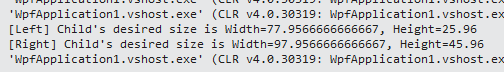
After the measure phase, during which a custom element calls the Measure method on each of its child elements, each child element will set its DesiredSize property to indicate how much space it wants.

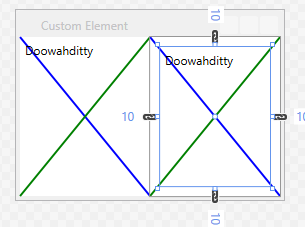
The DesiredSize of a child element accounts for any margins that have been set on that child.  Assume that we have the following XAML (MyElement is a custom element with a single child).

    <Grid>
        <Grid.ColumnDefinitions>
            <ColumnDefinition/>
            <ColumnDefinition/>
        </Grid.ColumnDefinitions>

        <loc:MyElement x:Name="Left">
            <loc:MyElement.Child>
                <Label Content="Doowahditty"/>
            </loc:MyElement.Child>
        </loc:MyElement>

        <loc:MyElement Grid.Column="1" x:Name="Right">
            <loc:MyElement.Child>
                <Label Content="Doowahditty" Margin="10"/>
            </loc:MyElement.Child>
        </loc:MyElement>
    </Grid>

We can see that the child element uses a margin.
1194-001

We can look at the value of the DesiredSize property after Measure has been called on the child element.  We can see that in the second case, the desired size is larger, indicating that the child wants to add a margin.

1194-002


#1,193 – MeasureOverride and Margins

During the measure phase, the MeasureOverride method is called on an element, indicating the size available to the control.  If a Margin has been set on the control, the available size passed in to MeasureOverride will have already been adjusted for that margin.

Below, we include two instances of MyElement in a Grid, setting a margin of 15 on the second element.

    <Grid>
        <Grid.ColumnDefinitions>
            <ColumnDefinition/>
            <ColumnDefinition/>
        </Grid.ColumnDefinitions>

        <loc:MyElement/>
        <loc:MyElement Grid.Column="1" Margin="15"/>
    </Grid>

At run-time, we see that the second element is smaller.
1193-001
If we instrument MyElement to report the value of the Size parameter that is passed to it, we see that MeasureOverride gets a smaller size passed in for the second instance.  The Size has been adjusted for a uniform margin of 15, subtracting 30 from both the width and the height.  (We see the same values passed in to ArrangeOverride).

1193-002


#1,175 – Custom Panel, part VII (Using Attached Property to Arrange)

Here’s an example of a custom panel that uses an attached property (weight) in determining both size and position of child elements.

    public class WeightedPanel : Panel
    {
        private static FrameworkPropertyMetadata weightMetadata =
            new FrameworkPropertyMetadata(1.0,
                FrameworkPropertyMetadataOptions.AffectsParentArrange);

        public static readonly DependencyProperty WeightProperty =
            DependencyProperty.RegisterAttached("Weight", typeof(double),
                typeof(WeightedPanel), weightMetadata);

        public static void SetWeight(DependencyObject depObj, double value)
        {
            depObj.SetValue(WeightProperty, value);
        }

        protected override Size MeasureOverride(Size availableSize)
        {
            double totalWeight = totalChildWeight();

            foreach (UIElement elem in InternalChildren)
            {
                double childWeight = (double)elem.GetValue(WeightProperty);
                double childHeight = (childWeight / totalWeight) * availableSize.Height;
                elem.Measure(new Size(availableSize.Width, childHeight));
            }

            return availableSize;
        }

        protected override Size ArrangeOverride(Size finalSize)
        {
            double totalWeight = totalChildWeight();
            double top = 0.0;

            foreach (UIElement elem in InternalChildren)
            {
                double childWeight = (double)elem.GetValue(WeightProperty);
                double childHeight = (childWeight / totalWeight) * finalSize.Height;
                Rect r = new Rect(new Point(0.0, top),
                                  new Size(elem.DesiredSize.Width, childHeight));

                elem.Arrange(r);

                top += childHeight;
            }

            return finalSize;
        }

        private double totalChildWeight()
        {
            double weightSum = 0;
            foreach (UIElement elem in InternalChildren)
                weightSum += (double)elem.GetValue(WeightProperty);

            return weightSum;
        }
    }

Below, we use this panel, specifying that 2nd label is 2x bigger (more weight) than the first label.

    <loc:WeightedPanel>
        <Label Content="I'm child #1" loc:WeightedPanel.Weight="1"
               Background="Thistle" />
        <Label Content="I'm child #2" loc:WeightedPanel.Weight="2"
               Background="Lavender" />
        <!-- Weight defaults to 1 -->
        <Label Content="Third kid"
               Background="Honeydew" />
    </loc:WeightedPanel>

1175-001

#1,173 – Custom Panel, part V (Two Columns)

Below is another example of a custom panel.  This panel arranges its children into two columns, flowing to the next row after both columns are filled.  It also gives each child element a uniform amount of space, based on the total size of the containing panel.

    public class TwoColUniformPanel : Panel
    {
        protected override Size MeasureOverride(Size availableSize)
        {
            Size childSize = CalcUniformChildSize(availableSize);

            foreach (UIElement elem in InternalChildren)
                elem.Measure(childSize);

            return availableSize;
        }

        protected override Size ArrangeOverride(Size finalSize)
        {
            // All children are the same size
            Size childSize = CalcUniformChildSize(finalSize);

            double top = 0.0;
            double left = 0.0;

            for (int i = 0; i < InternalChildren.Count; i++)
            {
                Rect r = new Rect(new Point(left, top), childSize);

                InternalChildren[i].Arrange(r);

                // Next row
                if (left > 0.0)
                    top += childSize.Height;

                // Alternate column
                left = (left > 0.0) ? 0.0 : (finalSize.Width / 2.0);
            }

            return finalSize;
        }

        private Size CalcUniformChildSize(Size availSize)
        {
            int numRows = (int)Math.Ceiling(InternalChildren.Count / 2.0);
            return new Size(availSize.Width / 2.0,
                            availSize.Height / numRows);
        }
    }

We can use the panel as follows:

    <loc:TwoColUniformPanel Margin="5">
        <Label Content="I'm child #1" VerticalAlignment="Center"
               Background="Thistle" />
        <Label Content="I'm child #2"
               Background="Lavender" />
        <Label Content="Third kid"
               Background="Honeydew" />
    </loc:TwoColUniformPanel>

Below are some images showing the result, as we resize the panel. Note that the first label stays vertically aligned in the center of the area allotted for it, rather than stretching to fill the area like the other labels.

1173-001

1173-002

1173-003

#1,171 – Custom Panel, part III (Using DesiredSize)

When creating a custom panel and overriding the measure and arrange methods, your custom panel can make use of a child element’s DesiredSize property when deciding what size to make each child and where to arrange them.

The code below arranges child elements vertically, like a vertical StackPanel, stretching each child to fit the panel’s full width, but using each child element’s DesiredSize.Height.

    public class MyPanel : Panel
    {
        protected override Size MeasureOverride(Size availableSize)
        {
            // Tell child they have as much height as they want
            Size childSize = new Size(availableSize.Width, double.PositiveInfinity);

            // Calling Measure causes each child to set its DesiredSize property
            foreach (UIElement elem in InternalChildren)
                elem.Measure(childSize);

            return availableSize;
        }

        protected override Size ArrangeOverride(Size finalSize)
        {
            Size childSize;

            double top = 0.0;
            for (int i = 0; i < InternalChildren.Count; i++)
            {
                // We force each child to full width, but let it
                // be at desired height
                childSize = new Size(finalSize.Width, InternalChildren[i].DesiredSize.Height);
                Rect r = new Rect(new Point(0.0, top), childSize);
                InternalChildren[i].Arrange(r);
                top += childSize.Height;
            }

            return finalSize;
        }
    }

We can use the panel as follows:

    <loc:MyPanel Margin="5" Background="LightGray">
        <Label Content="I'm child #1"
               Background="Thistle" />
        <Label Content="I'm child #2"
               Background="Lavender" />
        <Label Content="Third kid"
               Background="Honeydew" />
    </loc:MyPanel>

The panel at runtime looks like:
1171-001

#1,169 – Custom Panel, part I (Measure and Arrange)

You can create a class that derives from Panel in order to create a panel control with custom behavior.  You typically override the following two methods in your custom panel:

  • MeasureOverride – You call Measure method on each child element to determine how much space they need, then return the total space needed
  • ArrangeOverride – You call Arrange method for each child element to position them

Below is a very simple example–a panel that does nothing in either its MeasureOverride or ArrangeOverride methods.  We’ll build on this class in future posts.

    public class MyPanel : Panel
    {
        protected override Size MeasureOverride(Size availableSize)
        {
            Size measuredSize = base.MeasureOverride(availableSize);
            return measuredSize;
        }

        protected override Size ArrangeOverride(Size finalSize)
        {
            Size arrangedSize = base.ArrangeOverride(finalSize);
            return arrangedSize;
        }
    }

If we add children to this panel, they will not be displayed. Below is debug output at run-time. MeasureOverride returns (0,0) because we haven’t calculated any sizes.
1169-001

#1,168 – Layout in Action, part V

When a panel is laying out its children, it will respect (make use of) an explicit size specified for a child control.

In the example below, the MyLabel control specifies a width of 100.  This makes it wider than it would normally be to fit its content.

    <StackPanel Margin="5" Background="Honeydew">
        <loc:MyLabel Content="Billy" HorizontalAlignment="Center" Width="100"
                     Background="Thistle" />
    </StackPanel>

1168-001
At run-time, the measure/arrange process is:

  • StackPanel reads the label’s desired width of 100, using this value as the “constrained” width (target width)
  • StackPanel calls Measure on the label, with constrained width of 100 and height of Infinity
  • Label returns a size from MeasureOverride with width and height equal to what’s required for its content (31.4 wide x 26 high)
  • StackPanel calls Arrange on MyLabel, passing in a size that includes the explicit width (100 x 26)

1168-002

#1,167 – Layout in Action, part IV

The previous example showed how layout works when a child element needs less space than what it is available.  Below, we walk through the case when the child needs more space than what’s available.

Assume that we have a Label with more content than will fit into a containing StackPanel (which sizes to fit a containing window).  At run-time, the measure/arrange process is:

  • StackPanel calls Measure on the label, passing in its own width as a constraint width and infinity as a constraint height.
  • Label can’t fit into specified constraint width, so it returns a size from MeasureOverride with width equal to constraint width (it takes what it can get) and height to fit its desired height
  • StackPanel gives the label this requested height and width
  • StackPanel calls Arrange on MyLabel, which uses specified size to render label

1167-001

1167-002

#1,162 – Layout in Action, part I

Layout in WPF dictates how layout panels (containers) arrange their child elements.  Layout consists of two phases:

  • Measure – Container asks each child what its desired size is
    • Container calls Measure on each child element
    • In MeasureOverride, child element determines how much size it wants (typically by calling Measure on each of its own child elements)
    • Child element returns its desired size, to fit its child elements
  • Arrange – Container figures out how to arrange its children and decides on final position and size of each child
    • Container calls Arrange on each child element, passing in a size
    • In ArrangeOverride, child element is told how big it should be
    • Child element in turn tells each of its visual children how big they are going to be, by calling their Arrange methods
    • Child element returns final total arranged size to container