#1,051 – How the GridSplitter Behaves when Cells Use Auto Sizing

If one or both columns on either size of a GridSplitter (in its own column) have a width set to Auto, the behavior is as follows (“proportional” refers to star sizing):

  • Both columns set to Auto: Left column changes size and is switched to Absolute sizing
  • Left column Auto, right column proportional: Both columns change size, left switches to Absolute, right remains at original proportion (e.g. “1*”)
  • Right column Auto, left column proportional: Both columns change size, right switches to Absolute, left remains at original proportion

In the example below, columns 0 and 2 surround a GridSplitter in column 1.  Columns 0 and 2 are set to Auto size (as is the column with the GridSplitter) and column 3 is set to proportional.

Initially, we see that both columns 0 and 2 are auto-sized.
1051-001

If we slide the GridSplitter to the right, column 0 changes size and switches to Absolute sizing.  Column 2 remains as Auto.

1051-002

#1,049 – How the GridSplitter Behaves when Cells Use Star Sizing

Recall that a GridSplitter in its own column and with its HorizontalAlignment set to Center will resize columns on either side of it.  In the example below, columns 0 and 2 are resized, but the width of column 3 is not changed.

1049-001

1049-002

If all of the content columns are sized using star sizing, the GridSplitter will leave them as star sized, but change the coefficients to match the final size after moving the GridSplitter.  We can see this by dumping out the column widths before and after our sizing operation.

Before resizing, columns 0, 2 and 3 are all “1*” (or just “*”).  They take up equal space.

1049-003

After resizing, the coefficients change.  Columns are still proportionally sized, but the proportions are different.

1049-004

We can verify that the columns are sized proportionally by resizing the entire Grid (containing window).  The columns retain their post-GridSplitter relative sizes.

1049-005

#1,048 – How to Set a GridSplitter’s Alignment Properties

The most common way to use a GridSplitter is to place it in its own auto-sized row or column.  In the example below, we want a vertical GridSplitter, so we place it in its own auto-sized column.

        <Grid Name="myGrid">
            <Grid.RowDefinitions>
                <RowDefinition/>
                <RowDefinition/>
            </Grid.RowDefinitions>
            <Grid.ColumnDefinitions>
                <ColumnDefinition />
                <ColumnDefinition Width="Auto"/>
                <ColumnDefinition />
                <ColumnDefinition />
            </Grid.ColumnDefinitions>

            <Label Content="Row 0 Col 0" Background="Azure" Grid.Row="0" Grid.Column="0" />
            <!-- more here -->

            <GridSplitter Grid.Column="1" Grid.RowSpan="2" Width="3" Background="Blue"
                      VerticalAlignment="Stretch" HorizontalAlignment="Center" />
        </Grid>

When a vertical GridSplitter is in its own column, you’ll want to set its VerticalAlignment to Stretch and its HorizontalAlignment to Center.  (A horizontal GridSplitter would reverse this).

With the HorizontalAlignment set to Center, the column containing the GridSplitter does not itself resize.  Moving the GridSplitter resizes the two columns on either side of it, which is what we want.

1048-001

1048-002

1048-003

#466 – Using a GridSplitter in Conjunction with a SharedSizeGroup

A GridSplitter allows a user to change the size of a row or column by dragging a visual splitter.  A SharedSizeGroup allows two rows or columns to automatically have the same size.  You can combine these concepts, allowing a user to change the size of one column and have another column automatically have the same size.

In the example below, the user can drag either splitter, but when dragging, the width of both left and right columns changes at the same time.

    <Grid Grid.IsSharedSizeScope="True">
        <Grid.ColumnDefinitions>
            <ColumnDefinition SharedSizeGroup="A" Width="Auto"/>
            <ColumnDefinition Width="Auto"/>
            <ColumnDefinition/>
            <ColumnDefinition Width="Auto"/>
            <ColumnDefinition SharedSizeGroup="A" Width="Auto"/>
        </Grid.ColumnDefinitions>

        <Label Content="Left" Background="Azure" Grid.Column="0"/>
        <Label Content="Middle" Background="Lavender" Grid.Column="2"/>
        <Label Content="Right" Background="Moccasin" Grid.Column="4"/>

        <GridSplitter Grid.Column="1" Width="8" Background="DarkSlateBlue"
                        HorizontalAlignment="Center" VerticalAlignment="Stretch"/>
        <GridSplitter Grid.Column="3" Width="8" Background="DarkSlateBlue"
                        HorizontalAlignment="Center" VerticalAlignment="Stretch"/>
    </Grid>

Window at startup:

User drags left splitter, which makes both left and right columns wider.

User drags right splitter and columns also resize together.

#465 – Using GridSplitters with Nested Grids

You can use GridSplitter elements in any Grid, including a Grid that’s nested inside another Grid.  This allows you to have GridSplitters that split elements within just a portion of the screen, as shown below.

In this example, the main grid has a vertical splitter between left and right sub-grids, each of which has a horizontal splitter between top and bottom panels.

    <Grid>
        <Grid.ColumnDefinitions>
            <ColumnDefinition/>
            <ColumnDefinition Width="Auto"/>
            <ColumnDefinition/>
        </Grid.ColumnDefinitions>

        <!-- Sub-grid on left -->
        <Grid Grid.Column="0">
            <Grid.RowDefinitions>
                <RowDefinition/>
                <RowDefinition Height="Auto"/>
                <RowDefinition/>
            </Grid.RowDefinitions>

            <Label Content="Left, Row 0" Background="Azure" Grid.Row="0"/>
            <Label Content="Left, Row 2" Background="Lavender" Grid.Row="2"/>
            <GridSplitter Grid.Row="1" Height="8" Background="DarkSlateBlue"
                          HorizontalAlignment="Stretch" VerticalAlignment="Center"/>
        </Grid>

        <!-- Sub-grid on right -->
        <Grid Grid.Column="2">
            <Grid.RowDefinitions>
                <RowDefinition/>
                <RowDefinition Height="Auto"/>
                <RowDefinition/>
            </Grid.RowDefinitions>

            <Label Content="Right, Row 0" Background="Moccasin" Grid.Row="0"/>
            <Label Content="Right, Row 2" Background="Honeydew" Grid.Row="2"/>
            <GridSplitter Grid.Row="1" Height="8" Background="DarkSlateBlue"
                          HorizontalAlignment="Stretch" VerticalAlignment="Center"/>
        </Grid>

        <!-- Splitter between left/right sub-grids -->
        <GridSplitter Grid.Column ="1" Width="8" Background="DarkSlateBlue"
                      VerticalAlignment="Stretch" HorizontalAlignment="Center"/>
    </Grid>


#464 – ShowsPreview Property Delays Row/Column Size Change Using a GridSplitter

By default, when you use a GridSplitter, the rows or columns that are being changed as you drag the GridSplitter are changed dynamically, as you drag the GridSplitter.  There are times, however, when you only want to draw the newly sized rows or columns after you’re done dragging the GridSplitter.  You can do this by setting the ShowsPreview property to true.

With ShowsPreview set to true, you’ll only see a ghosted image of the horizontal or vertical GridSplitter as you drag it.  Then, when you release the left mouse button, the rows or columns will be rendered at the new size.

#463 – Multiple Parallel GridSplitters

You can include both a vertical and a horizontal GridSplitter in a Grid.  You can also include multiple horizontal or multiple verticial GridSplitter elements in the same Grid.

Here’s an example with two parallel horizontal GridSplitter elements.  The user can change the size of any of the three panels by clicking and dragging either of the two GridSplitters.

    <Grid>
        <Grid.RowDefinitions>
            <RowDefinition/>
            <RowDefinition Height="Auto"/>
            <RowDefinition/>
            <RowDefinition Height="Auto"/>
            <RowDefinition/>
        </Grid.RowDefinitions>
        <Grid.ColumnDefinitions>
            <ColumnDefinition/>
            <ColumnDefinition/>
        </Grid.ColumnDefinitions>

        <Label Content="Row 0 Col 0" Background="Azure" Grid.Row="0" Grid.Column="0" />
        <Label Content="Row 0 Col 1" Background="Lavender" Grid.Row="0" Grid.Column="1" />

        <GridSplitter Grid.Row="1" Grid.ColumnSpan="2" Height="6" BorderThickness="1"
                      Background="DarkBlue" BorderBrush="DarkSlateGray"
                      VerticalAlignment="Center" HorizontalAlignment="Stretch"/>

        <Label Content="Row 2 Col 0" Background="Moccasin" Grid.Row="2" Grid.Column="0" />
        <Label Content="Row 2 Col 1" Background="PowderBlue" Grid.Row="2" Grid.Column="1" />

        <GridSplitter Grid.Row="3" Grid.ColumnSpan="2" Height="6" BorderThickness="1"
                      Background="DarkBlue" BorderBrush="DarkSlateGray"
                      VerticalAlignment="Center" HorizontalAlignment="Stretch"/>

        <Label Content="Row 4 Col 0" Background="LightPink" Grid.Row="4" Grid.Column="0" />
        <Label Content="Row 4 Col 1" Background="Cornsilk" Grid.Row="4" Grid.Column="1" />
    </Grid>


#462 – Drawing a Better Looking GridSplitter

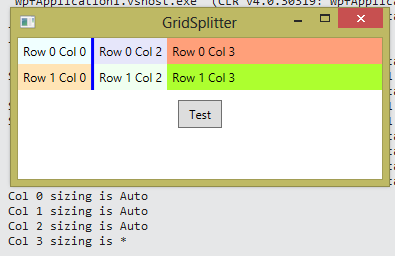
By default, a GridSplitter control is composed only of a Border element.  You can set the border’s thickness, color and background.

We can make the GridSplitter look a little nicer by drawing a couple horizontal lines on its surface.

We do this by overriding the default Style for the GridSplitter.

	<Window.Resources>
		<Style x:Key="GridSplitterPreviewStyle" >
			<Setter Property="Control.Template">
				<Setter.Value>
					<ControlTemplate>
						<Rectangle Fill="#80000000"/>
					</ControlTemplate>
				</Setter.Value>
			</Setter>
		</Style>
		<Style x:Key="GridSplitterStyle1" TargetType="{x:Type GridSplitter}">
			<Setter Property="Background"
                    Value="{DynamicResource {x:Static SystemColors.ControlBrushKey}}"/>
			<Setter Property="PreviewStyle" Value="{StaticResource GridSplitterPreviewStyle}"/>
			<Setter Property="Template">
				<Setter.Value>
					<ControlTemplate TargetType="{x:Type GridSplitter}">
						<Border BorderBrush="{TemplateBinding BorderBrush}"
                                BorderThickness="{TemplateBinding BorderThickness}"
                                Background="{TemplateBinding Background}"
                                CornerRadius="5">
                            <Canvas RenderOptions.EdgeMode="Aliased" UseLayoutRounding="True"
                                    Height="6" VerticalAlignment="Center"
                                    Width="50" HorizontalAlignment="Center">
                                <Line X1="0" X2="50" Y1="0" Y2="0"
                                      Stroke="White" StrokeThickness="1"/>
                                <Line X1="0" X2="50" Y1="1" Y2="1"
                                      Stroke="#A0A0A0" StrokeThickness="1"/>
                                <Line X1="0" X2="50" Y1="4" Y2="4"
                                      Stroke="White" StrokeThickness="1"/>
                                <Line X1="0" X2="50" Y1="5" Y2="5"
                                      Stroke="#A0A0A0" StrokeThickness="1"/>
                            </Canvas>
						</Border>
					</ControlTemplate>
				</Setter.Value>
			</Setter>
		</Style>
	</Window.Resources>

We also specify a gradient fill for the Background of the GridSplitter.

    <Grid>
        <Grid.RowDefinitions>
            <RowDefinition/>
            <RowDefinition Height="Auto"/>
            <RowDefinition/>
        </Grid.RowDefinitions>
        <Grid.ColumnDefinitions>
            <ColumnDefinition/>
            <ColumnDefinition/>
        </Grid.ColumnDefinitions>

        <Label Content="Row 0 Col 0" Background="Azure" Grid.Row="0" Grid.Column="0" />
        <Label Content="Row 0 Col 1" Background="Lavender" Grid.Row="0" Grid.Column="1" />
        <Label Content="Row 2 Col 0" Background="Moccasin" Grid.Row="2" Grid.Column="0" />
        <Label Content="Row 2 Col 1" Background="Honeydew" Grid.Row="2" Grid.Column="1" />

        <GridSplitter Grid.Row ="1" Grid.ColumnSpan="2" Height="16"
                      VerticalAlignment="Center" HorizontalAlignment="Stretch"
                      BorderBrush="White" BorderThickness="1"
					  Style="{DynamicResource GridSplitterStyle1}">
            <GridSplitter.Background>
                <LinearGradientBrush EndPoint="0.5,0" StartPoint="0.5,1">
                    <GradientStop Color="#A0A0A0" Offset="0"/>
                    <GradientStop Color="#E5E5E5" Offset="0.15"/>
                    <GradientStop Color="#ECECEC" Offset="0.8"/>
                    <GradientStop Color="#E5E5E5" Offset="1"/>
                </LinearGradientBrush>
            </GridSplitter.Background>
        </GridSplitter>
    </Grid>

#461 – Making a GridSplitter Look Three-Dimensional

You can make a GridSplitter element look like a more traditional three-dimensional element by using a Border and a gradient fill.  This will make it more obvious to the user that it is something that they can grab with the mouse.

In the XAML snippet below, the GridSplitter has a dark grey border and a gradient fill that goes from white to gray.

    <Grid>
        <Grid.RowDefinitions>
            <RowDefinition/>
            <RowDefinition Height="Auto"/>
            <RowDefinition/>
        </Grid.RowDefinitions>
        <Grid.ColumnDefinitions>
            <ColumnDefinition/>
            <ColumnDefinition/>
        </Grid.ColumnDefinitions>

        <Label Content="Row 0 Col 0" Background="Azure" Grid.Row="0" Grid.Column="0" />
        <Label Content="Row 0 Col 1" Background="Lavender" Grid.Row="0" Grid.Column="1" />
        <Label Content="Row 2 Col 0" Background="Moccasin" Grid.Row="2" Grid.Column="0" />
        <Label Content="Row 2 Col 1" Background="Honeydew" Grid.Row="2" Grid.Column="1" />

        <GridSplitter Grid.Row="1" Grid.ColumnSpan="2" Height="6" BorderThickness="1" BorderBrush="DarkSlateGray"
                      VerticalAlignment="Center" HorizontalAlignment="Stretch">
            <GridSplitter.Background>
                <LinearGradientBrush EndPoint="0.5,0" StartPoint="0.5,1">
                    <GradientStop Color="#FF808385" Offset="0"/>
                    <GradientStop Color="#FFECF1F7" Offset="1"/>
                </LinearGradientBrush>
            </GridSplitter.Background>
        </GridSplitter>

    </Grid>

#460 – A GridSplitter Can Share a Cell with Another Control

When using a GridSplitter in a Grid, you often define the Grid so that the GridSplitter is located within its own row (for a horizontal GridSplitter) or column (for a vertical GridSplitter).  However, you can also place a GridSplitter in a cell with another control.

In the example below, the horizonal GridSplitter is placed in the first row (of two rows), with two Label controls.

    <Grid>
        <Grid.RowDefinitions>
            <RowDefinition/>
            <RowDefinition/>
        </Grid.RowDefinitions>
        <Grid.ColumnDefinitions>
            <ColumnDefinition/>
            <ColumnDefinition/>
        </Grid.ColumnDefinitions>

        <Label Content="Row 0 Col 0" Background="Azure" Grid.Row="0" Grid.Column="0" />
        <Label Content="Row 0 Col 1" Background="Lavender" Grid.Row="0" Grid.Column="1" />
        <Label Content="Row 1 Col 0" Background="Moccasin" Grid.Row="1" Grid.Column="0" />
        <Label Content="Row 1 Col 1" Background="Honeydew" Grid.Row="1" Grid.Column="1" />

        <GridSplitter Grid.Row="0" Grid.ColumnSpan="2" Height="3" Background="Blue"
                      VerticalAlignment="Bottom" HorizontalAlignment="Stretch" />

    </Grid>


Note that we add the GridSplitter as the last element in the Grid, to make sure that it shows up on top of the Label that it shares a cell with.