#1,209 – Catching Data Binding Errors Part 2

In Part 1, I described how to use a TraceSource to intercept data binding errors. Below, we convert these binding errors into exceptions. You then can know that the error will get reported at runtime and you can catch and handle the exception as you like.

(Code below is inspired by WpfBindingErrors project and Jason Bock’s blog post).

Building on the code in the earlier post, we modify the WriteLine method to parse the resulting error message and build up a custom exception type.

    public class BindingErrorException : Exception
    {
        public string SourceObject { get; set; }
        public string SourceProperty { get; set; }
        public string TargetElement { get; set; }
        public string TargetProperty { get; set; }

        public BindingErrorException() 
            : base() { }

        public BindingErrorException(string message)
            : base(message) { }

    }

    public class BindingErrorTraceListener : TraceListener
    {
        private const string BindingErrorPattern = @"^BindingExpression path error(?:.+)'(.+)' property not found(?:.+)object[\s']+(.+?)'(?:.+)target element is '(.+?)'(?:.+)target property is '(.+?)'(?:.+)$";

        public override void Write(string s) { }

        public override void WriteLine(string message)
        {
            var xx = new BindingErrorException(message);

            var match = Regex.Match(message, BindingErrorPattern);
            if (match.Success)
            {
                xx.SourceObject = match.Groups[2].ToString();
                xx.SourceProperty = match.Groups[1].ToString();
                xx.TargetElement = match.Groups[3].ToString();
                xx.TargetProperty = match.Groups[4].ToString();
            }

            throw xx;
        }
    }

As before, we attach a listener at startup. We also catch unhandled binding exceptions and display a MessageBox.

    public partial class App : Application
    {
        protected override void OnStartup(StartupEventArgs e)
        {
            base.OnStartup(e);

            PresentationTraceSources.Refresh();
            PresentationTraceSources.DataBindingSource.Switch.Level = SourceLevels.Error;
            PresentationTraceSources.DataBindingSource.Listeners.Add(new BindingErrorTraceListener());

            DispatcherUnhandledException += App_DispatcherUnhandledException;
        }

        private void App_DispatcherUnhandledException(object sender, System.Windows.Threading.DispatcherUnhandledExceptionEventArgs e)
        {
            var bex = e.Exception as BindingErrorException;
            if (bex != null)
            {
                MessageBox.Show($"Binding error. {bex.SourceObject}.{bex.SourceProperty} => {bex.TargetElement}.{bex.TargetProperty}");
            }
        }
    }

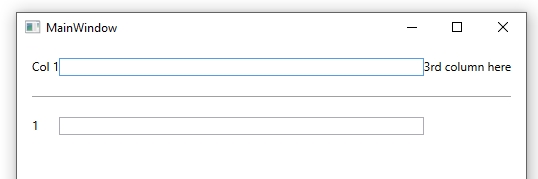
For a bad property name that leads to a binding error, we then get a nice little error.


#1,208 – Catching Data Binding Errors Part 1

In WPF, data binding errors by default are quietly swallowed, rather than throwing an exception.

Happily, there is a TraceSource that we can use to intercept all binding errors. All data binding errors will go through this trace source and we can therefore add a TraceListener to the trace source’s Listeners collection in order to intercept the error.

We start by creating a simple class deriving from TraceListener that overrides Write and WriteLine methods. These methods will be invoked when messages come from the trace source. Note that we don’t yet do anything useful with these messages, but just dump them to standard trace output (to prove to ourselves that we got them).

   public class BindingErrorTraceListener : TraceListener
    {
        public override void Write(string message)
        {
            Trace.WriteLine(string.Format("==[Write]{0}==", message));
        }

        public override void WriteLine(string message)
        {
            Trace.WriteLine(string.Format("==[WriteLine]{0}==", message));
        }
    }
}

We can now wire our listener into the standard data binding trace source. Below, we do this at application startup.


    public partial class App : Application
    {
        protected override void OnStartup(StartupEventArgs e)
        {
            base.OnStartup(e);

            PresentationTraceSources.DataBindingSource.Switch.Level = SourceLevels.Error;
            PresentationTraceSources.DataBindingSource.Listeners.Add(new BindingErrorTraceListener());
        }
    }

At this point, we’re not doing anything with the binding errors. But if you watch the output window, you’ll see that we’re now capturing them.

Next time, we’ll look at converting these errors into exceptions that you can catch.

#1,207 – Data Binding Can Fail Quietly in Production Code

By default, if there’s a problem in how you set up data binding in WPF, the user of the application will never see the binding errors. An exception occurs internally for the binding error, but the WPF application won’t crash or report the exception.

Let’s say that we have that we have an application the includes the following properties in an object that we bind to (i.e. the object that we set the DataContext of a window to). (Using SetProp from post #1,205).

        private string _yourText;
        public string YourText
        {
            get { return _yourText; }
            set
            {
                if (SetProp(ref _yourText, value))
                {
                    RaisePropertyChanged("TextLength");
                }
            }
        }

        private int _textLength;
        public int TextLength
        {
            get { return string.IsNullOrWhiteSpace(_yourText) ? 0 : _yourText.Length; }
        }

Now let’s say that we have the following XAML fragment (assume in a Window whose DataContext is set to a class containing the properties shown above).

        <TextBlock Text="Enter text:"/>
        <TextBox Grid.Column="1" Margin="10,0" Text="{Binding YourText, UpdateSourceTrigger=PropertyChanged}"/>

        <TextBlock Grid.Row="1" Margin="0,10" Text="Length:"/>
        <TextBlock Grid.Row="1" Grid.Column="1" Margin="0,10" Text="{Binding TextLenth}"/>

Note the error–we spelled the TextLength property incorrectly, so binding for this TextBlock will fail.

If we just build and run the application, we won’t get an exception and the application will run fine. It just won’t bind to TextLength.

If you run the application in the Visual Studio debugger and pay attention to the Output window, you’ll see the error reported there. But WPF swallows this error and the application runs fine.

#1,206 – Changing Color of Custom Circular Progress

A couple of earlier posts (#1,155 and #1,156) demonstrated how to create a simple custom control that displays progress in a circular fashion. A reader of the blog asked how you would change the color of the progress indicator when it got to a certain value. The example below shows how to do that.

Below is the code for the indicator itself. This matches post #1,156 except that we’ve removed the static constructor that overrides the stroke and fill color of the indicator.

    public class CircularProgress : Shape
    {
        // Value (0-100)
        public double Value
        {
            get { return (double)GetValue(ValueProperty); }
            set { SetValue(ValueProperty, value); }
        }

        // DependencyProperty - Value (0 - 100)
        private static FrameworkPropertyMetadata valueMetadata =
                new FrameworkPropertyMetadata(
                    0.0,     // Default value
                    FrameworkPropertyMetadataOptions.AffectsRender,
                    null,    // Property changed callback
                    new CoerceValueCallback(CoerceValue));   // Coerce value callback

        public static readonly DependencyProperty ValueProperty =
            DependencyProperty.Register("Value", typeof(double), typeof(CircularProgress), valueMetadata);

        private static object CoerceValue(DependencyObject depObj, object baseVal)
        {
            double val = (double)baseVal;
            val = Math.Min(val, 99.999);
            val = Math.Max(val, 0.0);
            return val;
        }

        protected override Geometry DefiningGeometry
        {
            get
            {
                double startAngle = 90.0;
                double endAngle = 90.0 - ((Value / 100.0) * 360.0);

                double maxWidth = Math.Max(0.0, RenderSize.Width - StrokeThickness);
                double maxHeight = Math.Max(0.0, RenderSize.Height - StrokeThickness);

                double xStart = maxWidth / 2.0 * Math.Cos(startAngle * Math.PI / 180.0);
                double yStart = maxHeight / 2.0 * Math.Sin(startAngle * Math.PI / 180.0);

                double xEnd = maxWidth / 2.0 * Math.Cos(endAngle * Math.PI / 180.0);
                double yEnd = maxHeight / 2.0 * Math.Sin(endAngle * Math.PI / 180.0);

                StreamGeometry geom = new StreamGeometry();
                using (StreamGeometryContext ctx = geom.Open())
                {
                    ctx.BeginFigure(
                        new Point((RenderSize.Width / 2.0) + xStart,
                                  (RenderSize.Height / 2.0) - yStart),
                        true,   // Filled
                        true);  // Closed
                    ctx.ArcTo(
                        new Point((RenderSize.Width / 2.0) + xEnd,
                                  (RenderSize.Height / 2.0) - yEnd),
                        new Size(maxWidth / 2.0, maxHeight / 2),
                        0.0,     // rotationAngle
                        (startAngle - endAngle) > 180,   // greater than 180 deg?
                        SweepDirection.Clockwise,
                        true,    // isStroked
                        false);
                    ctx.LineTo(new Point((RenderSize.Width / 2.0), (RenderSize.Height / 2.0)), true, false);
                }

                return geom;
            }
        }
    }

Next is a snippet from the code-behind for a main window. This is just a click handler for a button that updates a property. (Note the use of SetProp method from post #1,205)

        private double _pctComplete = 0.0;
        public double PctComplete
        {
            get { return _pctComplete; }
            set { SetProp(ref _pctComplete, value); }
        }

        private void Button_Click(object sender, RoutedEventArgs e)
        {
            PctComplete = 0.0;

            DispatcherTimer timer = new DispatcherTimer();
            timer.Tick += (s, ea) =>
            {
                PctComplete += 1.0;
                if (PctComplete >= 100.0)
                    timer.Stop();
            };
            timer.Interval = new TimeSpan(0, 0, 0, 0, 150);  
            timer.Start();
        }

We then have a XAML fragment, where we define an instance of the progress indicator. We also set up a data trigger to set the Stroke and Fill properties to change color when they reach a certain level.

    <Window.Resources>
        <loc:GreaterThanConverter x:Key="greaterThanConverter"/>
        
        <Style x:Key="progChangeColor" TargetType="loc:CircularProgress">
            <Setter Property="Stroke" Value="Red"/>
            <Setter Property="Fill" Value="Red"/>
            <Style.Triggers>
                <DataTrigger Binding="{Binding PctComplete, Converter={StaticResource greaterThanConverter}, ConverterParameter=75}" Value="True">
                    <Setter Property="Stroke" Value="Green"/>
                    <Setter Property="Fill" Value="Green"/>
                </DataTrigger>
            </Style.Triggers>
        </Style>
    </Window.Resources>
    
    <StackPanel>
        <loc:CircularProgress
            Style="{StaticResource progChangeColor}"
             Height="100" Width="100" Margin="5"
             Value="{Binding PctComplete}"
             HorizontalAlignment="Center"/>
        <ProgressBar Maximum="100"
                 Value="{Binding PctComplete}"
                 Height="25" Margin="10"/>
        <Button Content="Start Timer" Click="Button_Click"
            HorizontalAlignment="Center"
            Padding="12,7"/>
    </StackPanel>

Note that we’re making use of a value converter that takes a value in (e.g. PctComplete) and outputs True when that value passes a certain point (e.g. 75). Here’s the code for that converter:

    public class GreaterThanConverter : IValueConverter
    {
        public object Convert(object value, Type targetType, object parameter, CultureInfo culture)
        {
            return ((double)value) > double.Parse(parameter as string);
        }

        public object ConvertBack(object value, Type targetType, object parameter, CultureInfo culture)
        {
            throw new NotImplementedException();
        }
    }

When everything is wired up and we run this, we see that the indicator starts out red.

And it then turns green when progress gets past 75%.

#1,205 – Use CallerMemberName Attribute to Make INotifyPropertyChanged Implementation Cleaner

The INotifyPropertyChanged interface is central to using data binding in WPF. You typically create ViewModels containing properties that fire a PropertyChanged event whenever a property value changes. Implementing this plumbing over and over for every property can become tedious. This argues for a reusable pattern to make the per-property code cleaner.

Specifying string-based property names when raising the PropertyChanged event can also be error-prone. When, passing property names as string literals, a misspelled property name doesn’t lead to a compiler warning, but just a quiet data binding failure.

Below is a pattern you can use to make property change code cleaner. It relies on the CallerMemberName attribute, which can be used to default a method parameter to the name of a caller–the property name in this case.

We have a generic method that compares a new property value to the current value in the backing variable. If the value has changed, it assigns the new value and fires the property changed event.

        protected bool SetProp<T>(ref T backingField, T value, [CallerMemberName] string propName = null)
        {
            bool valueChanged = false;

            // Can't use equality operator on generic types
            if (!EqualityComparer<T>.Default.Equals(backingField, value))
            {
                backingField = value;
                RaisePropertyChanged(propName);
                valueChanged = true;
            }

            return valueChanged;
        }

        public event PropertyChangedEventHandler PropertyChanged = delegate { };

        protected void RaisePropertyChanged(string propName)
        {
            if (!string.IsNullOrWhiteSpace(propName) && (PropertyChanged != null))
            {
                PropertyChanged(this, new PropertyChangedEventArgs(propName));
            }
        }

A standard property implementation can now look pretty clean. (Note: We’re not checking the return value of SetProp, but we could do that if we wanted to perform other logic when the property value changes).

        private Dog _selectedDog;
        public Dog SelectedDog
        {
            get { return _selectedDog; }
            set { SetProp(ref _selectedDog, value); }
        }

You would generally put this sort of code in a common base class that all of your ViewModel classes could inherit from.

#1,204 – Using a DataTrigger to Change Content in a ContentPresenter

You can set the ContentTemplate property of a ContentPresenter to a panel containing some content, using a DataTemplate.

This technique becomes even more useful when you have different types of content to display, depending on a particular state in your application. In the example below, we set up a Style for a ContentPresenter that sets default content for the ContentPresenter and then swaps in entirely different content when the JobDone property in the data context becomes true.

    <Window.Resources>
        <DataTemplate x:Key="DefaultContent">
            <StackPanel>
                <TextBlock Margin="10" Text="Some default content here.."/>
                <TextBlock Margin="10" Text="Maybe show progress for operation"/>
            </StackPanel>
        </DataTemplate>

        <DataTemplate x:Key="AllDoneContent">
            <StackPanel>
                <TextBlock Margin="10" Text="** This is the ALL DONE content..."
                           Foreground="Green"/>
                <TextBlock Margin="10" Text="Put anything you like here"/>
                <Button Margin="10" Content="Click Me" HorizontalAlignment="Left"/>
            </StackPanel>
        </DataTemplate>

        <Style x:Key="MyContentStyle" TargetType="ContentPresenter">
            <Setter Property="ContentTemplate" Value="{StaticResource DefaultContent}"/>
            <Style.Triggers>
                <DataTrigger Binding="{Binding JobDone}" Value="True">
                    <Setter Property="ContentTemplate" Value="{StaticResource AllDoneContent}"/>
                </DataTrigger>
            </Style.Triggers>
        </Style>
        
    </Window.Resources>
    
    <Grid Margin="10">
        <Grid.RowDefinitions>
            <RowDefinition Height="*"/>
            <RowDefinition Height="Auto"/>
            <RowDefinition Height="*"/>
        </Grid.RowDefinitions>

        <ContentPresenter Grid.Row="0" Style="{StaticResource MyContentStyle}" Content="{Binding}"/>
        
        <Separator Grid.Row="1"/>

        <CheckBox Grid.Row="2" Margin="10" Content="Mark job done" IsChecked="{Binding JobDone}"/>
    </Grid>

Here’s how the application looks in the two states. Note that we can toggle between the two states using the CheckBox.

#1,203 – Create a Reusable Group of Elements with a ContentPresenter

There are several ways to achieve reuse in WPF. You can create a reusable control by creating shared data and control templates for a single type of control. You can also create custom controls, providing custom code and layout.

One simple way to reuse a group of controls is by using a ContentPresenter with a reusable ContentTemplate.

In the example below, we have a small grid displaying a person’s name and address. To use this set of controls in multiple places in an application, we place them in a DataTemplate and then use a ContentPresenter wherever we want the set of controls to appear.

The DataTemplate is defined in the resources section for a window. The main body of the Window includes two instances of the set of controls. Note that we need to set the Content of each ContentPresenter to the bound data context of the window. Not shown here, but assumed, is that our Window is bound to an object having MyName and Address properties.

    <Window.Resources>
        <DataTemplate x:Key="MyGridContentTemplate">
            <Grid Margin="8">
                <Grid.RowDefinitions>
                    <RowDefinition Height="Auto"/>
                    <RowDefinition Height="Auto"/>
                </Grid.RowDefinitions>
                <Grid.ColumnDefinitions>
                    <ColumnDefinition Width="Auto"/>
                    <ColumnDefinition/>
                </Grid.ColumnDefinitions>

                <TextBlock Text="Your name is:"/>
                <TextBlock Grid.Column="1" Margin="8,0,0,0"
                           FontWeight="Bold"
                           Text="{Binding MyName}"/>

                <TextBlock Grid.Row="1" Text="Your address is:"/>
                <TextBlock Grid.Row="1" Grid.Column="1" Margin="8,0,0,0"
                           FontWeight="Bold"
                           Text="{Binding Address}"/>
            </Grid>
        </DataTemplate>
    </Window.Resources>
    
    <Grid Margin="10">
        <Grid.RowDefinitions>
            <RowDefinition Height="*"/>
            <RowDefinition Height="Auto"/>
            <RowDefinition Height="*"/>
        </Grid.RowDefinitions>

        <ContentPresenter Grid.Row="0" ContentTemplate="{StaticResource MyGridContentTemplate}" Content="{Binding}"/>
        
        <Separator Grid.Row="1"/>

        <ContentPresenter Grid.Row="2" ContentTemplate="{StaticResource MyGridContentTemplate}" Content="{Binding}"/>
    </Grid>

Here’s what the application looks like at run-time:

#1,202 – Using a Color Animation to Draw Emphasis to Something

There are times when you might want to draw a user’s attention to some user interface element, for example when some event causes the contents of the element to change. A ColorAnimation on the Background of the element is a nice way to do that.

Below, we have a TextBlock that binds to a string property and a Button that changes that property’s value. We set up a style for the TextBlock containing an EventTrigger that fires whenever the target of the binding changes, i.e. the trigger will fire whenever the value of the Text property changes.

In the trigger, we have a Storyboard continuing two animations that run consecutively. The first fades in the background color and the second fades back to the original transparent value. The first animation is shorter, so that we have a longer fade out.

Here’s the XAML fragement:

<Window.Resources>
    <ResourceDictionary>
        <Style x:Key="LookAtMe" TargetType="TextBlock">
            <Setter Property="Background" Value="Transparent"/>
            <Style.Triggers>
                <EventTrigger RoutedEvent="Binding.TargetUpdated">
                    <EventTrigger.Actions>
                        <BeginStoryboard>
                            <Storyboard>
                                <ColorAnimation Storyboard.TargetProperty="(TextBlock.Background).(SolidColorBrush.Color)" 
                                                From="Transparent" To="Magenta" FillBehavior="Stop" 
                                                BeginTime="0:0:0" Duration="0:0:0.3"/>
                                <ColorAnimation Storyboard.TargetProperty="(TextBlock.Background).(SolidColorBrush.Color)" 
                                                From="Magenta" To="Transparent" 
                                                BeginTime="0:0:0.3" Duration="0:0:1"/>
                            </Storyboard>
                        </BeginStoryboard>
                    </EventTrigger.Actions>
                </EventTrigger>
            </Style.Triggers>
        </Style>
    </ResourceDictionary>
</Window.Resources>
    
    <StackPanel Margin="10">
        <TextBlock Text="{Binding SomeText, NotifyOnTargetUpdated=True}" 
                   Style="{StaticResource LookAtMe}"/>
        <Button Content="Do Something" 
                Margin="0,10,0,0" HorizontalAlignment="Center" 
                Click="btnDoSomething_Click"/>
    </StackPanel>

In the code-behind, we have the SomeText property and code to change this property whenever the button is pressed.

private string _someText = "Original text";
public string SomeText
{
    get { return _someText; }
    set
    {
        if (value != _someText)
        {
            _someText = value;
            RaisePropChanged("SomeText");
        }
    }
}

private int nextNum = 1;
private void btnDoSomething_Click(object sender, RoutedEventArgs e)
{
    SomeText = string.Format("Change to {0}", nextNum++);
}

public event PropertyChangedEventHandler PropertyChanged = delegate { };

private void RaisePropChanged(string propname)
{
    PropertyChanged(this, new PropertyChangedEventArgs(propname));
}

When you run this code, the background of the TextBlock flashes magenta whenever you click on the button.

#1,201 – How to Share Star Sized Column Sizes

You can use the SharedSizeGroup attribute to share column sizes across different grids. You can’t normally share sizes of star-sized columns across multiple grids, however, since star sizing works only in the context of the current grid.

Below is an example of how to get a star sized column to be the same size as a star sized column in a different grid. In the example, we have two grids. In the first, we have two auto-sized TextBlocks and then a star-sized TextBox that takes up the remaining space. In the second grid, we have just a TextBlock and a TextBox, but we want the TextBox to be the same size as the one in the first grid. Using SharedSizeGroup on the TextBox columns won’t work, since the columns would then get auto-sized.

The solution is to set up a SharedSizeGroup on every column except for the TextBox columns and to add a dummy third column in the second grid. The TextBox columns will then each independently use star sizing and end up the same size.

    <StackPanel Margin="15" Grid.IsSharedSizeScope="True">
        <Grid>
            <Grid.ColumnDefinitions>
                <ColumnDefinition Width="Auto" SharedSizeGroup="A"/>
                <ColumnDefinition Width="*"/>
                <ColumnDefinition Width="Auto" SharedSizeGroup="B"/>
            </Grid.ColumnDefinitions>

            <TextBlock Grid.Column="0" Text="Col 1"/>
            <TextBox Grid.Column="1" />
            <TextBlock Grid.Column="2" Text="3rd column here"/>
        </Grid>

        <Separator Margin="0,20"/>

        <Grid>
            <Grid.ColumnDefinitions>
                <ColumnDefinition Width="Auto" SharedSizeGroup="A"/>
                <ColumnDefinition />
                <ColumnDefinition SharedSizeGroup="B"/>
            </Grid.ColumnDefinitions>

            <TextBlock Grid.Column="0" Text="1"/>
            <TextBox Grid.Column="1"/>
        </Grid>
    </StackPanel>

1201

#1,200 – Overriding a Default Style

In WPF, you often set up default styles to set a series of properties on all instances of a certain type of element. Below, we set a default style that applies to all TextBlock elements, using the TargetType attribute. All properties in the style will be set for all instances of the TextBlock element.

<Window.Resources>
    <ResourceDictionary>
        <Style TargetType="TextBlock">
            <Setter Property="Foreground" Value="Purple"/>
            <Setter Property="FontStyle" Value="Italic"/>
        </Style>
    </ResourceDictionary>
</Window.Resources>

<StackPanel Margin="10">
    <TextBlock Text="Fafnir"/>
    <TextBlock Text="Siegfried"/>
    <TextBlock Text="Brynhildr"/>
</StackPanel>

1200_01

Sometimes you’ll be working in an environment where these default styles have been defined for you, but you want to override them.

The first way to override a default style is to define one of your own. Below, we define a named style and use it on the second TextBlock. (The style is added to the ResourceDictionary that we showed above).

<Style x:Key="BlueBig" TargetType="TextBlock">
   <Setter Property="Foreground" Value="Blue"/>
   <Setter Property="FontSize" Value="20"/>
</Style>
<TextBlock Text="Siegfried" Style="{StaticResource BlueBig}"/>

1200_02
The second way to override a default style is to revert the element to having no style at all using the x:Null markup extension. Below, the default style exists in our application but the first and third elements indicate that that they don’t want to use it. Notice that these TextBlocks appear normally.

<TextBlock Text="Fafnir" Style="{x:Null}"/>
<TextBlock Text="Siegfried" Style="{StaticResource BlueBig}"/>
<TextBlock Text="Brynhildr" Style="{x:Null}"/>

1200_03