#1,201 – How to Share Star Sized Column Sizes

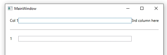
You can use the SharedSizeGroup attribute to share column sizes across different grids. You can’t normally share sizes of star-sized columns across multiple grids, however, since star sizing works only in the context of the current grid.

Below is an example of how to get a star sized column to be the same size as a star sized column in a different grid. In the example, we have two grids. In the first, we have two auto-sized TextBlocks and then a star-sized TextBox that takes up the remaining space. In the second grid, we have just a TextBlock and a TextBox, but we want the TextBox to be the same size as the one in the first grid. Using SharedSizeGroup on the TextBox columns won’t work, since the columns would then get auto-sized.

The solution is to set up a SharedSizeGroup on every column except for the TextBox columns and to add a dummy third column in the second grid. The TextBox columns will then each independently use star sizing and end up the same size.

    <StackPanel Margin="15" Grid.IsSharedSizeScope="True">
        <Grid>
            <Grid.ColumnDefinitions>
                <ColumnDefinition Width="Auto" SharedSizeGroup="A"/>
                <ColumnDefinition Width="*"/>
                <ColumnDefinition Width="Auto" SharedSizeGroup="B"/>
            </Grid.ColumnDefinitions>

            <TextBlock Grid.Column="0" Text="Col 1"/>
            <TextBox Grid.Column="1" />
            <TextBlock Grid.Column="2" Text="3rd column here"/>
        </Grid>

        <Separator Margin="0,20"/>

        <Grid>
            <Grid.ColumnDefinitions>
                <ColumnDefinition Width="Auto" SharedSizeGroup="A"/>
                <ColumnDefinition />
                <ColumnDefinition SharedSizeGroup="B"/>
            </Grid.ColumnDefinitions>

            <TextBlock Grid.Column="0" Text="1"/>
            <TextBox Grid.Column="1"/>
        </Grid>
    </StackPanel>

1201

#1,197 – Autosizing in a Grid with Maximum Size

You can use autosizing for grid rows or columns to have the row or column automatically size to fit its contents. There are times, however, when you want the row or column to fit its contents, but only up to a limit. E.g. Autosize a row height, but only to a maximum of 20% of the size of the entire grid.

You can autosize within limits by using the MaxHeight attribute and a value converter.

Below, we have a grid with two rows, each containing a ListBox. The second row is set to autosize and the first to use all remaining space.

<Window.Resources>
    <ResourceDictionary>
        <local:MaxHeightConverter x:Key="MaxHeightConverter"/>
        <sys:Double x:Key="adjMaxHeightRatio">0.2</sys:Double>
    </ResourceDictionary>
</Window.Resources>

<Grid x:Name="grdRoot">
    <Grid.RowDefinitions>
        <RowDefinition Height="*"/>
        <RowDefinition Height="Auto"/>
    </Grid.RowDefinitions>

    <ListBox Grid.Row="0" ItemsSource="{Binding Dogs}" />

    <ListBox Grid.Row="1" ItemsSource="{Binding MoreDogs}" MaxHeight="{Binding ElementName=grdRoot, Path=ActualHeight, Converter={StaticResource MaxHeightConverter}, ConverterParameter={StaticResource adjMaxHeightRatio}}" />
</Grid>

The second ListBox will take as much room as it needs (grow to fit all elements), until it reaches 20% of the height of the parent grid. At that point, it will be constrained and get a vertical scrollbar.

Here’s the code for the converter:

public class MaxHeightConverter : IValueConverter
{
    public object Convert(object value, Type targetType, object parameter, CultureInfo culture)
    {
        double pctHeight = (double)parameter;

        if ((pctHeight <= 0.0) || (pctHeight > 100.0))
            throw new Exception("MaxHeightConverter expects parameter in the range (0,100]");

        return ((double)value * pctHeight);
    }

    public object ConvertBack(object value, Type targetType, object parameter, CultureInfo culture)
    {
        throw new NotImplementedException();
    }
}

#1,060 – Clipping in Grid Happens Before Render Transforms

Layout and render transforms fit into the layout logic for panels as follows:

  • Layout transforms are performed
  • Panel calculates layout of child elements (and clips or resizes)
  • Render transforms are performed

Clipping and/or resizing of elements happens after layout transforms have been applied.  This means that the layout-transformed object is clipped/resized to fit into the Grid.  You can, however, applied a render transform to an object to allow it to extend outside the bounds of the Grid, because this step happens after clipping/resizing.

Below, the first button is rotated before layout, so the rotated button is sized to fit into the Grid cell.  The second button is rotated after layout, so is not resized.

    <Grid ShowGridLines="True" Background="Bisque"
          Margin="10" ClipToBounds="false">
        <Grid.RowDefinitions>
            <RowDefinition/>
            <RowDefinition/>
        </Grid.RowDefinitions>

        <Button Content="Click Here Please"
                HorizontalAlignment="Center"
                VerticalAlignment="Center">
            <Button.LayoutTransform>
                <RotateTransform Angle="30"/>
            </Button.LayoutTransform>
        </Button>

        <Button Grid.Row="1" Content="Click Here Please"
                Width="100"
                VerticalAlignment="Center">
            <Button.RenderTransform>
                <RotateTransform Angle="30"/>
            </Button.RenderTransform>
        </Button>
    </Grid>

1060-001

#1,059 – Clipping vs. Resizing in a Grid

Grid appears to clip its child elements, in that the elements are constrained to fit within a particular grid cell.

In reality, however, a Grid is often resizing, rather than clipping, the child elements.  If the child element does not specify an explicit size, the Grid will ask the child to be a smaller size, rather than simply clipping it at the grid cell boundary.

Below, the top Button does not have an explicit width, but the bottom Button does.  As we shrink the Grid, the top button will be resized, while the bottom button will be clipped.  The labels indicate the actual button widths.

    <Grid ShowGridLines="True" Background="Bisque"
          Margin="10" ClipToBounds="false">
        <Grid.RowDefinitions>
            <RowDefinition/>
            <RowDefinition/>
        </Grid.RowDefinitions>
        <Grid.ColumnDefinitions>
            <ColumnDefinition/>
            <ColumnDefinition/>
        </Grid.ColumnDefinitions>

        <Label Content="{Binding ElementName=myButton, Path=ActualWidth}"/>
        <Button Name="myButton" Margin="2"
                Grid.Column="1" Content="Click Here Please"
                HorizontalAlignment="Center"
                VerticalAlignment="Center"/>

        <Label Grid.Row="1" Content="{Binding ElementName=myButton2, Path=ActualWidth}"/>
        <Button Name="myButton2" Margin="2"
                Grid.Row="1" Grid.Column="1" Content="Click Here Please"
                Width="100"
                VerticalAlignment="Center"/>
    </Grid>


1059-001
1059-002

#1,057 – Preventing a Grid from Clipping a Child Element

Grid will normally clip child elements within each grid cell so that the element will not extend beyond the bounds of the cell.  In the example below, the Label in the second column is clipped to the right side of the column.

    <Grid Background="AliceBlue" Margin="25" ShowGridLines="True">
        <Grid.ColumnDefinitions>
            <ColumnDefinition/>
            <ColumnDefinition/>
        </Grid.ColumnDefinitions>
        <Label Grid.Column="1"
                Content="Each man delights in the work that suits him best." Background="Olive"
                VerticalAlignment="Center"
                Margin="10"/>
    </Grid>

1057-001
If we want to prevent the Grid from clipping the element, we can do this by placing the element in a Canvas, which we then put into the Grid.  Because a Canvas does not clip child elements,  this will allow the element to extend beyond the boundaries of the Grid.

    <Grid Background="AliceBlue" Margin="25" ShowGridLines="True">
        <Grid.ColumnDefinitions>
            <ColumnDefinition/>
            <ColumnDefinition/>
        </Grid.ColumnDefinitions>
        <Canvas Grid.Column="1">
            <Label Content="Each man delights in the work that suits him best." Background="Olive"
                   VerticalAlignment="Center"
                   Margin="10"/>
        </Canvas>
    </Grid>

1057-002

#1,056 – Grid Clips Child Elements

While a Canvas panel does not clip its child elements, a Grid does clip child elements.  The child elements are clipped even if you set the ClipToBounds property of the Grid to false.

        <Grid Background="AliceBlue" Margin="25" >
            <Label Content="Each man delights in the work that suits him best." Background="Olive"
                   VerticalAlignment="Center" 
                   Margin="10"/>
        </Grid>

1056-001
1056-002

#1,053 – How SharedSizeGroup Relates to Column Sizing

Recall that you can set the width of a column in a Grid (or height of a row) in three different ways: auto, explicit size, or star sizing.

When you’re using the SharedSizeGroup property to set multiple columns (or rows) to the same width (or height), the method that you use for setting the column width (or row height) affects the final size as follows:

  • Star sizing – not honored, treated as Auto
  • Absolute sizing – takes priority over Auto, columns are set to maximum explicit width
  • Auto sizing – if all columns are Auto, size is set to fit the largest content.  If any columns use explicit width, the explicit width value takes precedence

In the example below, we’ve set the first and third columns’ widths to be Auto and put them in the same SharedSizeGroup.

1053-001

Setting the width of the first column to 20 causes both columns to use that width.

1053-002

#1,052 – Making Two Columns in a Grid the Same Size

You can force two columns (or rows) in a Grid to always be the same size using the SharedSizeGroup property when defining the columns (or rows).

Below, we specify that the third column should auto-size and that the first and third columns should be the same size.  The first column will be sized to match the auto-sized third column.  We do the following:

  • Set Grid.IsSharedSizeScope property of the Grid to true
  • Set SharedSizeGroup property in the first and third ColumnDefinition elements to the same value (in this case it’s “A”)
        <Grid Name="myGrid" Grid.IsSharedSizeScope="True">
            <Grid.RowDefinitions>
                <RowDefinition/>
                <RowDefinition/>
            </Grid.RowDefinitions>
            <Grid.ColumnDefinitions>
                <ColumnDefinition SharedSizeGroup="A"/>
                <ColumnDefinition />
                <ColumnDefinition Width="Auto" SharedSizeGroup="A"/>
            </Grid.ColumnDefinitions>

            <Label Content="0,0" Background="Azure" />
            <Label Content="1,0" Background="Moccasin" Grid.Row="1" />
            <Label Content="Row 0 Col 2" Background="Lavender" Grid.Column="1" />
            <Label Content="Row 1 Col 2" Background="Honeydew" Grid.Row="1" Grid.Column="1" />
            <Label Content="Row 0 Col 3" Background="LightSalmon" Grid.Column="2" />
            <Label Content="Row 1 Col 3" Background="GreenYellow" Grid.Row="1" Grid.Column="2" />
        </Grid>

1052-001

#1,051 – How the GridSplitter Behaves when Cells Use Auto Sizing

If one or both columns on either size of a GridSplitter (in its own column) have a width set to Auto, the behavior is as follows (“proportional” refers to star sizing):

  • Both columns set to Auto: Left column changes size and is switched to Absolute sizing
  • Left column Auto, right column proportional: Both columns change size, left switches to Absolute, right remains at original proportion (e.g. “1*”)
  • Right column Auto, left column proportional: Both columns change size, right switches to Absolute, left remains at original proportion

In the example below, columns 0 and 2 surround a GridSplitter in column 1.  Columns 0 and 2 are set to Auto size (as is the column with the GridSplitter) and column 3 is set to proportional.

Initially, we see that both columns 0 and 2 are auto-sized.
1051-001

If we slide the GridSplitter to the right, column 0 changes size and switches to Absolute sizing.  Column 2 remains as Auto.

1051-002

#1,050 – How the GridSplitter Behaves when Cells Use Absolute Sizing

Recall that a GridSplitter in its own column and with its HorizontalAlignment set to Center will resize columns on either side of it.  In the example below, columns 0 and 2 are resized, but the width of column 3 is not changed.

1049-002

If one of the columns whose size is not changing as a result of using the GridSplitter has its size set to an absolute value, it will retain that value.  In the example below column 3 (far right) has an absolute width of 100.  The two columns whose size is changing are using star sizing and have had their relative sizes adjusted.

1050-001

If one of the columns being resized with the GridSplitter has an absolute size, moving the GridSplitter will change its size, but it will continue to have an absolute size.

Before resize:

1050-002


After resize:

1050-003

We can see that column 0 has an absolute size if we make the entire Grid wider.

1050-004