#1,218 – Stretching Items in TreeView across Entire Control

You can define a custom data template for items in a TreeView, displaying any content you like in a panel, for each data item.

There’s a problem with doing this, however, if you want the container in the data template to stretch the entire width of the TreeView. In the sample below, we have a data template for a dog breed the displays data across three columns in a Grid. We’ve set the middle column up as star-sized so that the rightmost column (first letter of the breed) sits on the far right of the grid. In the TreeView, we set HorizontalContentAlignment to Stretch, to try getting this grid to stretch across the entire width of the TreeView.

        <TreeView Grid.Row="0" Margin="5" ItemsSource="{Binding Breeds}" HorizontalContentAlignment="Stretch">
            <TreeView.Resources>
                <HierarchicalDataTemplate DataType="{x:Type loc:Breed}" ItemsSource="{Binding Dogs}">
                    <Grid Margin="0,5,0,0">
                        <Grid.ColumnDefinitions>
                            <ColumnDefinition Width="Auto"/>
                            <ColumnDefinition/>
                            <ColumnDefinition Width="Auto"/>
                        </Grid.ColumnDefinitions>
                        
                        <TextBlock Grid.Column="0" Text="Breed:"/>
                        <TextBlock Grid.Column="1" Margin="5,0,0,0" FontWeight="Bold" Text="{Binding Name}"/>
                        <TextBlock Grid.Column="2" Margin="0,0,3,0" FontStyle="Italic" Text="{Binding FirstLetter}"/>
                    </Grid>
                </HierarchicalDataTemplate>

                <HierarchicalDataTemplate DataType="{x:Type loc:Dog}">
                    <StackPanel Orientation="Horizontal" Margin="0,2,0,0">
                        <TextBlock Text="{Binding}"/>
                    </StackPanel>
                </HierarchicalDataTemplate>
            </TreeView.Resources>
        </TreeView>

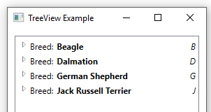
At runtime, you can see that this doesn’t work. The 3rd column is jammed up against the right side of the second column.

The problem has to do with the default ItemContainerStyle. It includes a control template for each data item that puts the main content for the data item in an auto-sized grid column, not allowing it to stretch across the control.

The solution is to override the ItemContainerStyle and tweak the column definitions to allow the content to extend across the Grid. Below is the full text of the modified style, including all dependent styles. The main style that can be used for a TreeView.ItemContainerStyle is named TreeViewItemStyle1. We’ve modified the style so that the control template has a Grid with only two columns. The second column contains the content and is star-sized.


<Style x:Key="TreeViewItemFocusVisual">
            <Setter Property="Control.Template">
                <Setter.Value>
                    <ControlTemplate>
                        <Rectangle/>
                    </ControlTemplate>
                </Setter.Value>
            </Setter>
        </Style>


        <SolidColorBrush x:Key="TreeViewItem.TreeArrow.Static.Checked.Fill" Color="#FF595959"/>
        <SolidColorBrush x:Key="TreeViewItem.TreeArrow.Static.Checked.Stroke" Color="#FF262626"/>
        <SolidColorBrush x:Key="TreeViewItem.TreeArrow.MouseOver.Stroke" Color="#FF27C7F7"/>
        <SolidColorBrush x:Key="TreeViewItem.TreeArrow.MouseOver.Fill" Color="#FFCCEEFB"/>
        <SolidColorBrush x:Key="TreeViewItem.TreeArrow.MouseOver.Checked.Stroke" Color="#FF1CC4F7"/>
        <SolidColorBrush x:Key="TreeViewItem.TreeArrow.MouseOver.Checked.Fill" Color="#FF82DFFB"/>
        <PathGeometry x:Key="TreeArrow" Figures="M0,0 L0,6 L6,0 z"/>
        <SolidColorBrush x:Key="TreeViewItem.TreeArrow.Static.Fill" Color="#FFFFFFFF"/>
        <SolidColorBrush x:Key="TreeViewItem.TreeArrow.Static.Stroke" Color="#FF818181"/>


<Style x:Key="ExpandCollapseToggleStyle" TargetType="{x:Type ToggleButton}">
            <Setter Property="Focusable" Value="False"/>
            <Setter Property="Width" Value="16"/>
            <Setter Property="Height" Value="16"/>
            <Setter Property="Template">
                <Setter.Value>
                    <ControlTemplate TargetType="{x:Type ToggleButton}">
                        <Border Background="Transparent" Height="16" Padding="5,5,5,5" Width="16">
                            <Path x:Name="ExpandPath" Data="{StaticResource TreeArrow}" Fill="{StaticResource TreeViewItem.TreeArrow.Static.Fill}" Stroke="{StaticResource TreeViewItem.TreeArrow.Static.Stroke}">
                                <Path.RenderTransform>
                                    <RotateTransform Angle="135" CenterY="3" CenterX="3"/>
                                </Path.RenderTransform>
                            </Path>
                        </Border>
                        <ControlTemplate.Triggers>
                            <Trigger Property="IsChecked" Value="True">
                                <Setter Property="RenderTransform" TargetName="ExpandPath">
                                    <Setter.Value>
                                        <RotateTransform Angle="180" CenterY="3" CenterX="3"/>
                                    </Setter.Value>
                                </Setter>
                                <Setter Property="Fill" TargetName="ExpandPath" Value="{StaticResource TreeViewItem.TreeArrow.Static.Checked.Fill}"/>
                                <Setter Property="Stroke" TargetName="ExpandPath" Value="{StaticResource TreeViewItem.TreeArrow.Static.Checked.Stroke}"/>
                            </Trigger>
                            <Trigger Property="IsMouseOver" Value="True">
                                <Setter Property="Stroke" TargetName="ExpandPath" Value="{StaticResource TreeViewItem.TreeArrow.MouseOver.Stroke}"/>
                                <Setter Property="Fill" TargetName="ExpandPath" Value="{StaticResource TreeViewItem.TreeArrow.MouseOver.Fill}"/>
                            </Trigger>
                            <MultiTrigger>
                                <MultiTrigger.Conditions>
                                    <Condition Property="IsMouseOver" Value="True"/>
                                    <Condition Property="IsChecked" Value="True"/>
                                </MultiTrigger.Conditions>
                                <Setter Property="Stroke" TargetName="ExpandPath" Value="{StaticResource TreeViewItem.TreeArrow.MouseOver.Checked.Stroke}"/>
                                <Setter Property="Fill" TargetName="ExpandPath" Value="{StaticResource TreeViewItem.TreeArrow.MouseOver.Checked.Fill}"/>
                            </MultiTrigger>
                        </ControlTemplate.Triggers>
                    </ControlTemplate>
                </Setter.Value>
            </Setter>
        </Style>


<Style x:Key="TreeViewItemStyle1" TargetType="{x:Type TreeViewItem}">
            <Setter Property="Background" Value="Transparent"/>
            <Setter Property="HorizontalContentAlignment" Value="{Binding HorizontalContentAlignment, RelativeSource={RelativeSource AncestorType={x:Type ItemsControl}}}"/>
            <Setter Property="VerticalContentAlignment" Value="{Binding VerticalContentAlignment, RelativeSource={RelativeSource AncestorType={x:Type ItemsControl}}}"/>
            <Setter Property="Padding" Value="1,0,0,0"/>
            <Setter Property="Foreground" Value="{DynamicResource {x:Static SystemColors.ControlTextBrushKey}}"/>
            <Setter Property="FocusVisualStyle" Value="{StaticResource TreeViewItemFocusVisual}"/>
            <Setter Property="Template">
                <Setter.Value>
                    <ControlTemplate TargetType="{x:Type TreeViewItem}">
                        <Grid>
                            <Grid.ColumnDefinitions>
                                <ColumnDefinition MinWidth="19" Width="Auto"/>
                                <ColumnDefinition Width="*"/>
                            </Grid.ColumnDefinitions>
                            <Grid.RowDefinitions>
                                <RowDefinition Height="Auto"/>
                                <RowDefinition/>
                            </Grid.RowDefinitions>
                            <ToggleButton x:Name="Expander" ClickMode="Press" IsChecked="{Binding IsExpanded, RelativeSource={RelativeSource TemplatedParent}}" Style="{StaticResource ExpandCollapseToggleStyle}"/>
                            <Border x:Name="Bd" Grid.Column="1" BorderBrush="{TemplateBinding BorderBrush}" BorderThickness="{TemplateBinding BorderThickness}" Background="{TemplateBinding Background}" Padding="{TemplateBinding Padding}" SnapsToDevicePixels="true">
                                <ContentPresenter x:Name="PART_Header" ContentSource="Header" HorizontalAlignment="{TemplateBinding HorizontalContentAlignment}" SnapsToDevicePixels="{TemplateBinding SnapsToDevicePixels}"/>
                            </Border>
                            <ItemsPresenter x:Name="ItemsHost" Grid.Row="1" Grid.Column="1" />
                        </Grid>
                        <ControlTemplate.Triggers>
                            <Trigger Property="IsExpanded" Value="false">
                                <Setter Property="Visibility" TargetName="ItemsHost" Value="Collapsed"/>
                            </Trigger>
                            <Trigger Property="HasItems" Value="false">
                                <Setter Property="Visibility" TargetName="Expander" Value="Hidden"/>
                            </Trigger>
                            <Trigger Property="IsSelected" Value="true">
                                <Setter Property="Background" TargetName="Bd" Value="{DynamicResource {x:Static SystemColors.HighlightBrushKey}}"/>
                                <Setter Property="Foreground" Value="{DynamicResource {x:Static SystemColors.HighlightTextBrushKey}}"/>
                            </Trigger>
                            <MultiTrigger>
                                <MultiTrigger.Conditions>
                                    <Condition Property="IsSelected" Value="true"/>
                                    <Condition Property="IsSelectionActive" Value="false"/>
                                </MultiTrigger.Conditions>
                                <Setter Property="Background" TargetName="Bd" Value="{DynamicResource {x:Static SystemColors.InactiveSelectionHighlightBrushKey}}"/>
                                <Setter Property="Foreground" Value="{DynamicResource {x:Static SystemColors.InactiveSelectionHighlightTextBrushKey}}"/>
                            </MultiTrigger>
                            <Trigger Property="IsEnabled" Value="false">
                                <Setter Property="Foreground" Value="{DynamicResource {x:Static SystemColors.GrayTextBrushKey}}"/>
                            </Trigger>
                        </ControlTemplate.Triggers>
                    </ControlTemplate>
                </Setter.Value>
            </Setter>
            <Style.Triggers>
                <Trigger Property="VirtualizingPanel.IsVirtualizing" Value="true">
                    <Setter Property="ItemsPanel">
                        <Setter.Value>
                            <ItemsPanelTemplate>
                                <VirtualizingStackPanel/>
                            </ItemsPanelTemplate>
                        </Setter.Value>
                    </Setter>
                </Trigger>
            </Style.Triggers>
        </Style>


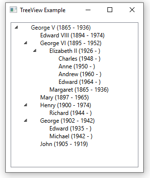
For completeness, here’s a fragment of the TreeView, using the new style.

<TreeView Grid.Row="0" Margin="5" ItemsSource="{Binding Breeds}" ItemContainerStyle="{StaticResource TreeViewItemStyle1}" HorizontalContentAlignment="Stretch">

We can see that the third element is now lined up on the right side of the TreeView at runtime.

#1,217 – Using Multiple HierarchicalDataTemplates in a TreeView

I showed last time how to use a HierarchicalDataTemplate as the ItemTemplate for a TreeView. This allowed us to specify the look and feel of each node in the tree and also dictated how the main data item would be traversed to generate the tree.

If you have some hierarchical data in which the items are not all of the same type, you can specify more than one HierarchicalDataTemplate for the TreeView, based on the underlying type of each node.

Let’s assume that we have both a Breed and a Dog class. Breed objects contain information about a breed and in turn have a Dogs property that is a list of individual dogs of that breed.

In the example below, we have a TreeView whose ItemsSource is bound to a list of breeds. We then include a template to use for each Breed item and a different template to use for each Dog item in the tree. We also indicate that the tree should be expanded by looking at the Dogs property in each breed instance.

        <TreeView Grid.Row="0" Margin="5" ItemsSource="{Binding Breeds}">
            <TreeView.Resources>
                <HierarchicalDataTemplate DataType="{x:Type loc:Breed}" ItemsSource="{Binding Dogs}">
                    <StackPanel Orientation="Horizontal" Margin="0,5,0,0">
                        <TextBlock Text="Breed:"/>
                        <TextBlock Margin="5,0,0,0" FontWeight="Bold" Text="{Binding Name}"/>
                    </StackPanel>
                </HierarchicalDataTemplate>

                <HierarchicalDataTemplate DataType="{x:Type loc:Dog}">
                    <StackPanel Orientation="Horizontal" Margin="0,2,0,0">
                        <TextBlock Text="{Binding}"/>
                    </StackPanel>
                </HierarchicalDataTemplate>
            </TreeView.Resources>
        </TreeView>

Note that we specify a DataType for each HierarchicalDataTemplate. As the tree is constructed, the appropriate template will be used, based on whether a node is a breed or a dog.

Below, we can see how this will look at runtime. Breed nodes show the breed’s name. Dog nodes show the dog’s name and age. We just have a TextBlock bound to the Dog instance as a whole, which causes the dog’s ToString method to get invoked. In our case, we’ve overridden ToString to display the dog’s name and age.

#1,215 – Binding a TreeView to a Hierarchical Data Source

Below is a very simple example of how you might use a TreeView control to display a set of hierarchical data.

Let’s say that we have a Person object that looks like the following. (INPCBase is just a class that implements INotifyPropertyChanged and includes a SetField method).

    public class Person : INPCBase
    {
        public Person(string name, int birth, int? death)
        {
            Name = name;
            Birth = birth;
            Death = death;

            Children = new List<Person>();
        }

        private string _name;
        public string Name
        {
            get { return _name; }
            set { SetField(ref _name, value); }
        }

        private int _birth;
        public int Birth
        {
            get { return _birth; }
            set { SetField(ref _birth, value); }
        }

        private int? _death;
        public int? Death
        {
            get { return _death; }
            set { SetField(ref _death, value); }
        }

        private List<Person> _children;
        public List<Person> Children
        {
            get { return _children; }
            private set { SetField(ref _children, value); }
        }

        public override string ToString()
        {
            string death = Death.HasValue ? Death.Value.ToString() : "";
            return string.Format($"{Name} ({Birth} - {death})");
        }
    }

Notice that we have a Children property that in turn contains other Person objects. Also note that we override ToString so that the default string representation for a Person includes their name and birth/death.

Now let’s assume that we have some ViewModel with a property called Royal that is a list of Person objects. The property might look like:

        private List<Person> _royal;
        public List<Person> Royal
        {
            get { return _royal; }
            set { SetField(ref _royal, value); }
        }

Let’s assume that we initialize this list as follows:

            var p1 = new Person("George V", 1865, 1936);

            var p2 = new Person("Edward VIII", 1894, 1974);
            var p3 = new Person("George VI", 1895, 1952);
            var p4 = new Person("Mary", 1897, 1965);
            var p5 = new Person("Henry", 1900, 1974);
            var p6 = new Person("George", 1902, 1942);
            var p7 = new Person("John", 1905, 1919);

            var p8 = new Person("Elizabeth II", 1926, null);
            var p9 = new Person("Margaret", 1865, 1936);

            var p10 = new Person("Richard", 1944, null);

            var p11 = new Person("Edward", 1935, null);
            var p12 = new Person("Michael", 1942, null);

            var p13 = new Person("Charles", 1948, null);
            var p14 = new Person("Anne", 1950, null);
            var p15 = new Person("Andrew", 1960, null);
            var p16 = new Person("Edward", 1964, null);

            p1.Children.AddRange(new [] { p2, p3, p4, p5, p6, p7});
            p3.Children.AddRange(new[] { p8, p9 });
            p5.Children.Add(p10);
            p6.Children.AddRange(new[] { p11, p12 });
            p8.Children.AddRange(new[] { p13, p14, p15, p16 });

            Royal = new List<Person>() { p1 };

To wire this hierarchical data source up to a TreeView control, we use a HierarchicalDataTemplate in XAML, as shown below.

        <TreeView Grid.Row="0" Margin="5" ItemsSource="{Binding Royal}">
            <TreeView.ItemTemplate>
                <HierarchicalDataTemplate ItemsSource="{Binding Children}">
                    <TreeViewItem Header="{Binding}"/>
                </HierarchicalDataTemplate>
            </TreeView.ItemTemplate>
        </TreeView>

There are several things to note about this XAML fragment:

  • We set the ItemsSource of the TreeView to our top-level property (a list of Person, which contains one person).
  • We tell the HierarchicalDataTemplate to use the Children property to traverse the hierarchy
  • We indicate that each node should be a TreeViewItem object, with text (Header) that just binds to the Person object. This causes the default ToString method of the object to be used for the text

The final result is a nice little family tree:

1215-01