#981 – Including a CheckBox with Each Item in a ListBox

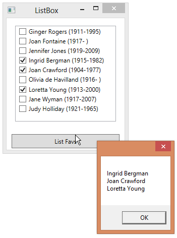
By default, a ListBox shows the selection state of each item in the list using a different brush.  If you want to make the selection of each item more obvious and not force the user to use Ctrl or Shift keys to multi-select items, you can render each item as a CheckBox.

Assume that we bind to a a list of Actor objects, where Actor has IsFav (boolean) and NameAndDates (string) properties, you can do the following:

        <ListBox Name="lbActors" Margin="15" Width="200" Height="190"
                 ItemsSource="{Binding ActorList}">
            <!-- Because CheckBox indicates selection, hide standard ListBox -->
            <!-- selection behavior -->
            <ListBox.ItemContainerStyle>
                <Style TargetType="{x:Type ListBoxItem}">
                    <Setter Property="Focusable" Value="False"/>
                </Style>
            </ListBox.ItemContainerStyle>
            <!-- Each item in list is a CheckBox -->
            <ListBox.ItemTemplate>
                <DataTemplate>
                    <CheckBox Content="{Binding NameAndDates}" IsChecked="{Binding IsFav}"/>
                </DataTemplate>
            </ListBox.ItemTemplate>
        </ListBox>

As you check each item, the IsFav property in the corresponding Actor object is set/cleared.

981-001

#854 – Clicked vs. Checked/Unchecked Events for CheckBox

If you want to add an event handler for a CheckBox that gets executed whenever a user clicks on the CheckBox, you can take one of two different approaches:

  • Add a handler for the Click event and then check the IsChecked property to discover the new state (checked / unchecked / indeterminate)
  • Handle one or more of the specific events for the individual states–Checked, Unchecked or Indeterminate

When a user clicks on the CheckBox, the specific event (e.g. Checked) is fired, followed by the Click event.

        private void CheckBox_Click(object sender, RoutedEventArgs e)
        {
            CheckBox cb = sender as CheckBox;
            string checkState;

            if (!cb.IsChecked.HasValue)
                checkState = "Indeterminate";
            else
            {
                if (cb.IsChecked == true)
                    checkState = "Checked";
                else
                    checkState = "Unchecked";
            }

            Trace.WriteLine(string.Format("Click event: {0}", checkState));
        }

        private void CheckBox_Checked(object sender, RoutedEventArgs e)
        {
            Trace.WriteLine("Checked event");
        }

        private void CheckBox_Unchecked(object sender, RoutedEventArgs e)
        {
            Trace.WriteLine("Unchecked event");
        }

        private void CheckBox_Indeterminate(object sender, RoutedEventArgs e)
        {
            Trace.WriteLine("Indeterminate event");
        }

854-001

#853 – A CheckBox Can Always Be in an Indeterminate State

If you set the IsThreeState property of a CheckBox to true, the user can cycle the CheckBox through three states, rather than true–checked, not checked and indeterminate.

<CheckBox Content="I cycle through 3 states" IsThreeState="True"/>

853-001
853-002
853-003
If the IsThreeState property is set to false, the user can only cycle the CheckBox through the checked and unchecked states.  You can, however, still set the CheckBox to an indeterminate state using data binding or from code.

        <CheckBox Name="chkTest" Content="I cycle through 2 states" IsThreeState="False"/>
        <Button Content="Set Indeterminate" Click="Button_Click" Margin="15"/>

</span>
<pre>        private void Button_Click(object sender, RoutedEventArgs e)
        {
            chkTest.IsChecked = null;
        }

853-004

#852 – Setting a Three-State CheckBox to an Indeterminate Value

A three-state CheckBox can take on one of three values: true, false, or indeterminate.  You can use data binding to get/set the value of a three-state CheckBox, binding the control to a nullable bool.

You can also explicitly set the value of a CheckBox, in either XAML or code.

To set a CheckBox to an indeterminate value in code, just set its IsChecked property to null.

            chkPie.IsChecked = null;

852-001
To set a CheckBox to an indeterminate value in XAML, set its IsChecked property to {x:Null}.

        <CheckBox Name="chkPie" Content="I Like Pie" IsThreeState="True"
                  IsChecked="{x:Null}"/>

#833 – CheckBox is a ContentControl

CheckBox control derives from ContentControl, which means that it can contain a single piece of content.  In the case of a CheckBox, this content is rendered next to the actual check box that a user can check on or off.

You typically set the content of a CheckBox to a string, which gets rendered next to the check box.

        <CheckBox Content="Learn to juggle"/>
        <CheckBox Content="Read War and Peace"/>
        <CheckBox Content="Visit Japan"/>

833-001
You can, however, set the Content property to anything that you like, including a panel that contains other controls.

        <CheckBox VerticalContentAlignment="Center">
            <CheckBox.Content>
                <StackPanel>
                    <Image Source="Juggler.png" Height="85"/>
                    <Label Content="Learn to juggle"/>
                </StackPanel>
            </CheckBox.Content>
        </CheckBox>
        <CheckBox VerticalContentAlignment="Center">
            <CheckBox.Content>
                <StackPanel>
                    <Image Source="leo.jpg" Height="85"/>
                    <Label Content="Read War and Peace"/>
                </StackPanel>
            </CheckBox.Content>
        </CheckBox>
        <CheckBox VerticalContentAlignment="Center">
            <CheckBox.Content>
                <StackPanel>
                    <Image Source="kinkakuji.jpg" Height="85"/>
                    <Label Content="Visit Japan"/>
                </StackPanel>
            </CheckBox.Content>
        </CheckBox>

833-002

#825 – Two Way Binding for a CheckBox

You can bind the IsChecked property of a CheckBox to a boolean variable, so that the variable will always reflect the current value of the CheckBox in the user interface.

You can also do two-way binding, where the boolean variable changes when the user toggles the CheckBox, but the CheckBox also toggles when the value of the variable changes.

        <Label Content="Things my dog can do:"/>
        <CheckBox Content="Sit" IsChecked="{Binding CanSit, Mode=TwoWay}"/>
        <CheckBox Content="Stay" IsChecked="{Binding CanStay, Mode=TwoWay}"/>
        <StackPanel Orientation="Horizontal" HorizontalAlignment="Center">
            <Button Content="Report State" Click="btnReportState_Click"
                    Margin="5"/>
            <Button Content="Change State" Click="btnChangeState_Click"
                    Margin="5"/>
        </StackPanel>

Code-behind:

    public partial class MainWindow : Window, INotifyPropertyChanged
    {
        private bool canSit;
        public bool CanSit
        {
            get { return canSit; }
            set
            {
                canSit = value;
                RaisePropertyChanged("CanSit");
            }
        }

        private bool canStay;
        public bool CanStay
        {
            get { return canStay; }
            set
            {
                canStay = value;
                RaisePropertyChanged("CanStay");
            }
        }

        public MainWindow()
        {
            this.InitializeComponent();
            this.DataContext = this;
        }

        private void btnReportState_Click(object sender, RoutedEventArgs e)
        {
            MessageBox.Show(string.Format("Sit: {0}, Stay: {1}", CanSit, CanStay));
        }

        private void btnChangeState_Click(object sender, RoutedEventArgs e)
        {
            CanSit = CanSit ? false : true;
        }

        public event PropertyChangedEventHandler PropertyChanged;

        private void RaisePropertyChanged(string propName)
        {
            PropertyChanged(this, new PropertyChangedEventArgs(propName));
        }
    }

#540 – Adding Common Controls in Blend

You can add various common controls to your application in Blend using buttons on the tools panel.  You select the icon for the control that you want to add and then double-click the icon to add it.

If you left-click and hold on the Button icon on the tools panel, or right-click, you’ll see a series of controls that you can insert by clicking on the icon at this location in the tools panel.

  • Button – Click on a button to perform some action
  • CheckBox – Check an item in a list
  • ComboBox – Select an item from a dropdown list
  • ListBox – Select an item from a list
  • RadioButton – Select one item from a group
  • ScrollBar – Scroll stuff
  • Slider – Pick a value from a range
  • TabControl – Switch between separate tabbed parts of app
  • GridSplitter – Make section of app bigger/smaller

Select the control that you want and then double-click to add to your GUI.

#355 – Implementing Three-State CheckBox Dependent Behavior

You can use a three-state CheckBox to reflect the state of a set of other CheckBox controls.

Here’s some sample code that implements this behavior.  (See the previous post for the XAML).

    public partial class MainWindow : Window, INotifyPropertyChanged
    {
        public event PropertyChangedEventHandler PropertyChanged;

        private bool doEat;
        public bool DoEat
        {
            get { return doEat; }
            set
            {
                doEat = value;
                OnPropertyChanged("DoEat");
                OnPropertyChanged("DoEverything");
            }
        }

        // Add same code for DoPray and DoLove properties here

        // Nullable bool - can be true, false or null
        public bool? DoEverything
        {
            get
            {
                if (DoEat && DoPray && DoLove)
                    return true;
                else if (!DoEat && !DoPray && !DoLove)
                    return false;
                else
                    return null;
            }

            set
            {
                if (value == true)
                    DoEat = DoPray = DoLove = true;
                else
                    DoEat = DoPray = DoLove = false;
            }
        }

        public MainWindow()
        {
            this.InitializeComponent();
            this.DataContext = this;
        }

        private void OnPropertyChanged(string prop)
        {
            if (PropertyChanged != null)
                PropertyChanged(this, new PropertyChangedEventArgs(prop));
        }
    }

#354 – Use Three-State CheckBox to Show State of Other CheckBoxes

Three-state CheckBox controls are often used in conjunction with other CheckBox controls. The three-state CheckBox appears checked if all other checkboxes are checked, unchecked if nothing else is checked, or the indeterminate state if some other CheckBox controls are checked.

Here’s an example, starting with the XAML:

        <CheckBox Content="Do Everything" IsChecked="{Binding DoEverything}" IsThreeState="True"/>
        <CheckBox Content="Eat" IsChecked="{Binding DoEat}" Margin="20,0,0,0"/>
        <CheckBox Content="Pray" IsChecked="{Binding DoPray}" Margin="20,0,0,0"/>
        <CheckBox Content="Love" IsChecked="{Binding DoLove}" Margin="20,0,0,0"/>

At run-time, you want the following behavior:

  • User checks Do Everything, all other items become checked

  • User unchecks Do Everything, all other items become unchecked

  • User checks individual items, Do Everything becomes checked if everything else is checked, unchecked if nothing is checked, or indeterminate if at some items are checked

See post #355 for an example of the code-behind that implements this behavior.


#353 – Binding a Three-State CheckBox to a Nullable Bool

Because a three-state CheckBox can take on any one of three different values, its current value can’t be represented by a simple bool.  A bool can only take on true and false values.

A three-state CheckBox can instead be bound to a nullable bool (represented by bool?), which can take on three different values.

  • true  (checked)
  • false  (not checked)
  • null  (indeterminate)

In the example below, we bind a CheckBox control’s IsChecked property to a nullable bool property.

        <CheckBox Content="Happy" IsChecked="{Binding IsHappy}" IsThreeState="True"/>

In the code-behind, we define the property and set the main window’s data context.

        // Nullable bool - can be true, false or null
        public bool? IsHappy { get; set; }

		public MainWindow()
		{
			this.InitializeComponent();
            this.DataContext = this;
        }