#1,027 – Displaying a Subrange on a Slider

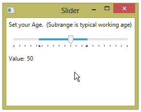
You can highlight a sub-range on a Slider that is some subset of the full range.  You do this by setting the IsSelectionRangeEnabled property to true and setting SelectionStart and SelectionEnd to the desired start and end values for the range.  The sub-range is displayed using a different color.  Triangular indicators are displayed on the tickmark bar to show the start and end of the range.

Displaying a sub-range in this manner has no effect on the values that you’re allowed to pick with the Slider.  It’s merely a visual indicator.

        <Label Content="Set your Age.  (Subrange is typical working age)."/>
        <Slider Name="mySlider" Margin="10" Foreground="Blue"
                Minimum="0" Maximum="100"
                IsSelectionRangeEnabled="True"
                SelectionStart="22" SelectionEnd="65"
                TickPlacement="BottomRight"
                TickFrequency="5" />
        <StackPanel Orientation="Horizontal">
            <Label Content="Value:" />
            <TextBlock Text="{Binding Value, ElementName=mySlider, StringFormat={}{0:0}}"
                       VerticalAlignment="Center"/>
        </StackPanel>
1027-001

#1,026 – Horizontal and Vertical Sliders

You can orient a Slider either horizontally or vertically by setting the Orientation property to Horizontal (the default) or Vertical.  The thumb on the Slider will be rendered differently, depending on the orientation.

Below is an example of both a horizontal and a vertical Slider.

    <Grid>
        <Grid.RowDefinitions>
            <RowDefinition Height="Auto"/>
            <RowDefinition/>
            <RowDefinition Height="Auto"/>
        </Grid.RowDefinitions>

        <Grid>
            <Grid.ColumnDefinitions>
                <ColumnDefinition Width="Auto"/>
                <ColumnDefinition/>
            </Grid.ColumnDefinitions>
            <Label Content="Width" VerticalAlignment="Center"/>
            <Slider Grid.Column="1" Margin="10" Foreground="Blue"
                    Minimum="1" Maximum="5"
                    TickPlacement="BottomRight"/>
        </Grid>

        <Slider Grid.Row="1" Margin="10,0" Foreground="Blue"
                Minimum="1" Maximum="10"
                Orientation="Vertical"
                TickPlacement="BottomRight"/>
        <Label Grid.Row="2" Content="Height"/>
    </Grid>

1026-001

#1,025 – Small and Large Changes to the Value of a Slider

When you use the mouse to drag the thumb of a Slider control, you can set the value of the slider to any value within its range.  (This is true unless you’ve set the IsSnapToTickEnabled property to true, in which case you’re constrained to values at tickmarks).

You can also increase or decrease the value of the Slider by:

  • Using the arrow keys on the keyboard – changes value by SmallChange property amount – default 0.1
  • Left-clicking in the Slider on one side of the thumb or the other – changes value by LargeChange property amount – default 1.0

You can change these default values by setting the SmallChange and/or LargeChange properties.

For example:

<Slider Name="mySlider" Margin="10"
        Minimum="0" Maximum="50"
        SmallChange="1" LargeChange="5"/>

With these changes, you can now use the arrow keys to change the Slider’s value by 1.0 and can left-click next to the thumb to change the value by 5.0.

#1,024 – Making a Slider Cycle through Values of an Enumerated Type

You may want to use a Slider control to let a user select from a set of values specified by an enumerated type.  For example, you could let users select a day of the week from the DayOfWeek enumerated type.

Here’s one way to do that.  In XAML, define Slider and TextBlock that uses a value converter to display the day.

    <Window.Resources>
        <local:DayOfWeekEnumToStringValueConverter x:Key="dayOfWeekEnumToStringConverter"/>
    </Window.Resources>

    <StackPanel>
        <Slider Name="mySlider" Margin="10"
                Minimum="0"
                IsSnapToTickEnabled="True"/>

        <TextBlock Text="{Binding Path=Value, ElementName=mySlider, Converter={StaticResource dayOfWeekEnumToStringConverter}}"
                    Margin="10"/>
    </StackPanel>

The value converter code could be:

    public class DayOfWeekEnumToStringValueConverter : IValueConverter
    {
        public object Convert(object value, Type targetType, object parameter, System.Globalization.CultureInfo culture)
        {
            DayOfWeek day = (DayOfWeek)((double)value);
            return day.ToString();
        }

        public object ConvertBack(object value, Type targetType, object parameter, System.Globalization.CultureInfo culture)
        {
            throw new NotImplementedException();
        }
    }

All that remains is to set the Maximum property. This can be done in code-behind (e.g. in the main window’s constructor):

            mySlider.Maximum = Enum.GetNames(typeof(DayOfWeek)).Length - 1;

1024-001

#1,023 – Displaying a Tooltip that Shows the Value of a Slider

You can use the AutoToolTipPlacement property to automatically show a tooltip on a slider while the thumb is being dragged.  The tooltip will show the current Value of the slider.

You can set AutoToolTipPlacement to either BottomRight or TopLeft to control the position of the tooltip.  (The default is None).

Note, however, that the value shown in the tooltip is by default rounded to the nearest integer.  You can see this in the example below, as we display the actual Value in a TextBlock.

        <Slider Name="mySlider" Margin="10"
                Minimum="1" Maximum="100"
                AutoToolTipPlacement="BottomRight"/>

1023-001
You can increase the precision shown in the tooltip by setting the AutoToolTipPrecision property.  You set this property to be the number of digits to the right of the decimal place that you want to see.

        <Slider Name="mySlider" Margin="10"
                Minimum="1" Maximum="100"
                AutoToolTipPlacement="BottomRight"
                AutoToolTipPrecision="2"/>

1023-002

#1,022 – Render Tick Marks in a Different Color

By default, tick marks on a Slider are rendered in a light grey color that is a bit tough to see.

1022-001

You can change the color used to display the tick marks by setting the Foreground property of the Slider.

        <Slider Name="mySlider" Margin="10"
                Minimum="1" Maximum="10"
                IsSnapToTickEnabled="True"
                TickPlacement="BottomRight"
                TickFrequency="2"
                Foreground="Blue"/>

1022-002

#1,021 – Two Ways to Position Tick Marks on a Slider

You can cause tick marks to be displayed with a Slider control by setting the TickPlacement property.  By default, this places tick marks every 1 unit between the Minimum and Maximum values (inclusive).

There are two ways to change where tick marks are displayed on the Slider.  The first is to set the TickFrequency to indicate the desired spacing between tick marks.  When you set TickFrequency:

  • Tick mark is displayed at Minimum value
  • Tick marks are displayed at Minimum + TickFrequency and then every TickFrequency units
  • Tick mark is displayed at Maximum value

For example, if Minimum is 1, Maximum is 10, and TickFrequency is 2, we get tick marks at: 1, 3, 5, 7, 9, 10.

1021-001

The second method for configuring tick marks is to list a series of positions using the Ticks property.  Ticks are placed at the specified locations, as well as the Minimum and Maximum location.

        <Slider Minimum="1" Maximum="10"
                IsSnapToTickEnabled="True"
                TickPlacement="BottomRight"
                Ticks="2,4,6,8"/>

1021-002

#1,020 – Displaying Tick Marks on a Slider

If you want to display tick marks on a Slider, you set the TickPlacement property to indicate where you want the tick marks to appear:

  • None – don’t display tick marks  (default)
  • BottomRight – display below horizontal Slider, to the right of vertical Slider
  • TopLeft – display above horizontal Slider, to the left of vertical Slider
  • Both – display on both sides of Slider

In the example below, we set up tick marks every 5 units.  Because the Minimum value of the Slider is 1, this places them at 1, 6, 11, 16, etc.

        <Slider Name="mySlider" Margin="10"
                Minimum="1" Maximum="100"
                TickFrequency="5" IsSnapToTickEnabled="True"
                TickPlacement="BottomRight"/>

1020-001

#1,019 – Constraining a Slider to Integer Values

The Value property of a Slider can take on any value between the Minimum and Maximum values.  Because it is of type double, it will normally take on a series of real number values as the user drags the thumb.

1019-001

If you want to constrain the Slider values to be integer values only, you can set the following properties:

  • TickFrequency : 1
  • IsSnapToTickEnabled : True

Tickmarks will not be shown, but the Slider will now be constrained only to integer values.

        <Slider Name="mySlider" Margin="10"
                Minimum="1" Maximum="100"
                TickFrequency="1" IsSnapToTickEnabled="True"/>
        <StackPanel Orientation="Horizontal">
            <Label Content="Value:" VerticalAlignment="Center"/>
            <TextBlock Text="{Binding Path=Value, ElementName=mySlider}"
                       Margin="10"/>
        </StackPanel>

1019-002

#1,018 – Slider Basics

The Slider is a control that allows a user to drag a “thumb” across a range of values, to select a specific numeric value.

The Slider’s main properties are:

  • Value – The numeric value selected by the slider
  • Minimum – The minimum value that the slider can be set to (thumb dragged all of the way to the left)
  • Maximum – The maximum value that the slider can be set to (thumb dragged all of the way to the right)

You’ll typically set the Minimum and Maximum to some static values, setting them in XAML to indicate the allowed range of values that a user is allowed to input.

You’ll typically bind the Value property to some property in code, allowing the user to set that value using the Slider.

        <Slider Name="mySlider" Margin="10"
                Minimum="1" Maximum="100"/>
        <StackPanel Orientation="Horizontal">
            <Label Content="Value:" VerticalAlignment="Center"/>
            <TextBlock Text="{Binding Path=Value, ElementName=mySlider}"
                       Margin="10"/>
        </StackPanel>

1018-001
1018-002
1018-003