#484 – InkCanvas Contains a Collection of Strokes

When you draw on an InkCanvas control, you create a series of Stroke objects.  One Stroke is created each time you hold the left mouse button down, drag the mouse to draw and then release the mouse button.  All strokes are stored in the Strokes property of the InkCanvas.

Each Stroke stores information about its drawing attributes (e.g. color, width) as well as the collection of points that make up the Stroke, stored in its StylusPoints collection.

In the example below, we use data binding to show all Strokes for an InkCanvas in an adjacent ListBox.

</pre>
    <Grid>
        <Grid.RowDefinitions>
            <RowDefinition Height="Auto"/>
            <RowDefinition Height="*" />
        </Grid.RowDefinitions>
        <Grid.ColumnDefinitions>
            <ColumnDefinition Width="*"/>
            <ColumnDefinition Width="150"/>
        </Grid.ColumnDefinitions>

        <Border Grid.Row="1" BorderBrush="DodgerBlue" BorderThickness="2" Margin="5" SnapsToDevicePixels="True">
            <InkCanvas Name="ink" MinHeight="0" MinWidth="0"/>
        </Border>
        <Label Grid.Column="1" Content="Strokes:" Margin="10,5"/>
        <ListBox Grid.Row="1" Grid.Column="1" ItemsSource="{Binding ElementName=ink, Path=Strokes}">
             <ListBox.ItemTemplate>
                 <DataTemplate>
                     <Label Content="{Binding Path=StylusPoints, Converter={StaticResource strokeInfoConverter}}"/>
                 </DataTemplate>
             </ListBox.ItemTemplate>
        </ListBox>
    </Grid>


#483 – InkCanvas MinHeight and MinWidth

If you don’t give an InkCanvas an explicit Height or Width, but leave both to default to Auto, the InkCanvas automatically sets its MinHeight property to 250 and its MinWidth to 350.  This is done using a trigger, created in the constructor of the InkCanvas.

This can be confusing, since the same is not true for the Canvas control, whose MinHeight and MinWidth properties are initially set to 0.0.

Below, we include an InkCanvas control in a window and attach a button at each corner, so that we can better see its boundaries.  The InkCanvas sizes to fit its container (the Window), but you can see that a minimum height and width has been set.

    <InkCanvas>
        <Button Content="Bottom Left" InkCanvas.Bottom="5" InkCanvas.Left="5"/>
        <Button Content="Bottom Right" InkCanvas.Bottom="5" InkCanvas.Right="5"/>
        <Button Content="Top Right" InkCanvas.Top="5" InkCanvas.Right="5"/>
        <Button Content="Top Left" InkCanvas.Top="5" InkCanvas.Left="5"/>
    </InkCanvas>


To allow the InkCanvas to size freely, set MinHeight and MinWidth to 0.0.

#482 – You Can Include Other Controls Inside an InkCanvas

You can use the InkCanvas control as a blank canvas that you can draw on, using the mouse or a stylus.  You can also include child controls in the InkCanvas in the same way that you add child controls to a Canvas.  But with the InkCanvas, the user cannot interact with the controls, but can just scribble over the top of them.

    <Grid>
        <Grid.RowDefinitions>
            <RowDefinition Height="Auto"/>
            <RowDefinition Height="*" />
        </Grid.RowDefinitions>

        <Label Grid.Row="0" Content="Draw in the area below using your mouse" Margin="10,5"/>
        <Border Grid.Row="1" BorderBrush="DodgerBlue" BorderThickness="2" Margin="10" SnapsToDevicePixels="True">
            <InkCanvas MinHeight="0" MinWidth="0">
                <Label Content="Draw on me" InkCanvas.Left="5" InkCanvas.Right="10"/>
                <Button Content="Me too" InkCanvas.Left="10" InkCanvas.Bottom="10" />
                <Image Source="Images\BestYears.jpg" Height="200" InkCanvas.Right="5" InkCanvas.Top="5"/>
            </InkCanvas>
        </Border>
    </Grid>

#481 – You Can Draw On an InkCanvas Control with the Mouse

You can use the InkCanvas control to include an area of your user interface that users can draw on, using the mouse or a stylus.

By default, an InkCanvas allows drawing on its surface using the mouse.  Each time that you click and drag with the mouse, you are creating a stroke, which is then stored with the InkCanvas.

    <Grid>
        <Grid.RowDefinitions>
            <RowDefinition Height="Auto"/>
            <RowDefinition Height="*" />
        </Grid.RowDefinitions>

        <Label Grid.Row="0" Content="Draw in the area below using your mouse" Margin="10,5"/>
        <Border Grid.Row="1" BorderBrush="DodgerBlue" BorderThickness="2" Margin="10" SnapsToDevicePixels="True">
            <InkCanvas/>
        </Border>
    </Grid>

#480 – ZIndex Values and Render Transforms

It’s possible for controls to overlap each other when using a RenderTransform–even in containers that don’t normally overlap their child controls.

In the example below, the first Button in a StackPanel is rotated and ends up overlapping the second Button.

    <StackPanel Margin="10">
        <Button Content="Alpha" HorizontalAlignment="Center" Padding="20,0" >
            <Button.RenderTransform>
                <RotateTransform Angle="45"/>
            </Button.RenderTransform>
        </Button>
        <Button Content="Bravo" HorizontalAlignment="Center" Padding="20,0" />
    </StackPanel>


Whenever overlapping occurs, the containing panel’s attached ZIndex property dictates the overlapping order of the child controls. With default ZIndex values of 0, child controls appearing later in the XAML are rendered on top of earlier controls.

You can explicitly control the overlap order by specifying ZIndex values.  In the previous example, if we give the first button a ZIndex of 2 and the second button a ZIndex of 1, their overlap order is reversed.

#479 – Using a Layout Transform on Child Elements in a Canvas

You can use a LayoutTransform on child elements of a Canvas to transform them graphically.  Specifically, you can use a RotateTransform, ScaleTransform or SkewTransform.  (Translation transforms are ignored).

    <Canvas>
        <Button Content="Hopalong Cassidy" Canvas.Left="10" Canvas.Top="10">
            <Button.LayoutTransform>
                <RotateTransform Angle="45"/>
            </Button.LayoutTransform>
        </Button>
        <Button Content="Roy Rogers" Canvas.Right="10" Canvas.Top="10">
            <Button.LayoutTransform>
                <TransformGroup>
                    <ScaleTransform ScaleX="2.0"/>
                    <RotateTransform Angle="-45"/>
                </TransformGroup>
            </Button.LayoutTransform>
        </Button>
        <Button Content="Spade Cooley" Canvas.Left="10" Canvas.Bottom="10">
            <Button.LayoutTransform>
                <SkewTransform AngleX="20"/>
            </Button.LayoutTransform>
        </Button>
    </Canvas>

#478 – Two Out of Four Margin Values Are Used for Elements in a Canvas

When adding child elements to a Canvas panel, you can specify at most two of the four attached properties: Top, Left, Bottom, Right.  This places the child element relative to one of the four corners of the Canvas.

Child elements can have values for their Margin property, but only two of the four possible sub-values are used.  The two parts of the margin used are based on the two Canvas attached properties that are being used.

For example, if you position a child element using the Canvas.Bottom and Canvas.Left properties, then only the Bottom and Left portions of the child element’s Margin are used.  The Top and Right margins are ignored.

Margin values that are used are added to the canvas positioning properties.

<Canvas>
    <Button Content="Left=10, Margin.Left=0" Canvas.Left="10" Canvas.Top="10" Margin="0,0,0,0"/>
    <Button Content="Left=10, Margin.Left=15" Canvas.Left="10" Canvas.Top="40" Margin="15,0,0,0"/>
</Canvas>

#477 – Default ZIndex Value for Child Elements of a Canvas

You can set the Canvas.ZIndex attached property for a child element of the Canvas panel, to dictate the overlap behavior of child elements.  Elements with a higher ZIndex value will appear on top of elements with a lower value.

By default, all child elements of a Canvas have a ZIndex value of 0.  In this case, the Canvas lays out the child elements in the order that they exist in the Children collection (the same order in which they appear in XAML), with elements occurring later in the collection layering on top of elements that occur earlier in the collection.

More generally, any time that two elements have the same value for ZIndex, they are layered in the order in which the appear in the Children collection.


#476 – Set ZIndex Values for Child Elements of Canvas

By default, child elements of a Canvas panel will be arranged in the order that they appear in a XAML file, with later elements appearing on top of earlier elements.

You can override this behavior by specifying explicit values for the Canvas.ZIndex attached property.  An element with a higher ZIndex value will appear on top of an element with a lower value.

        <Canvas Name="canv" Grid.Row="0">
            <Button Content="1 - Lft10,Top10" Canvas.Left="10" Canvas.Top="10" Canvas.ZIndex="4"/>
            <Button Content="2 - Rt10,Top10" Canvas.Right="10" Canvas.Top="15" Canvas.ZIndex="3"/>
            <Button Content="3 - Lft10,Bott10..." Canvas.Left="15" Canvas.Bottom="15" Canvas.ZIndex="2"/>
            <Button Content="4 - Rt10,Bott10" Canvas.Right="10" Canvas.Bottom="8"  Canvas.ZIndex="1"/>
        </Canvas>

#475 – Child Elements in Canvas Can Overlap

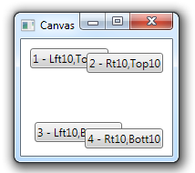
It’s possible for child elements of a Canvas to overlap each other, depending on their position.  In the example below, the Canvas contains four Button controls, each located relative to one of the four corners of the Canvas.  As the parent window is resized, it eventually gets small enough for the child elements to overlap.

When child elements in a Canvas overlap, their order is based on the order in which they were added to the Canvas.  If the elements were all specified in XAML, the first elements listed will be at the bottom of overlapped elements and the last elements will be at the top.

    <Canvas>
        <Button Content="1 - Lft10,Top10" Canvas.Left="10" Canvas.Top="10"/>
        <Button Content="2 - Rt10,Top10" Canvas.Right="10" Canvas.Top="15"/>
        <Button Content="3 - Lft10,Bott10..." Canvas.Left="15" Canvas.Bottom="15"/>
        <Button Content="4 - Rt10,Bott10" Canvas.Right="10" Canvas.Bottom="8"/>
    </Canvas>