#1,206 – Changing Color of Custom Circular Progress

A couple of earlier posts (#1,155 and #1,156) demonstrated how to create a simple custom control that displays progress in a circular fashion. A reader of the blog asked how you would change the color of the progress indicator when it got to a certain value. The example below shows how to do that.

Below is the code for the indicator itself. This matches post #1,156 except that we’ve removed the static constructor that overrides the stroke and fill color of the indicator.

    public class CircularProgress : Shape
    {
        // Value (0-100)
        public double Value
        {
            get { return (double)GetValue(ValueProperty); }
            set { SetValue(ValueProperty, value); }
        }

        // DependencyProperty - Value (0 - 100)
        private static FrameworkPropertyMetadata valueMetadata =
                new FrameworkPropertyMetadata(
                    0.0,     // Default value
                    FrameworkPropertyMetadataOptions.AffectsRender,
                    null,    // Property changed callback
                    new CoerceValueCallback(CoerceValue));   // Coerce value callback

        public static readonly DependencyProperty ValueProperty =
            DependencyProperty.Register("Value", typeof(double), typeof(CircularProgress), valueMetadata);

        private static object CoerceValue(DependencyObject depObj, object baseVal)
        {
            double val = (double)baseVal;
            val = Math.Min(val, 99.999);
            val = Math.Max(val, 0.0);
            return val;
        }

        protected override Geometry DefiningGeometry
        {
            get
            {
                double startAngle = 90.0;
                double endAngle = 90.0 - ((Value / 100.0) * 360.0);

                double maxWidth = Math.Max(0.0, RenderSize.Width - StrokeThickness);
                double maxHeight = Math.Max(0.0, RenderSize.Height - StrokeThickness);

                double xStart = maxWidth / 2.0 * Math.Cos(startAngle * Math.PI / 180.0);
                double yStart = maxHeight / 2.0 * Math.Sin(startAngle * Math.PI / 180.0);

                double xEnd = maxWidth / 2.0 * Math.Cos(endAngle * Math.PI / 180.0);
                double yEnd = maxHeight / 2.0 * Math.Sin(endAngle * Math.PI / 180.0);

                StreamGeometry geom = new StreamGeometry();
                using (StreamGeometryContext ctx = geom.Open())
                {
                    ctx.BeginFigure(
                        new Point((RenderSize.Width / 2.0) + xStart,
                                  (RenderSize.Height / 2.0) - yStart),
                        true,   // Filled
                        true);  // Closed
                    ctx.ArcTo(
                        new Point((RenderSize.Width / 2.0) + xEnd,
                                  (RenderSize.Height / 2.0) - yEnd),
                        new Size(maxWidth / 2.0, maxHeight / 2),
                        0.0,     // rotationAngle
                        (startAngle - endAngle) > 180,   // greater than 180 deg?
                        SweepDirection.Clockwise,
                        true,    // isStroked
                        false);
                    ctx.LineTo(new Point((RenderSize.Width / 2.0), (RenderSize.Height / 2.0)), true, false);
                }

                return geom;
            }
        }
    }

Next is a snippet from the code-behind for a main window. This is just a click handler for a button that updates a property. (Note the use of SetProp method from post #1,205)

        private double _pctComplete = 0.0;
        public double PctComplete
        {
            get { return _pctComplete; }
            set { SetProp(ref _pctComplete, value); }
        }

        private void Button_Click(object sender, RoutedEventArgs e)
        {
            PctComplete = 0.0;

            DispatcherTimer timer = new DispatcherTimer();
            timer.Tick += (s, ea) =>
            {
                PctComplete += 1.0;
                if (PctComplete >= 100.0)
                    timer.Stop();
            };
            timer.Interval = new TimeSpan(0, 0, 0, 0, 150);  
            timer.Start();
        }

We then have a XAML fragment, where we define an instance of the progress indicator. We also set up a data trigger to set the Stroke and Fill properties to change color when they reach a certain level.

    <Window.Resources>
        <loc:GreaterThanConverter x:Key="greaterThanConverter"/>
        
        <Style x:Key="progChangeColor" TargetType="loc:CircularProgress">
            <Setter Property="Stroke" Value="Red"/>
            <Setter Property="Fill" Value="Red"/>
            <Style.Triggers>
                <DataTrigger Binding="{Binding PctComplete, Converter={StaticResource greaterThanConverter}, ConverterParameter=75}" Value="True">
                    <Setter Property="Stroke" Value="Green"/>
                    <Setter Property="Fill" Value="Green"/>
                </DataTrigger>
            </Style.Triggers>
        </Style>
    </Window.Resources>
    
    <StackPanel>
        <loc:CircularProgress
            Style="{StaticResource progChangeColor}"
             Height="100" Width="100" Margin="5"
             Value="{Binding PctComplete}"
             HorizontalAlignment="Center"/>
        <ProgressBar Maximum="100"
                 Value="{Binding PctComplete}"
                 Height="25" Margin="10"/>
        <Button Content="Start Timer" Click="Button_Click"
            HorizontalAlignment="Center"
            Padding="12,7"/>
    </StackPanel>

Note that we’re making use of a value converter that takes a value in (e.g. PctComplete) and outputs True when that value passes a certain point (e.g. 75). Here’s the code for that converter:

    public class GreaterThanConverter : IValueConverter
    {
        public object Convert(object value, Type targetType, object parameter, CultureInfo culture)
        {
            return ((double)value) > double.Parse(parameter as string);
        }

        public object ConvertBack(object value, Type targetType, object parameter, CultureInfo culture)
        {
            throw new NotImplementedException();
        }
    }

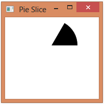
When everything is wired up and we run this, we see that the indicator starts out red.

And it then turns green when progress gets past 75%.

#1,198 – Selectively Enabling Child Elements in a Disabled Panel

When you set IsEnabled to false in a panel, all child elements in that panel are disabled. You cannot selectively enabled child elements in the panel.

You may, however, want to selectively enable child elements in a panel. (E.g. Disable entire panel, then set IsEnabled=True, IsReadOnly=True on TextBox controls so that you can copy text).

One possible solution is to define a new control that inherits from TextBox and does not coerce the value of IsEnabled.

    public class CanEnableTextBox : TextBox
    {
        static CanEnableTextBox()
        {
            CanEnableTextBox.IsEnabledProperty.OverrideMetadata(typeof(CanEnableTextBox),
                new System.Windows.UIPropertyMetadata(true,
                    new PropertyChangedCallback(IsEnabledPropertyChanged),
                    new CoerceValueCallback(CoerceIsEnabled)));

        }

        private static void IsEnabledPropertyChanged(DependencyObject source, DependencyPropertyChangedEventArgs args)
        {
            // Overriding PropertyChanged results in merged metadata, which is what we want--
            // the PropertyChanged logic in UIElement.IsEnabled will still get invoked.
        }

        private static object CoerceIsEnabled(DependencyObject source, object value)
        {
            return value;
        }
    }

You can now use this control in a panel that has IsEnabled set to false and you’ll be able to set IsEnabled on the child TextBox.

#1,191 – Custom Element with a Single Child Element

Below is an example of a simple custom element that derives from FrameworkElement and includes a single child element (UIElement), set using the Child dependency property.

Here’s the full code for the custom element.  We do the following:

  • Override both Measure and Layout
  • Override VisualChildrenCount and GetVisualChild to respond indicating that we have a single child
  • Override Render to render the graphical portion of the control
  • Use AddVisualChildAddLogicalChild to indicate that the child element belongs to the parent element
    public class MyElement : FrameworkElement
    {
        private static FrameworkPropertyMetadata childMetadata =
                   new FrameworkPropertyMetadata(null,
                            FrameworkPropertyMetadataOptions.AffectsParentArrange,
                            new PropertyChangedCallback(OnChildChanged));

        public static void OnChildChanged(DependencyObject obj, DependencyPropertyChangedEventArgs e)
        {
            MyElement thisElement = obj as MyElement;
            if (thisElement == null)
                throw new Exception("Child property must be attached to MyElement");

            // Remove old one
            Visual oldChild = e.OldValue as Visual;
            if (oldChild != null)
            {
                thisElement.RemoveVisualChild(oldChild);
                thisElement.RemoveLogicalChild(oldChild);
            }

            // Attach new one
            Visual newChild = e.NewValue as Visual;
            if (newChild != null)
            {
                thisElement.AddVisualChild(newChild);
                thisElement.AddLogicalChild(newChild);
            }
        }

        public static readonly DependencyProperty ChildProperty =
            DependencyProperty.RegisterAttached("Child", typeof(UIElement),
                typeof(MyElement), childMetadata);

        public static void SetChild(DependencyObject depObj, UIElement value)
        {
            depObj.SetValue(ChildProperty, value);
        }

        protected override int VisualChildrenCount
        {
            get
            {
                UIElement childElement = (UIElement)GetValue(ChildProperty);
                return childElement != null ? 1 : 0;
            }
        }

        protected override Visual GetVisualChild(int index)
        {
            // (ignoring index)
            return (UIElement)GetValue(ChildProperty);
        }

        protected override Size MeasureOverride(Size availableSize)
        {
            UIElement childElement = (UIElement)GetValue(ChildProperty);
            if (childElement != null)
                childElement.Measure(availableSize);

            // "X" and child both use all of the available space
            return availableSize;
        }

        protected override Size ArrangeOverride(Size finalSize)
        {
            UIElement childElement = (UIElement)GetValue(ChildProperty);
            if (childElement != null)
                childElement.Arrange(new Rect(new Point(0.0, 0.0), finalSize));

            return finalSize;
        }

        // Render a big "X"
        protected override void OnRender(DrawingContext dc)
        {
            dc.DrawLine(new Pen(Brushes.Blue, 2.0),
                new Point(0.0, 0.0),
                new Point(ActualWidth, ActualHeight));
            dc.DrawLine(new Pen(Brushes.Green, 2.0),
                new Point(ActualWidth, 0.0),
                new Point(0.0, ActualHeight));
        }
    }

We can now use this element as follows:

    <Grid>
        <loc:MyElement>
            <loc:MyElement.Child>
                <Label Content="I'm the child" HorizontalAlignment="Center"/>
            </loc:MyElement.Child>
        </loc:MyElement>
    </Grid>

When rendered, it looks like this:

1191-001

#1,176 – Custom Panel, part VIII (Treemap-like Visualization)

Here’s one more example of a custom panel.  The code below is for a panel that arranges its children in a very simple treemap sort of structure.  (This implementation isn’t really a treemap, but vaguely similar to what has been described in the literature).

The panel defines a Weight attached property that the child elements use to indicate a relative weight.  The panel then sorts the children based on weight and arranges them such their final area is proportional to their weight.

    public class ChildAndRect
    {
        public UIElement Element { get; set; }
        public Rect Rectangle { get; set; }
    }

    public class WeightedPanel : Panel
    {
        private static FrameworkPropertyMetadata weightMetadata =
            new FrameworkPropertyMetadata(1.0,
                FrameworkPropertyMetadataOptions.AffectsParentArrange);

        public static readonly DependencyProperty WeightProperty =
            DependencyProperty.RegisterAttached("Weight", typeof(double),
                typeof(WeightedPanel), weightMetadata);

        public static void SetWeight(DependencyObject depObj, double value)
        {
            depObj.SetValue(WeightProperty, value);
        }

        // Measure phase
        protected override Size MeasureOverride(Size availableSize)
        {
            double totalWeight = totalChildWeight();

            foreach (ChildAndRect child in ChildrenTreemapOrder(InternalChildren.Cast<UIElement>(), availableSize))
                child.Element.Measure(child.Rectangle.Size);

            return availableSize;
        }

        // Arrange phase
        protected override Size ArrangeOverride(Size finalSize)
        {
            foreach (ChildAndRect child in ChildrenTreemapOrder(InternalChildren.Cast<UIElement>(), finalSize))
                child.Element.Arrange(child.Rectangle);

            return finalSize;
        }

        private double totalChildWeight()
        {
            double weightSum = 0;
            foreach (UIElement elem in InternalChildren)
                weightSum += (double)elem.GetValue(WeightProperty);

            return weightSum;
        }

        /// <summary>
        /// Return child elements orderd by weight (largest to
        /// smallest), passing back Rect for each child
        /// (size and location), implementing a (crude)
        /// treemap.
        /// </summary>
        /// <param name="elems">Child elements to measure/arrange</param>
        /// <param name="containerSize">Available container size</param>
        /// <returns></returns>
        private IEnumerable<ChildAndRect> ChildrenTreemapOrder(IEnumerable<UIElement> elems, Size containerSize)
        {
            double remainingWeight = totalChildWeight();

            double top = 0.0;
            double left = 0.0;

            // Alternate between left edge and top edge
            bool leftEdge;

            // Sort by weight
            var childrenByWeight = elems.OrderByDescending(
                e => (double)e.GetValue(WeightProperty));

            // Allocate space for each child, one at a time.
            // Moving left to right, top to bottom
            foreach (var child in childrenByWeight)
            {
                leftEdge = (containerSize.Width - left) > (containerSize.Height - top);

                Size size;

                double childWeight = (double)child.GetValue(WeightProperty);
                double pctArea =  childWeight / remainingWeight;
                remainingWeight -= childWeight;

                // Entire height, proportionate width
                if (leftEdge)
                    size = new Size(pctArea * (containerSize.Width - left), containerSize.Height - top);

                // Top edge - Entire width, proportionate height
                else
                    size = new Size(containerSize.Width - left, pctArea * (containerSize.Height - top));

                yield return new ChildAndRect { Element = child, Rectangle = new Rect(new Point(left, top), size) };

                if (leftEdge)
                    left += size.Width;
                else
                    top += size.Height;
            }
        }
    }

Below, we use the panel to create labels representing several states. The Weight property is used to record the states’ area.  (The states are in no particular order).

    <loc:WeightedPanel>
        <Label Content="Oregon" loc:WeightedPanel.Weight="93381"
               Background="Bisque" />
        <Label Content="California" loc:WeightedPanel.Weight="163696"
               Background="Lavender" />
        <Label Content="Colorado" loc:WeightedPanel.Weight="104094"
               Background="LightCoral" />
        <Label Content="Montana" loc:WeightedPanel.Weight="147042"
               Background="Honeydew" />
        <Label Content="Nevada" loc:WeightedPanel.Weight="110561"
               Background="Goldenrod" />
        <Label Content="New Mexico" loc:WeightedPanel.Weight="121589"
               Background="Silver" />
        <Label Content="Texas" loc:WeightedPanel.Weight="268581"
               Background="Thistle" />
        <Label Content="Arizona" loc:WeightedPanel.Weight="113998"
               Background="GhostWhite" />
    </loc:WeightedPanel>

Here’s what this looks like at run-time:
1176-001
Note: One improvement that could be made to this algorithm is to adopt a true implementation of a treemap algorithm that includes “squarifying” elements to reduce the number of “long skinny” child objects.

#1,175 – Custom Panel, part VII (Using Attached Property to Arrange)

Here’s an example of a custom panel that uses an attached property (weight) in determining both size and position of child elements.

    public class WeightedPanel : Panel
    {
        private static FrameworkPropertyMetadata weightMetadata =
            new FrameworkPropertyMetadata(1.0,
                FrameworkPropertyMetadataOptions.AffectsParentArrange);

        public static readonly DependencyProperty WeightProperty =
            DependencyProperty.RegisterAttached("Weight", typeof(double),
                typeof(WeightedPanel), weightMetadata);

        public static void SetWeight(DependencyObject depObj, double value)
        {
            depObj.SetValue(WeightProperty, value);
        }

        protected override Size MeasureOverride(Size availableSize)
        {
            double totalWeight = totalChildWeight();

            foreach (UIElement elem in InternalChildren)
            {
                double childWeight = (double)elem.GetValue(WeightProperty);
                double childHeight = (childWeight / totalWeight) * availableSize.Height;
                elem.Measure(new Size(availableSize.Width, childHeight));
            }

            return availableSize;
        }

        protected override Size ArrangeOverride(Size finalSize)
        {
            double totalWeight = totalChildWeight();
            double top = 0.0;

            foreach (UIElement elem in InternalChildren)
            {
                double childWeight = (double)elem.GetValue(WeightProperty);
                double childHeight = (childWeight / totalWeight) * finalSize.Height;
                Rect r = new Rect(new Point(0.0, top),
                                  new Size(elem.DesiredSize.Width, childHeight));

                elem.Arrange(r);

                top += childHeight;
            }

            return finalSize;
        }

        private double totalChildWeight()
        {
            double weightSum = 0;
            foreach (UIElement elem in InternalChildren)
                weightSum += (double)elem.GetValue(WeightProperty);

            return weightSum;
        }
    }

Below, we use this panel, specifying that 2nd label is 2x bigger (more weight) than the first label.

    <loc:WeightedPanel>
        <Label Content="I'm child #1" loc:WeightedPanel.Weight="1"
               Background="Thistle" />
        <Label Content="I'm child #2" loc:WeightedPanel.Weight="2"
               Background="Lavender" />
        <!-- Weight defaults to 1 -->
        <Label Content="Third kid"
               Background="Honeydew" />
    </loc:WeightedPanel>

1175-001

#1,174 – Custom Panel, part VI (Attached Properties)

You can define an attached dependency property in a custom panel.  The attached property can be used by child elements of the panel and in a way that affects how the child elements are laid out.  In the example below, we define a boolean SecondColumn property.  If set, this property indicates that a child element should appear in a second column.

    public class TwoColPanel : Panel
    {
        private static FrameworkPropertyMetadata secColMetadata =
            new FrameworkPropertyMetadata(false,
                FrameworkPropertyMetadataOptions.AffectsParentArrange);

        public static readonly DependencyProperty SecondColumnProperty =
            DependencyProperty.RegisterAttached("SecondColumn", typeof(bool),
                typeof(TwoColPanel), secColMetadata);

        public static void SetSecondColumn(DependencyObject depObj, bool value)
        {
            depObj.SetValue(SecondColumnProperty, value);
        }

        protected override Size MeasureOverride(Size availableSize)
        {
            foreach (UIElement elem in InternalChildren)
                elem.Measure(availableSize);

            return availableSize;
        }

        protected override Size ArrangeOverride(Size finalSize)
        {
            double topCol1 = 0.0;
            double topCol2 = 0.0;

            for (int i = 0; i < InternalChildren.Count; i++)
            {
                bool col2 = (bool)InternalChildren[i].GetValue(SecondColumnProperty);

                double left = col2 ? (finalSize.Width / 2.0) : 0.0;
                double top = col2 ? topCol2 : topCol1;

                Rect r = new Rect(new Point(left, top),
                                  InternalChildren[i].DesiredSize);

                InternalChildren[i].Arrange(r);

                if (col2)
                    topCol2 += InternalChildren[i].DesiredSize.Height;
                else
                    topCol1 += InternalChildren[i].DesiredSize.Height;
            }

            return finalSize;
        }
    }

We use the attached property as follows:

    <loc:TwoColPanel Margin="5">
        <Label Content="I'm child #1" loc:TwoColPanel.SecondColumn="True"
               Background="Thistle" />
        <Label Content="I'm child #2" loc:TwoColPanel.SecondColumn="False"
               Background="Lavender" />
        <Label Content="Third kid"
               Background="Honeydew" />
    </loc:TwoColPanel>

1174-001

#1,156 – Changing Circular Progress Control to Be Only an Arc

An earlier post presented a circular progress control that displayed a pie-shaped filled area indicating progress.

1155-001

We can change the control to draw just the outer part of the circle (an arc) as a progress indicator.  We make the following changes:

  • Do not draw line to origin at end of shape
  • Set isClosed parameter in BeginFigure to false
  • Default Fill property to be transparent
  • Default Stroke to have thickness of 10.0

Here is the updated code:

    public class CircularProgress : Shape
    {
        static CircularProgress()
        {
            Brush myGreenBrush = new SolidColorBrush(Color.FromArgb(255, 6, 176, 37));
            myGreenBrush.Freeze();

            StrokeProperty.OverrideMetadata(
                typeof(CircularProgress),
                new FrameworkPropertyMetadata(myGreenBrush));
            FillProperty.OverrideMetadata(
                typeof(CircularProgress),
                new FrameworkPropertyMetadata(Brushes.Transparent));

            StrokeThicknessProperty.OverrideMetadata(
                typeof(CircularProgress),
                new FrameworkPropertyMetadata(10.0));
        }

        // Value (0-100)
        public double Value
        {
            get { return (double)GetValue(ValueProperty); }
            set { SetValue(ValueProperty, value); }
        }

        // DependencyProperty - Value (0 - 100)
        private static FrameworkPropertyMetadata valueMetadata =
                new FrameworkPropertyMetadata(
                    0.0,     // Default value
                    FrameworkPropertyMetadataOptions.AffectsRender,
                    null,    // Property changed callback
                    new CoerceValueCallback(CoerceValue));   // Coerce value callback

        public static readonly DependencyProperty ValueProperty =
            DependencyProperty.Register("Value", typeof(double), typeof(CircularProgress), valueMetadata);

        private static object CoerceValue(DependencyObject depObj, object baseVal)
        {
            double val = (double)baseVal;
            val = Math.Min(val, 99.999);
            val = Math.Max(val, 0.0);
            return val;
        }

        protected override Geometry DefiningGeometry
        {
            get
            {
                double startAngle = 90.0;
                double endAngle = 90.0 - ((Value / 100.0) * 360.0);

                double maxWidth = Math.Max(0.0, RenderSize.Width - StrokeThickness);
                double maxHeight = Math.Max(0.0, RenderSize.Height - StrokeThickness);

                double xStart = maxWidth / 2.0 * Math.Cos(startAngle * Math.PI / 180.0);
                double yStart = maxHeight / 2.0 * Math.Sin(startAngle * Math.PI / 180.0);

                double xEnd = maxWidth / 2.0 * Math.Cos(endAngle * Math.PI / 180.0);
                double yEnd = maxHeight / 2.0 * Math.Sin(endAngle * Math.PI / 180.0);

                StreamGeometry geom = new StreamGeometry();
                using (StreamGeometryContext ctx = geom.Open())
                {
                    ctx.BeginFigure(
                        new Point((RenderSize.Width / 2.0) + xStart,
                                  (RenderSize.Height / 2.0) - yStart),
                        true,   // Filled
                        false);  // Closed
                    ctx.ArcTo(
                        new Point((RenderSize.Width / 2.0) + xEnd,
                                  (RenderSize.Height / 2.0) - yEnd),
                        new Size(maxWidth / 2.0, maxHeight / 2),
                        0.0,     // rotationAngle
                        (startAngle - endAngle) > 180,   // greater than 180 deg?
                        SweepDirection.Clockwise,
                        true,    // isStroked
                        false);
                //    ctx.LineTo(new Point((RenderSize.Width / 2.0), (RenderSize.Height / 2.0)), true, true);
                }

                return geom;
            }
        }
    }

Below is a screenshot showing the updated arc-based circular progress indicator.

1156-001


#1,155 – A Circular Progress Indicator

Using the earlier custom pie shape control as a base, we can now create a custom control that serves as a circular progress indicator.

Here’s the code for the circular progress control:

    public class CircularProgress : Shape
    {
        static CircularProgress()
        {
            Brush myGreenBrush = new SolidColorBrush(Color.FromArgb(255, 6, 176, 37));
            myGreenBrush.Freeze();

            StrokeProperty.OverrideMetadata(
                typeof(CircularProgress),
                new FrameworkPropertyMetadata(myGreenBrush));
            FillProperty.OverrideMetadata(
                typeof(CircularProgress),
                new FrameworkPropertyMetadata(myGreenBrush));
        }

        // Value (0-100)
        public double Value
        {
            get { return (double)GetValue(ValueProperty); }
            set { SetValue(ValueProperty, value); }
        }

        // DependencyProperty - Value (0 - 100)
        private static FrameworkPropertyMetadata valueMetadata =
                new FrameworkPropertyMetadata(
                    0.0,     // Default value
                    FrameworkPropertyMetadataOptions.AffectsRender,
                    null,    // Property changed callback
                    new CoerceValueCallback(CoerceValue));   // Coerce value callback

        public static readonly DependencyProperty ValueProperty =
            DependencyProperty.Register("Value", typeof(double), typeof(CircularProgress), valueMetadata);

        private static object CoerceValue(DependencyObject depObj, object baseVal)
        {
            double val = (double)baseVal;
            val = Math.Min(val, 99.999);
            val = Math.Max(val, 0.0);
            return val;
        }

        protected override Geometry DefiningGeometry
        {
            get
            {
                double startAngle = 90.0;
                double endAngle = 90.0 - ((Value / 100.0) * 360.0);

                double maxWidth = Math.Max(0.0, RenderSize.Width - StrokeThickness);
                double maxHeight = Math.Max(0.0, RenderSize.Height - StrokeThickness);

                double xStart = maxWidth / 2.0 * Math.Cos(startAngle * Math.PI / 180.0);
                double yStart = maxHeight / 2.0 * Math.Sin(startAngle * Math.PI / 180.0);

                double xEnd = maxWidth / 2.0 * Math.Cos(endAngle * Math.PI / 180.0);
                double yEnd = maxHeight / 2.0 * Math.Sin(endAngle * Math.PI / 180.0);

                StreamGeometry geom = new StreamGeometry();
                using (StreamGeometryContext ctx = geom.Open())
                {
                    ctx.BeginFigure(
                        new Point((RenderSize.Width / 2.0) + xStart,
                                  (RenderSize.Height / 2.0) - yStart),
                        true,   // Filled
                        true);  // Closed
                    ctx.ArcTo(
                        new Point((RenderSize.Width / 2.0) + xEnd,
                                  (RenderSize.Height / 2.0) - yEnd),
                        new Size(maxWidth / 2.0, maxHeight / 2),
                        0.0,     // rotationAngle
                        (startAngle - endAngle) > 180,   // greater than 180 deg?
                        SweepDirection.Clockwise,
                        true,    // isStroked
                        false);
                    ctx.LineTo(new Point((RenderSize.Width / 2.0), (RenderSize.Height / 2.0)), true, false);
                }

                return geom;
            }
        }
    }

Here’s an example of using this control in XAML. The example also includes a traditional progress bar, so that we can compare them.

    <StackPanel>
        <loc:CircularProgress
                 Height="100" Width="100" Margin="5"
                 Value="{Binding PctComplete}"
                 HorizontalAlignment="Center"/>
        <ProgressBar x:Name="prog2" Maximum="100"
                     Value="{Binding PctComplete}"
                     Height="25" Margin="10"/>
        <Button Content="Start Timer" Click="Button_Click"
                HorizontalAlignment="Center"
                Padding="12,7"/>
    </StackPanel>

Finally, here’s the code-behind, including the PctComplete property that we bind to and code that kicks off a timer that updates the property periodically.

    public partial class MainWindow : Window, INotifyPropertyChanged
    {
        public MainWindow()
        {
            this.DataContext = this;
            InitializeComponent();
        }

        public event PropertyChangedEventHandler PropertyChanged = delegate { };

        protected virtual void OnPropertyChanged(string prop)
        {
            PropertyChanged(this, new PropertyChangedEventArgs(prop));
        }

        private double pctComplete = 0.0;
        public double PctComplete
        {
            get { return pctComplete; }
            set
            {
                if (pctComplete != value)
                {
                    pctComplete = value;
                    OnPropertyChanged("PctComplete");
                }
            }
        }

        private void Button_Click(object sender, RoutedEventArgs e)
        {
            PctComplete = 0.0;

            DispatcherTimer timer = new DispatcherTimer();
            timer.Tick += (s, ea) =>
            {
                PctComplete += 1.0;
                if (PctComplete >= 100.0)
                    timer.Stop();
            };
            timer.Interval = new TimeSpan(0, 0, 0, 0, 30);  // 2/sec
            timer.Start();
        }
    }

Here’s the control in action:

1155-001

#1,153 – Handling Custom Dependency Properties that Affect Rendering

In our example of a custom “pie slice” shape, we defined StartAngle and EndAngle properties that dictate where the pie shape starts and ends.  We then define how the shape is rendered by overriding the DefiningGeometry property.

One problem with the earlier code example was that the shape wasn’t automatically re-rendered if the start or end angles were changed.  Since the values of these properties are used in rendering the shape, we want the shape to automatically redraw itself whenever either property changes.

We can force a re-render by specifying the AffectsRender flag when defining the metadata for the StartAngle and EndAngle properties.  Below is updated code for defining these properties.

        // Angle that arc starts at
        public double StartAngle
        {
            get { return (double)GetValue(StartAngleProperty); }
            set { SetValue(StartAngleProperty, value); }
        }

        // DependencyProperty - StartAngle
        private static FrameworkPropertyMetadata startAngleMetadata =
                new FrameworkPropertyMetadata(
                    0.0,     // Default value
                    FrameworkPropertyMetadataOptions.AffectsRender,
                    null,    // Property changed callback
                    new CoerceValueCallback(CoerceAngle));   // Coerce value callback

        public static readonly DependencyProperty StartAngleProperty =
            DependencyProperty.Register("StartAngle", typeof(double), typeof(PieSlice), startAngleMetadata);

        // Angle that arc ends at
        public double EndAngle
        {
            get { return (double)GetValue(EndAngleProperty); }
            set { SetValue(EndAngleProperty, value); }
        }

        // DependencyProperty - EndAngle
        private static FrameworkPropertyMetadata endAngleMetadata =
                new FrameworkPropertyMetadata(
                    90.0,     // Default value
                    FrameworkPropertyMetadataOptions.AffectsRender,
                    null,    // Property changed callback
                    new CoerceValueCallback(CoerceAngle));   // Coerce value callback

        public static readonly DependencyProperty EndAngleProperty =
            DependencyProperty.Register("EndAngle", typeof(double), typeof(PieSlice), endAngleMetadata);

#1,152 – A Custom “Pie Slice” Shape

We can build on the earlier custom Arc shape code to create a custom shape that draws a slice of a pie.  We only need to add a line segment back to the origin and set options to close the resulting curve and to fill in the middle.

Here is the resulting PieSlice class:

    public class PieSlice : Shape
    {
        // Angle that arc starts at
        public double StartAngle
        {
            get { return (double)GetValue(StartAngleProperty); }
            set { SetValue(StartAngleProperty, value); }
        }

        // DependencyProperty - StartAngle
        private static PropertyMetadata startAngleMetadata =
                new PropertyMetadata(
                    0.0,     // Default value
                    null,    // Property changed callback
                    new CoerceValueCallback(CoerceAngle));   // Coerce value callback

        public static readonly DependencyProperty StartAngleProperty =
            DependencyProperty.Register("StartAngle", typeof(double), typeof(PieSlice), startAngleMetadata);

        // Angle that arc ends at
        public double EndAngle
        {
            get { return (double)GetValue(EndAngleProperty); }
            set { SetValue(EndAngleProperty, value); }
        }

        // DependencyProperty - EndAngle
        private static PropertyMetadata endAngleMetadata =
                new PropertyMetadata(
                    90.0,     // Default value
                    null,    // Property changed callback
                    new CoerceValueCallback(CoerceAngle));   // Coerce value callback

        public static readonly DependencyProperty EndAngleProperty =
            DependencyProperty.Register("EndAngle", typeof(double), typeof(PieSlice), endAngleMetadata);

        private static object CoerceAngle(DependencyObject depObj, object baseVal)
        {
            double angle = (double)baseVal;
            angle = Math.Min(angle, 359.9);
            angle = Math.Max(angle, 0.0);
            return angle;
        }

        protected override Geometry DefiningGeometry
        {
            get
            {
                double maxWidth = Math.Max(0.0, RenderSize.Width - StrokeThickness);
                double maxHeight = Math.Max(0.0, RenderSize.Height - StrokeThickness);
                //Console.WriteLine(string.Format("* maxWidth={0}, maxHeight={1}", maxWidth, maxHeight));

                double xStart = maxWidth / 2.0 * Math.Cos(StartAngle * Math.PI / 180.0);
                double yStart = maxHeight / 2.0 * Math.Sin(StartAngle * Math.PI / 180.0);

                double xEnd = maxWidth / 2.0 * Math.Cos(EndAngle * Math.PI / 180.0);
                double yEnd = maxHeight / 2.0 * Math.Sin(EndAngle * Math.PI / 180.0);

                StreamGeometry geom = new StreamGeometry();
                using (StreamGeometryContext ctx = geom.Open())
                {
                    ctx.BeginFigure(
                        new Point((RenderSize.Width / 2.0) + xStart,
                                  (RenderSize.Height / 2.0) - yStart),
                        true,   // Filled
                        true);  // Closed
                    ctx.ArcTo(
                        new Point((RenderSize.Width / 2.0) + xEnd,
                                  (RenderSize.Height / 2.0) - yEnd),
                        new Size(maxWidth / 2.0, maxHeight / 2),
                        0.0,     // rotationAngle
                        (EndAngle - StartAngle) > 180,   // greater than 180 deg?
                        SweepDirection.Counterclockwise,
                        true,    // isStroked
                        false);
                    ctx.LineTo(new Point((RenderSize.Width / 2.0), (RenderSize.Height / 2.0)), true, false);
                }

                return geom;
            }
        }
    }

To use the PieSlice from XAML, we specify a stroke color (for the outline), a fill color, and start and end angles.

        <loc:PieSlice Stroke="Black" Fill="Black"
                 Height="100" Width="100" Margin="5"
                 StartAngle="0" EndAngle="60"
                 HorizontalAlignment="Center"/>

1152-001