#875 – Popup Control Doesn’t Require a Border

You’ll most often include a Border element as the single child of a Popup control, placing controls within the Border that should appear in the Popup.

You can, however, define a Popup that has a child element other than a Border.  The example below shows a simple Popup that contains only a TextBlock.

        <Popup Name="popCaesar" StaysOpen="False"
               AllowsTransparency="True">
            <TextBlock Text="Julius Caesar was a Roman emperor who lived from 100 BC to 44 BC"
                    Padding="5" Background="AntiqueWhite"
                    Width="150" TextWrapping="Wrap"/>
        </Popup>

875-001

#874 – Setting the Background for a Popup

You must explicitly set the Background for the controls hosted within a Popup control.  The Popup does not inherit the background brush of any parent element (e.g. a parent Window).

You typically set the Background property for the single element hosted within the Popup (e.g. a Border element).  If you don’t specify a value for the Background, the behavior depends on the value of the Popup’s AllowTransparency property:

  • If AllowTransparency is false, the background of the popup will be black
  • If AllowTransparency is true, the popup will be transparent

874-001

Below is an example where the Background is set for the Border element contained within the Popup.

        <Popup Name="popCaesar" StaysOpen="False"
               AllowsTransparency="True">
            <Border BorderBrush="Blue" BorderThickness="1"
                    Background="AliceBlue">
                <StackPanel Orientation="Horizontal">
                    <Image Source="Caesar.jpg" Height="100"/>
                    <TextBlock Text="Julius Caesar was a Roman emperor who lived from 100 BC to 44 BC"
                            Margin="10"
                            Width="150" TextWrapping="Wrap"/>
                </StackPanel>
            </Border>
        </Popup>

874-002

#873 – Using a Popup Rather than a Tooltip

Both Tooltips and Popup controls allow you to display a small popup window that contains some content.  Which one you use depends on what you need to accomplish with the popup window.

In general, you should use a Tooltip, unless one of the following is true:

  • You need to explicitly control when the window closes
  • The popup needs to accept focus

#872 – Animating a Popup

You can animate a Popup control so that it appears gradually, using a specified animation.  The popup does not animate when it is being hidden, but only when it is being shown.

To animate a popup, you set its AllowTransparency property to true and then set its PopupAnimation property to one of the following values:

  • None – No animation performed
  • Fade – Popup fades in
  • Scroll – Popup slides in diagonally, from the upper left corner of the parent window (or from bottom right, if there isn’t enough room)
  • Slide – Popup slides down to final location (or slides up if there isn’t enough room at top of screen)
        <Button Content="Learn About Caesar"
            Margin="5" Padding="10,5"
            VerticalAlignment="Center"/>
        <TextBlock Name="txt" Text="?" FontWeight="Bold" FontSize="24"
                VerticalAlignment="Center"
                MouseEnter="question_MouseEnter"/>
        <Popup Name="popCaesar" StaysOpen="False"
                AllowsTransparency="True" PopupAnimation="Scroll">
            <Border BorderBrush="Blue" BorderThickness="1"
                    Background="AliceBlue">
                <StackPanel Orientation="Horizontal">
                    <Image Source="Caesar.jpg" Height="100"/>
                    <TextBlock Text="Julius Caesar was a Roman emperor who lived from 100 BC to 44 BC"
                                Margin="10"
                                Width="150" TextWrapping="Wrap"/>
                </StackPanel>
            </Border>
        </Popup>

#871 – Popup Control Automatically Sizes to Fit Its Content

Because a Popup control is a ContentControl, it can contain exactly one child element.  This element might be a container that in turn contains other elements.

When you create a Popup, you don’t need to specify an explicit size.  The Popup control will automatically size to fit its content.

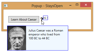
In the example below, both popups size to fit their content.  The first popup’s size is based on the height of the Image and the specified width of the TextBlock.  The second popup automatically sizes to fit the contained text.

        <Popup Name="popCaesar" StaysOpen="False">
            <Border BorderBrush="Blue" BorderThickness="1"
                    Background="AliceBlue">
                <StackPanel Orientation="Horizontal">
                    <Image Source="Caesar.jpg" Height="100"/>
                    <TextBlock Text="Julius Caesar was a Roman emperor who lived from 100 BC to 44 BC"
                               Margin="10"
                               Width="150" TextWrapping="Wrap"/>
                </StackPanel>
            </Border>
        </Popup>
        <Popup Name="popSmall" StaysOpen="False"
               Placement="Right" PlacementTarget="{Binding ElementName=txt}">
            <Border BorderBrush="Blue" BorderThickness="1"
                    Background="White">
                <TextBlock Text="Hi !"/>
            </Border>
        </Popup>

871-001

#870 – Popup Is a ContentControl

The Popup control is a ContentControlwhich means that it can contain exactly one child control.  The child control can be any .NET object, but is often an instance of a Border, which in turn contains a single child element.  The single element in the Border could then be a container control deriving from Panel, which in turn contains multiple child controls.

For example, the code below shows a Popup whose child is a Border element which in turn contains a horizontally-oriented StackPanel that contains several other controls.

        <Popup Name="popCaesar" IsOpen="False">
            <Border BorderBrush="Blue" BorderThickness="1"
                Background="AliceBlue">
                <StackPanel Orientation="Horizontal">
                    <Image Source="Caesar.jpg" Height="100"/>
                    <TextBlock Text="Julius Caesar was a Roman emperor who lived from 100 BC to 44 BC"
                            Margin="10"
                            Width="150" TextWrapping="Wrap"/>
                </StackPanel>
            </Border>
        </Popup>

870-001

#869 – Don’t Leave a Popup Window Open

You can leave a Popup window open while the user interacts with other controls in your application by leaving the StaysOpen property set to true.

You wouldn’t typically do this, however, because this leads to behavior that is a bit odd and not typical.  The popup window will always be on top of the main application window, so it blocks any portion of the application that ends up under the popup.  If the user has moved the main window, the popup may end up located somewhere that isn’t close to the main window and it may not be obvious what application it belongs to.

If you do want the popup to remain visible until the user explicitly asks to hide it, you should:

  • Include some indication, like a title, that indicates the parent application
  • Provide a control, like an OK button, that allows the user to explicitly hide the popup

#868 – A Popup Stays Open By Default

You make a Popup control visible by setting its IsOpen property to true.  By default, the popup will then stay open until you set the IsOpen property back to false.

You can also set the popup’s StaysOpen property to false, which causes the popup to close as soon as the user clicks anywhere else in the application (outside of the popup’s boundaries).

In the example below, we set IsOpen to true in a MouseEnter event handler.  But we’ve set StaysOpen to false so that the popup automatically closes whenever we click on something outside of the popup’s boundaries.

    <StackPanel Margin="15" Orientation="Horizontal">
        <Button Content="Learn About Caesar"
            Margin="5" Padding="10,5"
            VerticalAlignment="Center"/>
        <TextBlock Text="?" FontWeight="Bold" FontSize="24"
               VerticalAlignment="Center"
               MouseEnter="question_MouseEnter"/>
        <Popup Name="popCaesar" IsOpen="False" StaysOpen="False">
            <Border BorderBrush="Blue" BorderThickness="1"
                Background="AliceBlue">
                <StackPanel Orientation="Horizontal">
                    <Image Source="Caesar.jpg" Height="100"/>
                    <TextBlock Text="Julius Caesar was a Roman emperor who lived from 100 BC to 44 BC"
                            Margin="10"
                            Width="150" TextWrapping="Wrap"/>
                </StackPanel>
            </Border>
        </Popup>
    </StackPanel>

868-001
868-002

#867 – Controlling Whether a Popup Is Open Using Data Binding

You can control whether a popup is open by setting its IsOpen property from your code, using the name of the Popup control.  Another approach is to bind the IsOpen property to a boolean value and then to manipulate the boolean value to control whether the popup is open.

        <Popup IsOpen="{Binding PopupOpen}">
            <-- Content of Popup goes here -->

In your code-behind, you implement INotifyPropertyChanged and define the boolean PopupOpen property.

    public partial class MainWindow : Window, INotifyPropertyChanged
    {
        public MainWindow()
        {
            this.InitializeComponent();
            this.DataContext = this;
        }

        // INotifyPropertyChanged
        public event PropertyChangedEventHandler PropertyChanged = delegate { };

        private void RaisePropertyChanged(string propName)
        {
            PropertyChanged(this, new PropertyChangedEventArgs(propName));
        }

        private bool popupOpen;
        public bool PopupOpen
        {
            get { return popupOpen; }
            set
            {
                popupOpen = value;
                RaisePropertyChanged("PopupOpen");
            }
        }

        private void question_MouseEnter(object sender, MouseEventArgs e)
        {
            PopupOpen = true;
        }

        private void btnOK_Click(object sender, RoutedEventArgs e)
        {
            PopupOpen = false;
        }

    }

#866 – Displaying a Popup Window

You can include content in a popup window using the Popup control, which appears on top of your application.

Below, we define a Popup that includes content within a blue border.

    <StackPanel Margin="15" Orientation="Horizontal">
        <Button Content="Learn About Caesar"
                Margin="5" Padding="10,5"
                VerticalAlignment="Center"/>
        <TextBlock Text="?" FontWeight="Bold" FontSize="24"
                   VerticalAlignment="Center"
                   MouseEnter="question_MouseEnter"/>
        <Popup Name="popCaesar" IsOpen="False">
            <Border BorderBrush="Blue" BorderThickness="1"
                    Background="AliceBlue">
                <StackPanel Orientation="Horizontal">
                    <Image Source="Caesar.jpg" Height="100"/>
                    <StackPanel Orientation="Vertical">
                        <TextBlock Text="Julius Caesar was a Roman emperor who lived from 100 BC to 44 BC"
                                   Margin="10"
                                   Width="150" TextWrapping="Wrap"/>
                        <Button Content="OK" Click="btnOK_Click"
                                HorizontalAlignment="Right" Margin="10"
                                Padding="5,2"/>
                    </StackPanel>
                </StackPanel>
            </Border>
        </Popup>
    </StackPanel>

You make a Popup visible by setting its IsOpen property to true.  We set the property to true when the user hovers over the question mark and to false when they click on the OK button.

        private void question_MouseEnter(object sender, MouseEventArgs e)
        {
            popCaesar.IsOpen = true;
        }

        private void btnOK_Click(object sender, RoutedEventArgs e)
        {
            popCaesar.IsOpen = false;
        }

866-001