#1,201 – How to Share Star Sized Column Sizes

You can use the SharedSizeGroup attribute to share column sizes across different grids. You can’t normally share sizes of star-sized columns across multiple grids, however, since star sizing works only in the context of the current grid.

Below is an example of how to get a star sized column to be the same size as a star sized column in a different grid. In the example, we have two grids. In the first, we have two auto-sized TextBlocks and then a star-sized TextBox that takes up the remaining space. In the second grid, we have just a TextBlock and a TextBox, but we want the TextBox to be the same size as the one in the first grid. Using SharedSizeGroup on the TextBox columns won’t work, since the columns would then get auto-sized.

The solution is to set up a SharedSizeGroup on every column except for the TextBox columns and to add a dummy third column in the second grid. The TextBox columns will then each independently use star sizing and end up the same size.

    <StackPanel Margin="15" Grid.IsSharedSizeScope="True">
        <Grid>
            <Grid.ColumnDefinitions>
                <ColumnDefinition Width="Auto" SharedSizeGroup="A"/>
                <ColumnDefinition Width="*"/>
                <ColumnDefinition Width="Auto" SharedSizeGroup="B"/>
            </Grid.ColumnDefinitions>

            <TextBlock Grid.Column="0" Text="Col 1"/>
            <TextBox Grid.Column="1" />
            <TextBlock Grid.Column="2" Text="3rd column here"/>
        </Grid>

        <Separator Margin="0,20"/>

        <Grid>
            <Grid.ColumnDefinitions>
                <ColumnDefinition Width="Auto" SharedSizeGroup="A"/>
                <ColumnDefinition />
                <ColumnDefinition SharedSizeGroup="B"/>
            </Grid.ColumnDefinitions>

            <TextBlock Grid.Column="0" Text="1"/>
            <TextBox Grid.Column="1"/>
        </Grid>
    </StackPanel>

1201

#1,053 – How SharedSizeGroup Relates to Column Sizing

Recall that you can set the width of a column in a Grid (or height of a row) in three different ways: auto, explicit size, or star sizing.

When you’re using the SharedSizeGroup property to set multiple columns (or rows) to the same width (or height), the method that you use for setting the column width (or row height) affects the final size as follows:

  • Star sizing – not honored, treated as Auto
  • Absolute sizing – takes priority over Auto, columns are set to maximum explicit width
  • Auto sizing – if all columns are Auto, size is set to fit the largest content.  If any columns use explicit width, the explicit width value takes precedence

In the example below, we’ve set the first and third columns’ widths to be Auto and put them in the same SharedSizeGroup.

1053-001

Setting the width of the first column to 20 causes both columns to use that width.

1053-002

#1,052 – Making Two Columns in a Grid the Same Size

You can force two columns (or rows) in a Grid to always be the same size using the SharedSizeGroup property when defining the columns (or rows).

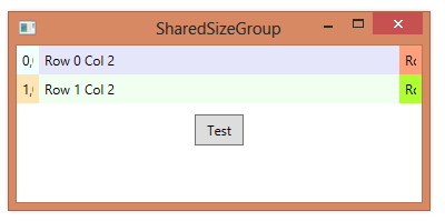
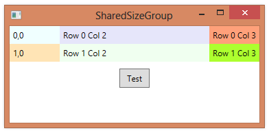
Below, we specify that the third column should auto-size and that the first and third columns should be the same size.  The first column will be sized to match the auto-sized third column.  We do the following:

  • Set Grid.IsSharedSizeScope property of the Grid to true
  • Set SharedSizeGroup property in the first and third ColumnDefinition elements to the same value (in this case it’s “A”)
        <Grid Name="myGrid" Grid.IsSharedSizeScope="True">
            <Grid.RowDefinitions>
                <RowDefinition/>
                <RowDefinition/>
            </Grid.RowDefinitions>
            <Grid.ColumnDefinitions>
                <ColumnDefinition SharedSizeGroup="A"/>
                <ColumnDefinition />
                <ColumnDefinition Width="Auto" SharedSizeGroup="A"/>
            </Grid.ColumnDefinitions>

            <Label Content="0,0" Background="Azure" />
            <Label Content="1,0" Background="Moccasin" Grid.Row="1" />
            <Label Content="Row 0 Col 2" Background="Lavender" Grid.Column="1" />
            <Label Content="Row 1 Col 2" Background="Honeydew" Grid.Row="1" Grid.Column="1" />
            <Label Content="Row 0 Col 3" Background="LightSalmon" Grid.Column="2" />
            <Label Content="Row 1 Col 3" Background="GreenYellow" Grid.Row="1" Grid.Column="2" />
        </Grid>

1052-001

#466 – Using a GridSplitter in Conjunction with a SharedSizeGroup

A GridSplitter allows a user to change the size of a row or column by dragging a visual splitter.  A SharedSizeGroup allows two rows or columns to automatically have the same size.  You can combine these concepts, allowing a user to change the size of one column and have another column automatically have the same size.

In the example below, the user can drag either splitter, but when dragging, the width of both left and right columns changes at the same time.

    <Grid Grid.IsSharedSizeScope="True">
        <Grid.ColumnDefinitions>
            <ColumnDefinition SharedSizeGroup="A" Width="Auto"/>
            <ColumnDefinition Width="Auto"/>
            <ColumnDefinition/>
            <ColumnDefinition Width="Auto"/>
            <ColumnDefinition SharedSizeGroup="A" Width="Auto"/>
        </Grid.ColumnDefinitions>

        <Label Content="Left" Background="Azure" Grid.Column="0"/>
        <Label Content="Middle" Background="Lavender" Grid.Column="2"/>
        <Label Content="Right" Background="Moccasin" Grid.Column="4"/>

        <GridSplitter Grid.Column="1" Width="8" Background="DarkSlateBlue"
                        HorizontalAlignment="Center" VerticalAlignment="Stretch"/>
        <GridSplitter Grid.Column="3" Width="8" Background="DarkSlateBlue"
                        HorizontalAlignment="Center" VerticalAlignment="Stretch"/>
    </Grid>

Window at startup:

User drags left splitter, which makes both left and right columns wider.

User drags right splitter and columns also resize together.

#425 – SharedSizeGroup Allows Sharing Column Sizes Across Different Grids

You can use the SharedSizeGroup property of a ColumnDefinition to lead to consistent column sizes in a ListBox with a data template.  This works because each entry in the list has its own instance of a Grid and the column sizes are being shared across different grids.

As a more general example, we can share column sizes across two Grid controls hosted in the same window.

    <StackPanel Grid.IsSharedSizeScope="True">
        <Label Content="First grid:" />
        <Grid Margin="10" ShowGridLines="True" Background="AliceBlue">
            <Grid.ColumnDefinitions>
                <ColumnDefinition Width="Auto" SharedSizeGroup="A"/>
                <ColumnDefinition/>
                <ColumnDefinition/>
            </Grid.ColumnDefinitions>

            <Label Grid.Column="0" Content="{Binding Thing1}"/>
        </Grid>

        <Label Content="Second grid:" />
        <Grid Margin="10" ShowGridLines="True" Background="AliceBlue">
            <Grid.ColumnDefinitions>
                <ColumnDefinition/>
                <ColumnDefinition Width="Auto" SharedSizeGroup="A"/>
                <ColumnDefinition/>
            </Grid.ColumnDefinitions>

            <Label Grid.Column="1" Content="{Binding Thing2}"/>
        </Grid>

        <Button Margin="10" Content="Change Thing1" Click="Button_Click" />
    </StackPanel>

We share size between the first column in the first grid and the second column in the second grid, since they use the same value for SharedSizeGroup.

After adding characters to Thing1:

#424 – Getting Data-Bound Items in a ListBox to Be a Consistent Size

I demonstrated earlier how to add some rich content to a ListBox using data binding.

The problem with this is that the items don’t line up vertically.  We use several StackPanel elements in the data template, which autosize to fit their content.  We’d like them to autosize, but to use that same size across all rows, for each column.

We can share sizes between entries using the Grid.IsSharedSizeScope and SharedSizeGroup properties.

        <ListBox ItemsSource="{Binding MovieList}" SnapsToDevicePixels="True"
                 Grid.IsSharedSizeScope="True">
            <ListBox.ItemTemplate>
                <DataTemplate>
                    <StackPanel Orientation="Horizontal" Margin="0,0,0,5">
                        <Grid>
                            <Grid.ColumnDefinitions>
                                <ColumnDefinition SharedSizeGroup="Col1"/>
                            </Grid.ColumnDefinitions>
                            <Image Source="{Binding Image}" />
                        </Grid>
                        <Grid>
                            <Grid.ColumnDefinitions>
                                <ColumnDefinition SharedSizeGroup="Col2"/>
                            </Grid.ColumnDefinitions>
                            <StackPanel Orientation="Vertical">
                                <Label Content="{Binding Title}" FontWeight="Bold"/>
                                <Label Content="{Binding Year}"/>
                            </StackPanel>
                        </Grid>

                        <Border BorderBrush="Black" BorderThickness="0.5"/>

                        <Grid>
                            <Grid.ColumnDefinitions>
                                <ColumnDefinition SharedSizeGroup="Col3"/>
                            </Grid.ColumnDefinitions>
                            <StackPanel Orientation="Vertical">
                                <Label Content="Actors:"/>
                                <Label Content="{Binding ActorLead}" Margin="10,0"/>
                                <Label Content="{Binding ActressLead}" Margin="10,0"/>
                            </StackPanel>
                        </Grid>

                        <Border BorderBrush="Black" BorderThickness="0.5"/>

                        <StackPanel Orientation="Vertical">
                            <Label Content="Director:"/>
                            <Label Content="{Binding Director}" Margin="10,0"/>
                        </StackPanel>
                    </StackPanel>
                </DataTemplate>
            </ListBox.ItemTemplate>
        </ListBox>