#440 – How Alignment Properties Behave in a WrapPanel

The alignment properties, when specified for children of a WrapPanel, dictate the alignment within the current row (if Orientation is Horizontal) or column (if Orientation is Vertical).

For example, the VerticalAlignment properties of controls in a WrapPanel whose Orientation is Horizontal indicate the alignment of the control with respect to the other controls within the same row.

In the example below, the William II label is set artificially high, which then dictates the height of a row that it appears in.  Other controls on that same row will then align themselves relative to this height.

    <WrapPanel Orientation="Horizontal">
        <Label Background="AliceBlue" Content="William I" VerticalAlignment="Center"/>
        <Label Background="AntiqueWhite" Content="William II" VerticalAlignment="Center" Height="60"/>
        <Label Background="AliceBlue" Content="Henry I" VerticalAlignment="Bottom"/>
        <Label Background="AntiqueWhite" Content="Stephen" VerticalAlignment="Top"/>
        <Label Background="AliceBlue" Content="Matilda"  VerticalAlignment="Stretch"/>
        <Label Background="AntiqueWhite" Content="Henry II" VerticalAlignment="Center"/>
        <Label Background="AliceBlue" Content="Richard I" VerticalAlignment="Center"/>
        <Label Background="AntiqueWhite" Content="John" VerticalAlignment="Center"/>
    </WrapPanel>

#439 – Using a DropShadow with a Border, part II

I described earlier how you can use two sibling Border elements to end up with the effect of a Border with a DropShadow.  We did this because specifying a DropShadowEffect for a Border will lead to all of the child elements contained in the Border getting the same drop shadow.

A cleaner way to avoid the drop shadows on the child elements is to just specify a value for the Background property of the original parent Border, so that it becomes opaque.

            <Border Margin="10" BorderBrush="DarkGray" BorderThickness="1" CornerRadius="4"
                    Background="{x:Static SystemColors.ControlLightLightBrush}">
            	<Border.Effect>
            		<DropShadowEffect/>
            	</Border.Effect>
                <StackPanel Orientation="Vertical" Margin="5" Visibility="Visible">
                    <Label Content="Rounded corners are everywhere"/>
                    <Button Content="Push Me" Padding="30,5" Margin="5" HorizontalAlignment="Center"/>
                </StackPanel>
            </Border>


You can get some nice effects by using the combination of a gradient fill for the background along with a drop shadow.

#438 – Border Element Can Have a Background

You can use the Background property to specify a background color (or brush) for everything within a Border.

            <Border Margin="10" BorderBrush="DarkGray" BorderThickness="1" CornerRadius="4">
            	<Border.Background>
            		<LinearGradientBrush EndPoint="1,0.5" StartPoint="0,0.5">
            			<GradientStop Color="#FF93C0D4" Offset="0"/>
            			<GradientStop Color="#FFCACACA" Offset="1"/>
            		</LinearGradientBrush>
            	</Border.Background>
                <StackPanel Orientation="Vertical" Margin="5" Visibility="Visible">
                    <Label Content="Rounded corners are all around us"/>
                    <Button Content="Push Me" Padding="30,5" Margin="5" HorizontalAlignment="Center"/>
                </StackPanel>
            </Border>

#437 – Showing Rounded Corners on a Border

You can set a Border element to show rounded corners by using the CornerRadius property.  If specified, this property indicates the radius, in device independent units, of one or more of the corners of a Border.

        <Grid>
            <Border Margin="10" BorderBrush="DarkGray" BorderThickness="1" CornerRadius="5">
                <StackPanel Orientation="Vertical" Margin="5" Visibility="Visible">
                    <Label Content="Rounded corners are all around us"/>
                    <Button Content="Push Me" Padding="30,5" HorizontalAlignment="Center"/>
                </StackPanel>
            </Border>
        </Grid>


You can also specify different radii for each corner.

            <Border Margin="10" BorderBrush="DarkGray" BorderThickness="1" CornerRadius="4,8,32,16">

Happy Thanksgiving

Happy Thanksgiving (in the United States)!  There will be no WPF post today, but we’ll resume regular posts tomorrow.

#436 – Using a Drop Shadow with a Border

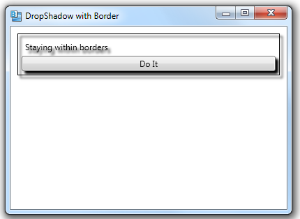
If you specify a DropShadowEffect for a Border, all elements within the border will get a drop shadow.

        <Border Margin="10" BorderBrush="Black" BorderThickness="1">
            <Border.Effect>
                <DropShadowEffect/>
            </Border.Effect>
            <StackPanel Orientation="Vertical" Margin="5">
                <Label Content="Staying within borders"/>
                <Button Content="Do It"/>
            </StackPanel>
        </Border>


If you want the drop shadow around only the Border, you can create two sibling borders–one that has the drop shadow but no content and one that has the content and no drop shadow.

        <Grid>
            <Border Margin="10" BorderBrush="Black" BorderThickness="1" Background="White">
                <Border.Effect>
                    <DropShadowEffect ShadowDepth="2"/>
                </Border.Effect>
            </Border>

            <Border Margin="10" BorderBrush="Black" BorderThickness="1">
                <StackPanel Orientation="Vertical" Margin="5">
                    <Label Content="Staying within borders"/>
                    <Button Content="Do It"/>
                </StackPanel>
            </Border>
        </Grid>

#435 – Use Border Element to Draw Border Around Elements

You can easily draw a border around any control by nesting the element within a Border element in XAML.  The content property for the Border element is the Child property, which specifies the single child (an UIElement) contained with the border.  In XAML, you surround a control with a border by making it the child element of a Border element.

	<StackPanel>
		<Label Margin="10" Content="I'm free.."/>

        <Border Margin="10" BorderBrush="Black" BorderThickness="1">
            <Label Content="Don't Fence Me In"/>
        </Border>

        <Border Margin="10" BorderBrush="Black" BorderThickness="1">
            <StackPanel Orientation="Vertical" Margin="5">
                <Label Content="Staying within borders"/>
                <Button Content="Do It"/>
            </StackPanel>
        </Border>
	</StackPanel>

The BorderBrush and BorderThickness properties must both be specified.  The BorderBrush can be set to any brush, including solid or gradient brushes.  The BorderThickness property specifies the thickness of the border in device independent units.

#434 – Canvas Layout Mode in Blend

By default, when you edit a Grid in Blend, margins are preserved when you change the Grid layout, but the visual appearance of controls may change.  This is know as grid layout mode and is indicated by the small icon in the upper left corner of a Grid on the design surface.

You can also switch to canvas layout mode, which allows editing the Grid in a mode that behaves a little more like the Canvas panel.  Controls retain their position and size and their margins are adjusted as Grid elements are resized.

You can click on the icon shown above to switch to canvas layout mode.  In the example below, I switch to canvas layout mode and then change the width of the second column.  The Button’s position and size stay the same and its margins are adjusted.

Margins before the change:

Margins after the change:

#433 – Preservation of Margins While Editing Grid in Blend

Assume that you have a simple 2×2 Grid and you use the design surface in Blend to place a Button in the Grid.  If you place the Button by dragging it and dropping it, its Grid.Row and Grid.Column properties will be set accordingly and its Margin will be set to reflect the specific spot where you dropped it.

	<Grid Height="300" Width="300">
		<Grid.RowDefinitions>
			<RowDefinition Height="0.5*"/>
			<RowDefinition Height="0.5*"/>
		</Grid.RowDefinitions>
		<Grid.ColumnDefinitions>
			<ColumnDefinition Width="0.5*"/>
			<ColumnDefinition Width="0.5*"/>
		</Grid.ColumnDefinitions>
		<Button Content="Button" Grid.Column="1" Margin="59,48,16,0" Grid.Row="1" VerticalAlignment="Top"/>
	</Grid>

If you now change the width of the 2nd column, making it wider, you’ll notice that the button’s Margin is preserved, which means that the size of the button changes.

		<Button Content="Button" Grid.Column="1" Margin="59,48,16,0" Grid.Row="1" VerticalAlignment="Top"/>

This is normally what you want.  As you change things on the design surface, the XAML does not change but the visual appearance of the controls may change.

#432 – Height and Width vs. ActualHeight and ActualWidth

Specifying the height and width of a control using the Height and Width properties indicates the desired height and width.  The layout system will take the requested height and width into account, but the actual height and width depends on a number of factors.

You can use the ActualHeight and ActualWidth properties to get at the actual height and width, after layout.

    <StackPanel>
        <Button Name="btnA" HorizontalAlignment="Stretch" Content="Get Info"
                Click="btnA_Click"/>
        <Button Name="btnB" HorizontalAlignment="Center" Width="1in" Content="Push or Pull Me"/>
        <Button Name="btnC" Width="175" MaxWidth="{Binding ElementName=btnB, Path=ActualWidth}" Content="Push Me"/>
    </StackPanel>


Clicking on GetInfo, we display info about the third button.  ActualWidth is smaller than the requested Width, because it can’t be wider than the second button.

The first button’s Width is set to “NaN” (Not a Number), indicating that Width is set to Auto.

The second button’s width was set to 1 inch, which is 96 units on my 96 dpi display.