#1,023 – Displaying a Tooltip that Shows the Value of a Slider

You can use the AutoToolTipPlacement property to automatically show a tooltip on a slider while the thumb is being dragged.  The tooltip will show the current Value of the slider.

You can set AutoToolTipPlacement to either BottomRight or TopLeft to control the position of the tooltip.  (The default is None).

Note, however, that the value shown in the tooltip is by default rounded to the nearest integer.  You can see this in the example below, as we display the actual Value in a TextBlock.

        <Slider Name="mySlider" Margin="10"
                Minimum="1" Maximum="100"
                AutoToolTipPlacement="BottomRight"/>

1023-001
You can increase the precision shown in the tooltip by setting the AutoToolTipPrecision property.  You set this property to be the number of digits to the right of the decimal place that you want to see.

        <Slider Name="mySlider" Margin="10"
                Minimum="1" Maximum="100"
                AutoToolTipPlacement="BottomRight"
                AutoToolTipPrecision="2"/>

1023-002

#873 – Using a Popup Rather than a Tooltip

Both Tooltips and Popup controls allow you to display a small popup window that contains some content.  Which one you use depends on what you need to accomplish with the popup window.

In general, you should use a Tooltip, unless one of the following is true:

  • You need to explicitly control when the window closes
  • The popup needs to accept focus

#865 – ToolTip Can Extend Beyond Window Boundaries

The ToolTip control is one of the few controls whose content is not clipped at the boundary of its container.  In fact, it can extend beyond the boundaries of an application’s window.

865-001

#864 – Changing the Look of a ToolTip with a Control Template

You can change the content of a ToolTip if you want it to display more than simple text.  If you want to go further and change the look of the ToolTip more completely, you can use a control template.  This lets you display the tooltip’s content in something other than the default bordered popup.

The example below displays a ToolTip with a custom border and background.

        <Button Content="Caesar"
                Margin="5" Padding="10,5"
                HorizontalAlignment="Center">
            <Button.ToolTip>
                <ToolTip Content="Click to learn more about Julius Caesar (100 BC - 44 BC)"
                         OverridesDefaultStyle="True"
                         HasDropShadow="True">
                    <ToolTip.Template>
                        <ControlTemplate TargetType="ToolTip">
                            <Border BorderBrush="Blue" BorderThickness="1"
                                    Background="AliceBlue"
                                    CornerRadius="5">
                                <StackPanel Orientation="Horizontal">
                                    <Image Source="Caesar.jpg" Height="100"/>
                                    <TextBlock Text="{TemplateBinding Content}"
                                               Margin="10"
                                               Width="150" TextWrapping="Wrap"/>
                                </StackPanel>
                            </Border>
                        </ControlTemplate>
                    </ToolTip.Template>
                </ToolTip>
            </Button.ToolTip>
        </Button>

864-001

#863 – Tooltips Are Normally Not Shown when a Control Is Disabled

By default, a tooltip will not be shown if you hover over a control that is disabled.  This makes sense–if you can’t interact with a control, you probably don’t need to see whatever additional information the tooltip is providing.  (Although you might make the argument that a tooltip could provide information about why a particular control is disabled).

In the code below, the first button has its IsEnabled property set to false, which means that its tooltip won’t be shown when you hover over it at runtime.

    <StackPanel Margin="15">
        <Button Content="Hemingway" IsEnabled="False"
                Margin="5" Padding="10,5"
                HorizontalAlignment="Center"
                ToolTip="Ernest Hemingway (1899-1961)"/>
        <Button Content="Fitzgerald"
                Margin="5" Padding="10,5"
                HorizontalAlignment="Center"
                ToolTip="F. Scott Fitzgerald (1896-1940)"/>
    </StackPanel>

863-001

If you do want the tooltip to be displayed when the parent control is disabled, you can set the ToolTipService.ShowOnDisabled property to true.


#862 – Changing Default Tooltip Delay for all Applications

The TooltipService.InitialShowDelay allows you to set the amount of time that passes between when you first hover over a control and when a tooltip pops up.  This value defaults to 400 ms (0.4 secs).  This default value actually comes from a registry setting–MouseHoverTime–that dictates this delay for all applications.

You can find the MouseHoverTime registry setting at: HKEY_CURRENT_USER\Control Panel\Mouse

862-001


You can change this registry setting by entering a new value for the delay (in milliseconds).  You’ll need to log out and back in before the setting will take effect.

If you change this setting, applications that do not explicitly specify a value for InitialShowDelay will pick up the new value from the registry.  Applications that explicitly set a value for InitialShowDelay will still use their explicit value.

#861 – Tooltip Delays and Timing

Several properties of the TooltipService class affect timing of tooltips displayed for a control.

  • InitialShowDelay – how long to wait after hovering over a control before popping up the tooltip  (default is 0.4 secs)
  • ShowDuration – how long to show a tooltip before hiding it (assuming that you don’t move the mouse)  (default is 5 secs)
  • BetweenShowDelay – how much time to allow for moving to another control when showing the tooltip on the second control without an initial delay  (default is 0.1 secs)

For example, assuming that you have a couple of buttons that show tooltips and these properties have default values:

  • You hover over the first button
  • After 0.4 secs, the tooltip shows up
  • If you wait 5 secs, the tooltip will disappear
  • If you move off the button, the tooltip disappears immediately
  • If you move to the second button within 0.1 secs, the first tooltip is quickly replaced by the second tooltip (no delay)

861-001


#860 – Making a Tooltip Partially Transparent

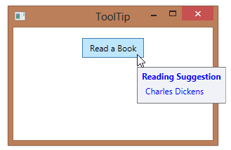
You’ll normally want your tooltips fully opaque so that the user can easily read the content on the tooltip.  However, there might be cases when you’d like the tooltip at least partially transparent, to hint at content behind the tooltip.

To make a tooltip partially transparent, you can set its Background property to a color that includes an alpha value indicating transparency.

The alpha component of a color value ranges from 0-255 (00-FF), with a value of 0 representing a fully transparent color and 255 representing a fully opaque color.

In the example below, we set the alpha portion of the color value to D5, which is slightly transparent.

        <Button Content="Read a Book"
                Padding="10,5" HorizontalAlignment="Center">
            <Button.ToolTip>
                <ToolTip Background="#D5F0F0FF">
                    <StackPanel>
                        <TextBlock Text="Reading Suggestion" FontWeight="Bold"/>
                        <TextBlock Text="Charles Dickens" Margin="5"/>
                    </StackPanel>
                </ToolTip>
            </Button.ToolTip>
        </Button>

When the tooltip appears, you can see through it to the button behind it.
860-001

#859 – Changing the Amount of Time That a ToolTip Is Shown For

By default, a ToolTip will be displayed for 5 seconds before automatically disappearing.  To change this value, set the ToolTipService.ShowDuration property on the element to which the tooltip is attached.

In the example below, we change our tooltip to only stay displayed for 2 seconds (2000 milliseconds).

        <Button Content="Read a Book"
                Padding="10,5" HorizontalAlignment="Center"
                ToolTipService.ShowDuration="2000">
            <Button.ToolTip>
                <ToolTip >
                    <StackPanel>
                        <TextBlock Text="Reading Suggestion" FontWeight="Bold"/>
                        <TextBlock Text="Charles Dickens" Margin="5"/>
                    </StackPanel>
                </ToolTip>
            </Button.ToolTip>
        </Button>

859-001

#858 – How to Set Properties for a Tooltip

There are basically three different ways to specify tooltips.  The first is to just set the Tooltip property on the control where the tooltip should appear.  You set the property to the text that you want to see in the tooltip.

        <Button Content="Read a Book"
                Padding="10,5" HorizontalAlignment="Center"
                ToolTip="You might start with Charles Dickens"/>

858-001
If you want to create a more complex tooltip, you can use the property element syntax.

        <Button Content="Read a Book"
                Padding="10,5" HorizontalAlignment="Center">
            <Button.ToolTip>
                <StackPanel>
                    <TextBlock Text="Reading Suggestion" FontWeight="Bold"/>
                    <TextBlock Text="Charles Dickens" Margin="5"/>
                </StackPanel>
            </Button.ToolTip>
        </Button>

858-002
Finally, if you want to specify property values for the ToolTip, you can use a ToolTip element.

        <Button Content="Read a Book"
                    Padding="10,5" HorizontalAlignment="Center">
            <Button.ToolTip>
                <ToolTip Foreground="Blue">
                    <StackPanel>
                        <TextBlock Text="Reading Suggestion" FontWeight="Bold"/>
                        <TextBlock Text="Charles Dickens" Margin="5"/>
                    </StackPanel>
                </ToolTip>
            </Button.ToolTip>
        </Button>

858-003