#452 – Data Binding Elements in a Collection to a Grid, Part V

We saw earlier that to bind Grid.Row and Grid.Column properties on child items in an ItemsControl,  we need to set up the binding on the ContentPresenter elements that contain the individual items.

We can do this by overriding the ItemsControl.PrepareContainerForItemOverride method.  This method is called for each item in the collection and receives both the containing element (a ContentPresenter in our case) and the contained item (a ChessPiece object in our example).  We bind the Grid.Row and Grid.Column properties on the ContentPresenter to the same properties on the contained item.

public class GridBasedItemsControl : ItemsControl
    {
        protected override void PrepareContainerForItemOverride(DependencyObject element, object item)
        {
            base.PrepareContainerForItemOverride(element, item);

            ContentPresenter cp = element as ContentPresenter;

            if ((cp != null) && (item != null))
            {
                BindingOperations.SetBinding(cp, Grid.RowProperty, new Binding { Source = item, Path = new PropertyPath("Row")});
                BindingOperations.SetBinding(cp, Grid.ColumnProperty, new Binding { Source = item, Path = new PropertyPath("Column") });
            }

        }
    }

Everything now works as expected.
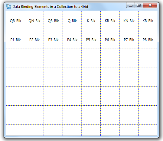
NOTE: Reader Bruno pointed out a much better way to do this, using the ItemContainerStyle property.

#451 – Data Binding Elements in a Collection to a Grid, Part IV

Our first attempt to bind elements in a collection to a Grid didn’t work as expected.  We set the Grid.Row and Grid.Column properties in the data template, but the items did not show up in the correct row and column.

The problem is that when we’re setting the Grid.Row and Grid.Column properties on the Label control in the data template, these Label controls are not direct children of the Grid, so the properties have no effect.

We can look at the visual tree of the ItemsControl to see this.  The direct child elements of the Grid are actually instances of a ContentPresenter.

What we really want to do is set the value of the Grid.Row and Grid.Column properties on the ContentPresenter, rather than the Label.  I’ll show how to do that in the next post.


#450 – Data Binding Elements in a Collection to a Grid, part III

We’ve done part of the work required in order to bind a collection of elements to a Grid, with each object’s Row and Column properties indicating where in the Grid it should be located.

  • Set the ItemsPanel property of an ItemsControl to represent a Grid
  • Set the ItemTemplate property to represent the item, setting the Grid.Row and Grid.Column property for each

At this point, the binding doesn’t work as expected.  Each element does get inserted into the grid, but every element is added to Row 0 and Column 0.  The Grid.Row and Grid.Column attached properties are being ignored.

#449 – Data Binding Elements in a Collection to a Grid, part II

This post continues with the goal of binding a collection of elements to a Grid, with each object’s Row and Column properties indicating where in the Grid it should be located.  Last time we set the ItemsPanel property of an ItemsControl to order things in an 8×8 grid.  We also set the ItemTemplate property to include a Label with attached Grid.Row and Grid.Column properties.

In this post, we create a series of ChessPiece elements at runtime, representing a series of chess pieces.

            ChessPieces = new ObservableCollection<ChessPiece>();
            ChessPieces.Add(new ChessPiece("QR-Blk", 1, 1));
            ChessPieces.Add(new ChessPiece("QN-Blk", 1, 2));
            ChessPieces.Add(new ChessPiece("QB-Blk", 1, 3));
            ChessPieces.Add(new ChessPiece("Q-Blk", 1, 4));
            ChessPieces.Add(new ChessPiece("K-Blk", 1, 5));
            ChessPieces.Add(new ChessPiece("KB-Blk", 1, 6));
            ChessPieces.Add(new ChessPiece("KN-Blk", 1, 7));
            ChessPieces.Add(new ChessPiece("KR-Blk", 1, 8));

            ChessPieces.Add(new ChessPiece("P1-Blk", 2, 1));
            ChessPieces.Add(new ChessPiece("P2-Blk", 2, 2));
            ChessPieces.Add(new ChessPiece("P3-Blk", 2, 3));
            ChessPieces.Add(new ChessPiece("P4-Blk", 2, 4));
            ChessPieces.Add(new ChessPiece("P5-Blk", 2, 5));
            ChessPieces.Add(new ChessPiece("P6-Blk", 2, 6));
            ChessPieces.Add(new ChessPiece("P7-Blk", 2, 7));
            ChessPieces.Add(new ChessPiece("P8-Blk", 2, 8));
            OnPropertyChanged("ChessPieces");

#448 – Data Binding Elements in a Collection to a Grid, part I

Assume that you have a collection of objects that you want to place in a grid, with their position only known at runtime.  You might have properties on the objects indicating what row and column they should be placed in and then use data binding to locate the objects.

You can use a Grid panel as the ItemsPanel of an ItemsControl.  This dictates the layout of the items in the collection.  You can then specify the ItemTemplate to indicate how each item should be displayed.

Your first try might look something like this:

    <ItemsControl ItemsSource="{Binding ChessPieces}" Height="500" Width="500">
        <ItemsControl.ItemsPanel>
            <ItemsPanelTemplate>
                <Grid ShowGridLines="True">
                    <Grid.RowDefinitions>
                        <RowDefinition Height="*"/>
                        <!-- 7 more rows -->
                    </Grid.RowDefinitions>
                    <Grid.ColumnDefinitions>
                        <ColumnDefinition Width="*"/>
                        <!-- 7 more columns -->
                    </Grid.ColumnDefinitions>
                </Grid>
            </ItemsPanelTemplate>
        </ItemsControl.ItemsPanel>
        <ItemsControl.ItemTemplate>
            <DataTemplate>
                <Label Content="{Binding Text}" Grid.Row="{Binding Row}" Grid.Column="{Binding Column}"
                        HorizontalAlignment="Center" VerticalAlignment="Center"/>
            </DataTemplate>
        </ItemsControl.ItemTemplate>
    </ItemsControl>

Next time–create a collection of ChessPiece objects at runtime.

#447 – You Can Use Layout Transforms Within a DockPanel

You can use a LayoutTransform on individual child elements in a DockPanel container to scale or rotate the elements.

In the example below, we have four Label controls, each docked to one side of a DockPanel.  The labels on the left, top and right sides use a LayoutTransform to make them face outwards.

<DockPanel LastChildFill="False">
    <Label Content="Facing Up" DockPanel.Dock="Top" Background="Aquamarine"
           HorizontalContentAlignment="Center">
        <Label.LayoutTransform>
            <RotateTransform Angle="180"/>
        </Label.LayoutTransform>
    </Label>

    <Label Content="Facing Down" DockPanel.Dock="Bottom" Background="LightSteelBlue"
           HorizontalContentAlignment="Center">
    </Label>

    <Label Content="Facing Left" DockPanel.Dock="Left" Background="DarkSeaGreen"
           HorizontalContentAlignment="Center">
        <Label.LayoutTransform>
            <RotateTransform Angle="90"/>
        </Label.LayoutTransform>
    </Label>

    <Label Content="Facing Right" DockPanel.Dock="Right" Background="SkyBlue"
           HorizontalContentAlignment="Center">
        <Label.LayoutTransform>
            <RotateTransform Angle="-90"/>
        </Label.LayoutTransform>
    </Label>
</DockPanel>

#446 – Default Docking for DockPanel Children

You normally specify a value for the DockPanel.Dock attached property for all children of a DockPanel, indicating which side the element should be docked to.  However, if you don’t specify a value for the Dock property, the child element will be docked to the Left, by default.

    <DockPanel LastChildFill="False">
        <ListBox ItemsSource="{Binding MovieList}"/>
        <Label Content="1 - Label at Top" DockPanel.Dock="Top" Background="Bisque"/>
        <Label Content="2 - Label at Left" DockPanel.Dock="Left" Background="BurlyWood"/>
        <Label Content="3 - Last Label" DockPanel.Dock="Top" Background="Cornsilk"/>
    </DockPanel>


Because the DockPanel container docks elements in the order that they appear in the XAML, if we change the order of the elements, the ListBox will still default to a Dock value of Left, but will dock within the remaining space.

    <DockPanel LastChildFill="False">
        <Label Content="1 - Label at Top" DockPanel.Dock="Top" Background="Bisque"/>
        <ListBox ItemsSource="{Binding MovieList}"/>
        <Label Content="2 - Label at Left" DockPanel.Dock="Left" Background="BurlyWood"/>
        <Label Content="3 - Last Label" DockPanel.Dock="Top" Background="Cornsilk"/>
    </DockPanel>

#445 – DockPanel Can Be Used Like a StackPanel

The DockPanel layout container is most often used to dock other container controls along each edge of a window and perhaps include a control that fills the remaining space.  This works well as the outermost container for a main application window.

But because you can stack multiple controls consecutively on the same side, you can use a DockPanel like a StackPanel, but stacking controls in any direction.

Docking everything to the left:

Docking everything to the right:

To the top:

Or the bottom:

You can also use various combinations, stacking a series of controls to one side and then another group of controls to another side.

    <DockPanel LastChildFill="False">
        <Button Content="1 - Button" DockPanel.Dock="Left"/>
        <Button Content="2 - Button" DockPanel.Dock="Left" />
        <Button Content="3 - Button" DockPanel.Dock="Left" />

        <Button Content="4 - Button" DockPanel.Dock="Bottom" />
        <Button Content="5 - Button" DockPanel.Dock="Bottom" />
        <Button Content="6 - Button" DockPanel.Dock="Bottom" />

        <Button Content="7 - Button" DockPanel.Dock="Right" />
        <Button Content="8 - Button" DockPanel.Dock="Right" />
        <Button Content="9 - Button" DockPanel.Dock="Right" />
    </DockPanel>

#444 – Children of DockPanel Don’t Always Have to be Stretched

Normally, when you dock a child element in a DockPanel to one of the sides, it is stretched to fit the entire length or height of that side.

    <DockPanel>
        <Button Content="1st (Top)" DockPanel.Dock="Top" />
        <Button Content="2nd (Left)" DockPanel.Dock="Left" />
        <Button Content="3rd (Top)" DockPanel.Dock="Top" />
        <Label Content="4th (Right)" DockPanel.Dock="Right" Background="DarkKhaki"/>
        <Label Content="5th, fills remaining space" Background="Khaki"/>
    </DockPanel>

You can, however, use HorizontalAlignment (when docked to Top or Bottom) or VerticalAlignment (when docked to Left or Right) to have the control autosize to fit its content.

    <DockPanel>
        <Button Content="1st (Top/Center)" DockPanel.Dock="Top" HorizontalAlignment="Center"/>
        <Button Content="2nd (Left/Bottom)" DockPanel.Dock="Left" VerticalAlignment="Bottom"/>
        <Button Content="3rd (Top/Right)" DockPanel.Dock="Top" HorizontalAlignment="Right"/>
        <Label Content="4th (Right/Top)" DockPanel.Dock="Right" Background="DarkKhaki" VerticalAlignment="Top"/>
        <Label Content="5th, fills remaining space, Centered" Background="Khaki" HorizontalAlignment="Center"/>
    </DockPanel>

#443 – Reversing the Flow Direction in a WrapPanel

You can set a WrapPanel to flow its children from right to left, rather then from left to right by setting the FlowDirection property to RightToLeft.  (The default is LeftToRight).

For a horizontally oriented WrapPanel, elements will fill in the top row from right to left, flowing to the second row when the first one fills up.  For a vertically oriented WrapPanel, elements will fill in the rightmost column from top to bottom and then move to the next column to the left when the first column fills up.

Below are examples of each combination of Orientation and FlowDirection.

Orientation = Horizontal, FlowDirection = LeftToRight (the default).

Orientation = HorizontalFlowDirection = RightToLeft.

Orientation = VerticalFlowDirection = LeftToRight (the default).

Orientation = VerticalFlowDirection = RightToLeft.

You would normally use right-to-left flow in culture that present text from right to left (e.g. Arabic).  But you can also use it whenever this layout makes sense for your application.